


Flutter has been widely adopted because of its flexibility to build applications to run on your Android, iOS, macOS and Windows machines with one codebase. In most cases, these devices come in different sizes, and despite Flutter’s cross-platform capabilities, you cannot guarantee that the interface of your application would, by default, render as expected across these devices. This is a feature you have to account for during your development process.
This article will demonstrate how to create an adaptive app with Flutter. You’ll learn how to build a basic ecommerce application that adapts to a given device’s size without having to rebuild the app as the screen size changes. We’ll cover:
- What is an adaptive application?
- What to consider when building an adaptive app
- Using the Flutter
LayoutBuilderto create an adaptive app - Project overview
- Tutorial: Creating an adaptive ecommerce app with Flutter
What is an adaptive application?
An application is considered adaptive when it is designed to change the values of its properties at runtime based on specific parameters in response to different inputs or conditions. For example, an adaptive application renders different interfaces on mobile and desktop views using the same codebase.
It is important to note that adaptive design should not be confused with responsive design. A responsive application dynamically changes the layout of its interface based on the available screen size, but maintains the laid-out design. The contents of the app are simply rearranged to fit the screen size.
On the other hand, an adaptive design requires that you create platform-specific designs, content, and templates. That is, the design of your application on a mobile device would be different on a larger screen such as a desktop device.
What to consider when building an adaptive app
To improve the user experience, you should design your application to accommodate different devices (phones, foldables, tablets, smartwatches, and PCs) with varying designs, sizes, shapes, and operating systems. Your users should be able to explore your application on these varying devices and still enjoy the experiences native to the devices and OS.
An important decision you’ll have to make in your design or development phase is determining the threshold at which your application should switch its layouts. In a section of the Android documentation are a set of recommended values to help you decide the layout of your application across different screen sizes.
In most cases, the available width of the screen could be more important than its available height because of the influence of vertical scrolling. You’ll also need to account for the mouse, keyboard, touch inputs, and other characteristics particular to each platform. You should customize the experience and interface of your application to suit the host device.
Using the Flutter LayoutBuilder to create an adaptive app
Flutter provides many widgets you can use when building your adaptive application. There are also some external packages such as the Flutter Adaptive UI and adaptive layout that you can integrate into your application. In this article, we’ll focus on using the Flutter-provided LayoutBuilder widget to build an adaptive application.
The LayoutBuilder class is useful for building responsive and adaptive applications because it has a builder function that it invokes at layout time. This function returns a widget, receives the application context and constraints, and performs specific operations based on the values of the constraints. For instance, you can choose to render a different design when the device width meets a condition specified through the constraints.maxWidth property:
LayoutBuilder(
        builder: (ctx, constraints) {
          if (constraints.maxWidth < 600) {
              return widget;
          }else{
            return anotherWidget;
          }
        }
    );
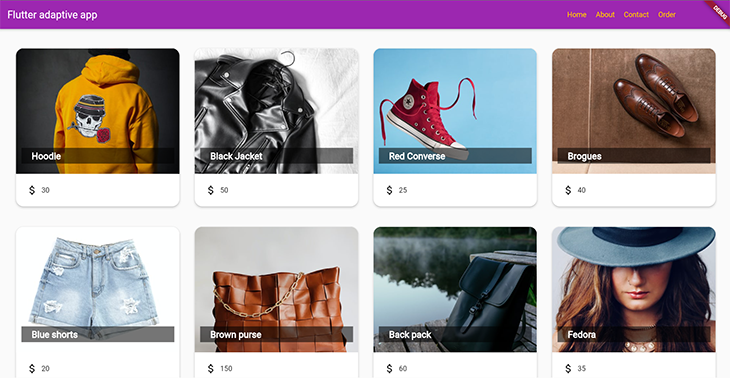
Project overview
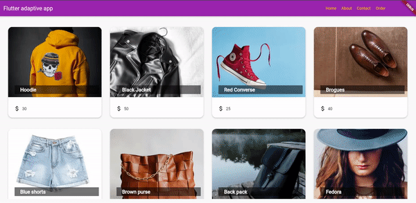
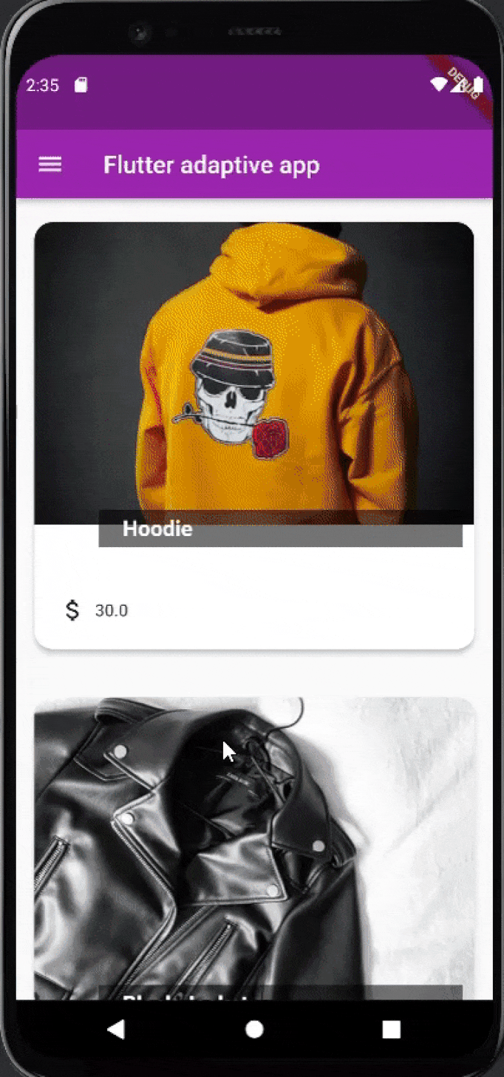
The demo application for this tutorial is an ecommerce app that displays its products in a scrollable view. On mobile devices, each product takes up the available width and the user can vertically scroll through the screen to view each available product. The mobile view will also contain an app drawer with navigation buttons.
On a larger screen, such as on a desktop device, the products are distributed across the width and height of the screen. The desktop view will also contain a navigation bar at the top of the screen to replace the app drawer from the mobile view.
As previously mentioned, the application will use the Flutter LayoutBuilder class to ensure that it renders the specified interface, according to the available screen size, at runtime, without having to rebuild the application.
Here is the expected output of the application across varying screen sizes:
Prerequisites
- Fundamental knowledge of Flutter
- The Flutter SDK installed on your machine
- Any suitable IDE of your choice; I’ll be using Android Studio for this demonstration
Tutorial: Creating an adaptive ecommerce app with Flutter
Setting up
Open your terminal and run the following command to create the bootstrapped Flutter project, then open the project in your preferred IDE.
flutter create shop_app
In the lib folder, create two packages — widgets and screens — that will contain the Dart files for your application’s widgets and screens, respectively.
Create a dummy_data.dart file in the lib folder, then copy the content from the GitHub repo for this tutorial into the file. You will use this file to generate the Product widgets in the subsequent sections.
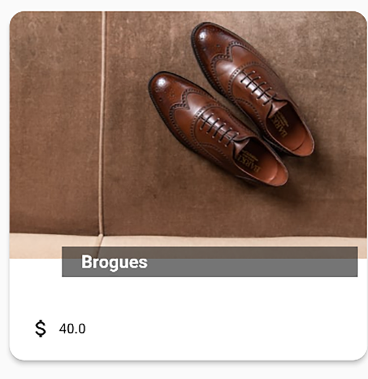
Building the Product widget
The Product widget represents the template for each product item on the app. In the widgets package, create a product.dart file and add the following code:
import 'package:flutter/material.dart';

class Product extends StatelessWidget {
  final String id;
  final String name;
  final Color color;
  final String imageUrl;
  final double price;

  const Product({
    required this.id,
    required this.name,
    this.color = Colors.amberAccent,
    required this.imageUrl,
    required this.price
  });
}
Here is the build method for the widget:
 @override
  Widget build(BuildContext context) {
    return InkWell(
      onTap: () => (){},
      child: Card(
        shape: RoundedRectangleBorder(
            borderRadius: BorderRadius.circular(15)
        ),
        elevation: 4,
        margin: EdgeInsets.fromLTRB(15, 20, 15, 20),
        child: Column(
          children: [
            Expanded(
              child: Stack(
                children: [
                  ClipRRect(
                    borderRadius: const BorderRadius.only(
                        topLeft: Radius.circular(15),
                        topRight: Radius.circular(15)),
                    child: Image.network(
                      imageUrl,
                      height: 250,
                      width: double.infinity,
                      fit: BoxFit.cover,
                    ),
                  ),
                  Positioned(
                    bottom: 20,
                    right: 10,
                    child: Container(
                      color:  Colors.black54,
                      width: 300,
                      padding: const EdgeInsets.symmetric(vertical: 5, horizontal: 20),
                      child: Text(name,
                        style: const TextStyle(
                          fontSize: 18,
                          color: Colors.white,
                          fontWeight: FontWeight.bold
                        ),
                        softWrap: true,
                        overflow: TextOverflow.fade,
                      ),
                    ),
                  )
                ],
              ),
            ),
            Padding(
              padding: const EdgeInsets.all(20.0),
              child:
                  Row(
                    children: [
                      const Icon(Icons.attach_money),
                      const SizedBox(width: 6),
                      Text('$price')
                    ],
                  ),
              ),
          ],
        ),
      ),
    );
  }
The widget above uses a combination of Flutter classes and widgets, including:
- The InkWell class to enhance the user experience of the application
- The Stack to place widgets on top of one another
- The Positioned widget to place the product name in a specific position
Here is the output of the Product widget:
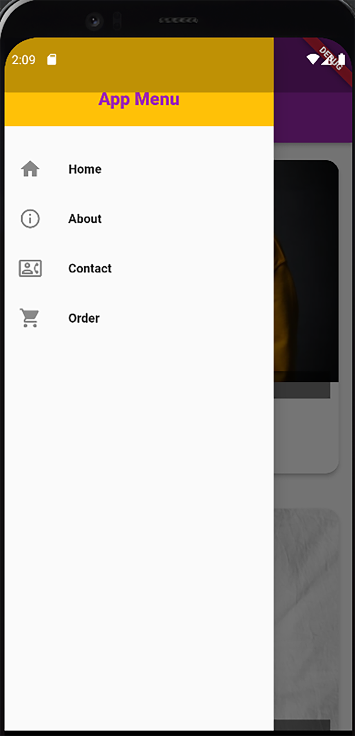
Building the navigation drawer
The navigation drawer will specifically be used within the mobile view of the application; that is, the application will render the drawer when opened on a mobile device. Within the widgets package, create a Dart file named navigation_drawer and include the following code in the file:
import 'package:flutter/material.dart';

class NavigationDrawer extends StatelessWidget {
  const NavigationDrawer({Key? key}) : super(key: key);

  Widget buildListTile(String title, IconData icon){
    return ListTile(
      leading: Icon(icon,
        size: 26,),
      title: Text(
        title,
        style: const TextStyle(
            fontSize: 14,
            fontWeight: FontWeight.bold
        ),
      ),
      onTap: () {},
    );
  }

  @override
  Widget build(BuildContext context) {
    return Drawer(
      child: Column(
        children: [
          Container(
            height: 100,
              padding: EdgeInsets.all(20),
          alignment: Alignment.bottomCenter,
            color: Theme.of(context).accentColor,
            child: Text('App Menu',
                style: TextStyle(
                  fontWeight: FontWeight.w900,
                  fontSize: 20,
                  color: Theme.of(context).primaryColor,
                ),
            ),
          ),
          const SizedBox(height: 20),
          buildListTile('Home', Icons.home),
          buildListTile('About', Icons.info_outline),
          buildListTile('Contact', Icons.contact_phone_outlined),
          buildListTile('Order', Icons.shopping_cart),
        ],
      ),
    );
  }
}
From the above code, the buildListTile method builds a ListTile widget for specific items in the drawer, in this case, Home, About, Contact, and Order.
Rendering the mobile screen
Next, create the screen to render the mobile view of the application. In the screens package, create a Dart file with the name mobile_product_view and include the following code snippet in the file:
import 'package:flutter/material.dart';
import 'package:shop_app/widgets/product.dart';

import '../dummy_data.dart';
import '../widgets/navigation_drawer.dart';

class MobileProductView extends StatelessWidget {
  final String title;

  const MobileProductView({Key? key, required this.title}) : super(key: key);

  @override
  Widget build(BuildContext context) {
   return Scaffold(
        appBar: AppBar(
          title: Text(title),
        ),
        drawer: NavigationDrawer(),
     body:  GridView.count(
       crossAxisCount: 1,
    children: DUMMY_DATA.map((product) =>
    Product(id: product.id, name: product.name, imageUrl: product.imageUrl, color: product.color, price: product.price)).toList(),
    )
    );
  }
}
The code above shows the application using the data from the dummy_data.dart file to build a list of Product widgets that are rendered as GridView.
Rendering the desktop screen
This section will contain the implementation for the desktop view of the application. Create a Dart file with the name desktop_product_view in the screens package. Add the following code to the file:
import 'package:flutter/material.dart';
import 'package:shop_app/widgets/product.dart';

import '../dummy_data.dart';

class DesktopProductView extends StatelessWidget {
  final String title;
  final int crossAxisCount;

  const DesktopProductView({Key? key, required this.title, required this.crossAxisCount}) : super(key: key);

  @override
  Widget build(BuildContext context) {

    Widget getAction(String actionName){
      return TextButton(
        onPressed: () {},
        child: Text(
          actionName,
          style: TextStyle(
              color: Theme.of(context).accentColor,
            fontWeight: FontWeight.w500
          ),
        ),
      );
    }

    return Scaffold(
      appBar: AppBar(
        title: Text(title),
        actions: [
          Padding(
            padding: const EdgeInsets.only(right: 100.0),
            child: Row(
              mainAxisAlignment: MainAxisAlignment.spaceBetween,
              children: [
                getAction('Home'),
                getAction('About'),
                getAction('Contact'),
                getAction('Order'),
              ],
            ),
          )
        ],
      ),
      body: Padding(
        padding: const EdgeInsets.all(18.0),
        child: GridView.count(
         crossAxisCount: crossAxisCount,
          children: DUMMY_DATA.map((product) =>
              Product(
                  id: product.id,
                  name: product.name,
                  imageUrl: product.imageUrl,
                  color: product.color,
                  price: product.price)
          ).toList(),
        ),
      ),
    );
  }
}
From the above code, the widget receives the crossAxisCount value through its constructor. With this value, it specifies the quantity of Product widgets to render in the GridView at runtime.
The actions in the AppBar widget will replace the drawer you created for the mobile view. Using the getAction method, you create specific action widgets for the AppBar.
Implementing the LayoutBuilder class
The implementation of the LayoutBuilder class will be done in the main.dart file. This is because we are designing the entire screen of the application to be adaptive. Hence, the LayoutBuilder should build the interface from the outermost layer of the widgets, which in this case is placed in the main.dart file.
Here is the code you should add to the main.dart file:
import 'package:flutter/material.dart';
import 'package:shop_app/screens/mobile_product_view.dart';

import 'screens/desktop_product_view.dart';

void main() {
  runApp(const MyApp());
}

class MyApp extends StatelessWidget {
  const MyApp({super.key});

  @override
  Widget build(BuildContext context) {
    return MaterialApp(
      title: 'Flutter Demo',
      theme: ThemeData(
        primarySwatch: Colors.purple,
        accentColor: Colors.amber
      ),
      home: const MyHomePage(title: 'Flutter adaptive app'),
    );
  }
}

class MyHomePage extends StatefulWidget {
  const MyHomePage({super.key, required this.title});
  final String title;

  @override
  State<MyHomePage> createState() => _MyHomePageState();
}

class _MyHomePageState extends State<MyHomePage> {

  @override
  Widget build(BuildContext context) {
    return LayoutBuilder(
      builder: (ctx, constraints){
        if(constraints.maxWidth < 600){
          return MobileProductView(title: widget.title);
        }
        int crossAxisCount = 0;
        if(constraints.maxWidth > 1400) {
          crossAxisCount = 4;
        } else if(constraints.maxWidth > 900) {
          crossAxisCount = 3;
        } else if (constraints.maxWidth >= 600) {
          crossAxisCount = 2;
        }
        return DesktopProductView(title: widget.title, crossAxisCount: crossAxisCount);
      }
    );
  }
}
The build method of the MyHomePage widget builds the screens using the LayoutBuilder based on the following constraints:
- If the width of the device screen is less than 600 pixels, it builds the
MobileProductView, which represents the interface you have created in the previous section for mobile devices - If the width of the device screen is greater than 600 pixels, it builds the
DesktopProductViewbut with the specifiedcrossAxisCount, depending on the device width, as illustrated in the code
If you intend to make just a specific part of your application adaptive and not the entire screen as demonstrated above, you would have to implement the LayoutBuilder on the desired portion of the widget.
Conclusion
Making your application adaptive across different operating systems and device screen sizes is a good way of improving its user experience. This tutorial demonstrated how to make your application adaptive using the Flutter LayoutBuilder class. As mentioned at the beginning of the article, there are other options such as the adaptive layout package you can adopt when building an adaptive app.
The project built in this tutorial is available on GitHub. I also recommend that you explore the Flutter docs to get a broader glimpse of building adaptive layouts across different portions of your application.
The post Creating an adaptive app with Flutter appeared first on LogRocket Blog.
from LogRocket Blog https://ift.tt/SgiRzQ1
Gain $200 in a week
via Read more


