


Nuxt.js, like Vue, supports plugins, which can be of three types: custom-built plugins, Vue plugins, and external packages and modules. While the Nuxt docs discuss the last two in detail, they only briefly explain how to build and use a custom plugin in your Nuxt application.
A global custom plugin can come in handy in a couple of situations. For example, let’s imagine that you can’t find an open source plugin for a feature you’re trying to implement, or you’re not completely satisfied with the ones you found. Or, maybe you’re feeling a little bit creative and you have some time on your hands.
In this tutorial, we’ll cover two different options to build our own custom plugin, using both Vue and JavaScript. As an example, our custom plugin will display my birthday in the console of your Nuxt app, but you can personalize it to fit your project’s needs. Let’s get started!
- Building the component
- The store
- Subscribe the component to the store
- Initialize the plugin
- Define and register the plugin
- Using the plugin
Building the component
The first step is to build the Vue component. For this article, we’ll use a basic toast component that will display simple success and error messages. I’ve already built one for this article, and we’ll go over it in detail later:
<template>
  <div class="toast-element">
    <div :class="['toast-container', { success: state === 'success', error: state === 'error' }]">
      <div class="icon">
        <svg
          v-if="state === 'success'"
          width="8"
          height="7"
          viewBox="0 0 8 7"
          fill="none"
          xmlns="http://www.w3.org/2000/svg"
        >
          <path d="M6.96304 0.962891L2.88896 5.37647L1.03711 3.3703" stroke="white" stroke-width="1.5" stroke-linecap="round" stroke-linejoin="round" />
        </svg>
        <svg
          v-else
          width="3"
          height="10"
          viewBox="0 0 3 10"
          fill="none"
          xmlns="http://www.w3.org/2000/svg"
        >
          <path d="M1 1.6665V4.99984" stroke="white" stroke-width="2" stroke-linecap="round" stroke-linejoin="round" />
          <path d="M1 8.3335H1.00833" stroke="white" stroke-width="2" stroke-linecap="round" stroke-linejoin="round" />
        </svg>
      </div>
      <p>

      </p>
    </div>
  </div>
</template>

<script>
export default {
  data () {
    return {
      toastIsVisible: false,
      message: '',
      state: ''
    }
  },
  mounted () {
    this.$store.subscribe((mutation, state) => {
      if (mutation.type === 'toast/showToast') {
        this.message = state.toast.content
        this.state = state.toast.state
        this.toastIsVisible = true
        document.querySelector('.toast-element').classList.add('enter')
        setTimeout(() => {
          if (this.toastIsVisible) {
            this.removeToast()
          }
        }, 3000)
      }
    })
  },
  methods: {
    removeToast () {
      document.querySelector('.toast-element').classList.replace('enter', 'leave')
      setTimeout(() => {
        this.toastIsVisible = false
      }, 240)
    }
  }
}
</script>

<style scoped>
.toast-element {
  position: fixed;
  top: -90px;
  left: 0;
  width: 100%;
  height: max-content;
  display: flex;
  justify-content: center;
  align-items: center;
  z-index: 7;
  opacity: 0;
  transition: all 240ms cubic-bezier(0, 0.0, 0.2, 1) 0s;
}
.enter {
  top: 20px;
  opacity: 1;
}
.leave {
  top: 20px;
  transform: scale(0.9);
}
.toast-container {
  width: fit-content;
  border: 1px solid transparent;
  border-radius: 5px;
  padding: 0.9375rem 1.875rem;
  display: grid;
  grid-template-columns: repeat(2, max-content);
  column-gap: 0.9375rem;
  align-items: center;
}
.success {
  border-color: #037F10;
  background-color: #F4FFF6;
}
.error {
  border-color: #FF2525;
  background-color: #FFF4F4;
}
.icon {
  border-radius: 50%;
  display: flex;
}
.success .icon {
  padding: 6px;
  background-color: #037F10;
}
.error .icon {
  padding: 5px 8px 5px 9px;
  background-color: #FF2525;
}
p {
  width: max-content;
  font-size: 1.0625rem;
  font-weight: 400;
}
.success p {
  color: #037F10;
}
.error p {
  color: #FF2525;
}
</style>
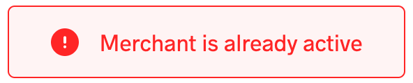
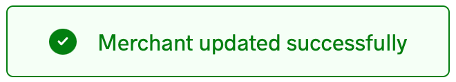
The toast component creates two buttons that look like the following:
If you review the toast component, you’ll notice a call to the store’s subscribe() method. Because our component is dynamic, we’ll need to get the content from somewhere, namely, the store.
The store
In our toast component, there are two variables, the toast message and its state, either success or error. With the help of Vuex, we’ll store the state in our Nuxt app. Therefore, we’ll need a store, preferably a different one from the app’s general store:
export const state = () => ({
  content: '',
  state: ''
})

export const mutations = {
  showToast (state, payload) {
    state.content = payload.content
    state.state = payload.state
  }
}
Subscribe the component to the store
Now that our store is ready, we need to set up a communication channel between the store and the toast component. Here, the subscribe() method comes in handy, subscribing the component to the store’s mutations. Therefore, it is called after every mutation of the store, receiving the mutation and state objects as arguments. To learn more about the subscribe() method, check out the subscribe section on the Vuex API page.
Because the subscribe() method is called after each mutation of the store, we need to confirm that the toast store was mutated. Once we’ve confirmed that, we can go ahead and update the component’s variables, the message, and its state:
this.$store.subscribe((mutation, state) => {
  if (mutation.type === 'toast/showToast') {
    this.message = state.toast.content
    this.state = state.toast.state
    this.toastIsVisible = true
    document.querySelector('.toast-element').classList.add('enter')
    setTimeout(() => {
      if (this.toastIsVisible) {
        this.removeToast()
      }
    }, 3000)
  }
})
We check that the mutation’s type is toast/showToast because our toast store is in toast.js and the mutation is the showToast() method.
Initialize the plugin
Now that we’re finished building the component and implementing its functionality, we need to make it available in the Nuxt app so that we can call a show method to show the toast component when we need it; we’ll do so in the plugins folder.
Making the plugin available across the app is also called injecting the plugin, and Vue provides the inject() function for this purpose. This, in turn, prefixes the object of the show method with a $:
export default ({ app, store }, inject) => {
  inject('toaster', {
    showToast ({ content = '', state = '' }) {
      store.commit('toast/showToast', { content, state })
    }
  })
}
Therefore, whenever we call this $toaster.showToast() method in our Nuxt app, we need to pass in the content and state parameters as well.
However, if your plugin is for some JavaScript functionality, like in our example, displaying my birthday, then you’ll only need the code below:
export default ({ app }, inject) => {
  inject('displayBirthday', () => {
    console.log(`March 3rd!`)
  })
}
$displayBirthday() will log my birthday to your console. For a case like this, you wouldn’t need a store or a component.
If you’ve paid close attention to the two code snippets, you’ll notice that the types of the second parameter of the inject() function vary. The first one is an object, while the second is a function. The object type is useful when your plugin might require multiple actions, while the function is best for a single action. However, the object can have just a single method in it.
Define and register the plugin
Before we render the plugin, our Nuxt app needs to confirm that the toast plugin exists. We can add the code for this using the plugins property in the nuxt.config.js file:
export default {
  plugins: [
    { src: '~/plugins/toaster' }
  ]
}
The plugin injection code is in the plugins/toaster.js file.
Using the plugin
With that, our plugin is ready to use! To see our plugin in action, first, the toast component needs to be present on the page. Then, we can call the $toaster.showToast() method of our store and pass along the content and state parameters:
this.$toaster.showToast({
  content: 'Successfully logged in!',
  state: 'success'
})
Conclusion
In this article, we’ve learned how to build a global custom plugin in a Nuxt app using Vue and JavaScript. You can use this component to implement different types of functionalities in your application, and it comes in handy when you can’t find an open source plugin that fits your project’s needs. We also discussed how to go about using a component for the plugin and what to do when the plugin doesn’t need a component.
While our example for this tutorial demonstrated fairly simple functionality, displaying a date in the console, feel free to build on this project and customize it to fit your needs. For more information on Nuxt plugins, I recommend checking out the Nuxt Docs. Happy building!
The post How to create a global custom plugin in Nuxt.js appeared first on LogRocket Blog.
from LogRocket Blog https://ift.tt/IjZih72
Gain $200 in a week
via Read more


