The Unity Terrain is a Unity native, powerful, and versatile tool for level and environmental designing. It provides easy mechanisms to mold and modify terrains using the concept of height maps.
In this article, we will see the basics of how to use this tool and its main features. We start with the theory of how terrain generation works by using height maps. Then we will discuss the primary mechanisms to modify a terrain. By the end of the article, I present a typical workflow for making nice Unity scenes using free assets and the Unity Terrain tool.
- From height maps to terrains
- Unity Terrain settings
- Options for sculpting and altering the terrain
- Planting trees, grass, and…stones?
- More versatile trees with LOD groups
- Proposed terrain workflow for better results
From height maps to terrains
A height map is a texture that changes how a specific mesh is viewed by the player, similar to how normal maps work. More specifically, the height map information shifts the mesh’s vertices to display features such as elevations, cliffs, plains, and craters.
Due to its 2D nature, a single height map can only interfere with one axis of the vertices at a time. Notably, the Unity Terrain height map alters the position of the vertices on the y-axis.
When we work with a Unity Terrain by elevating or lowering its parts, we are technically altering its height map. The alteration acts immediately, and we can see the results of our change in the terrain. Alternatively, it is also possible to change the height map directly outside Unity and import height maps to the engine.
For example, the website Cities: Skylines Height Map Generator provides mechanisms to extract height map information from the real world. Although the website is meant to be used in the Cities: Skylines game, the maps work just as well in Unity. Consider, though, that they will contain real-world distances and might need to be adjusted in an external tool for optimal usage in Unity.
The images below show a height map extracted from the website and imported into a Unity Terrain.


Unity Terrain settings
When selected, a Unity Terrain can be edited by using the Terrain Toolbar. The toolbar contains the main functionalities for the terrain grouped in 5 sections: Adjacent Terrain Tiles; Sculpt and Paint; Add Trees; Add Details; and General Settings.
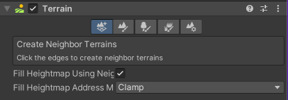
Adjacent Terrain Tiles allow you to create other terrains in a grid-like format near the current terrain. It is beneficial to use it when you already have a well-established terrain but need more space next to it.
That is a more suitable solution than increasing the terrain size. Altering the size will affect how the heightmap is read, and a proportional scale factor will be applied to the terrain and all its elements.
Regarding height maps, creating a new adjacent terrain will create a new terrain game object with its height map. The newly created heightmap will try to match the values in its border, seamlessly coupling it to the previous terrain it was connected to.
The Sculpt and Paint option works directly with the height map. This option contains its Terrain Tools, which we will cover in the following section. In short, this option allows us to deform the heightmap and hide portions of it to create holes and entrances, for example.
Both options to Add Trees and Add Details are used to populate the terrain with elements that are handled automatically by Unity, such as trees, bushes, shrubs, stones, grass patches, and others. One advantage of using the Unity Terrain over using user-placed game objects in the scene is that Unity manages many optimization techniques for the elements of a terrain. Trees and details are automatically accounted for in visibility culling–related algorithms and billboarding.
Finally, the General Settings option holds all relevant information regarding the terrain game object, such as the optimization techniques (detail distance, billboarding distance, shadows, etc.) and the size of the terrain.
The General Settings are divided into Basic Terran, Tree & Detail Objects, Wind Settings for Grass, Mesh Resolution, Hole Settings, Texture Resolutions, Lighting, and Lightmapping. It is outside of this piece’s scope to cover each option extensively, but we will go through the most used ones.
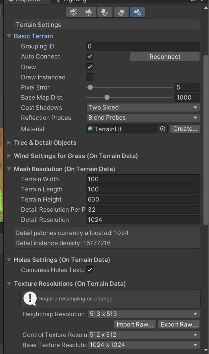
The Basic Terrain section covers the main rendering aspects of the terrain, such as the terrain material, its shadow properties, and the draw mode used. Notice that if you expect to use self-made post-processing shaders or scripted rendering passes, the option Draw Instanced needs to be disabled.
The Mesh Resolution values determine the size of the terrain. Changing the width and length of the terrain will immediately change how the height map information will be read. The terrain width, length, and height determine the terrain’s size in the x, y, and z axes.
The Texture Resolutions section handles the more specific height map texture information. You can set the resolution for the height map and import/export height maps there. Using the import function, you can use the data acquired from other sources (such as the one presented earlier) to your map. It is also common to export the current height map, alter it in an external tool, and then import it back.
Options for sculpting and altering the terrain
As stated previously, the Sculpt and Paint option allows us to alter the terrain by changing the height map. These options have six tools: Raise or Lower Terrain, Paint Holes, Paint Texture, Set Height, Smooth Height, and Stamp Terrain.
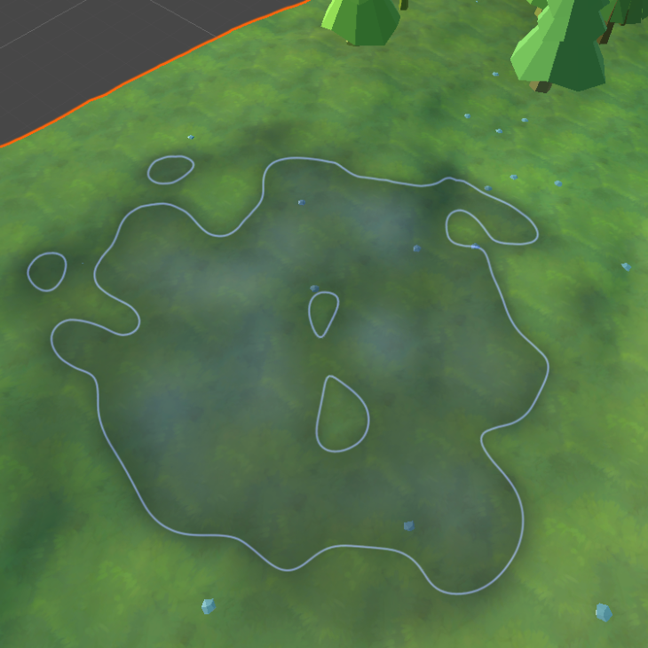
The options for Raise or Lower Terrain, Set Height, and Smooth Height are all used to directly affect the height map by either increasing or decreasing its values. Set Height is used to change the height map to meet a specific desired result, while Smooth Height softens the terrain as if blurring the selected areas in the height map. All of these options are done by using Terrain Brushes (as seen in the image above).
Terrain Brushes are similar to how brushes work in other image editing software, such as GIMP and Photoshop. A brush presents a pattern in shades of grey and alpha, which is applied to the terrain to mold it using its values. Transparent areas of the brush will not affect the terrain, and darker areas will impact the terrain more than lighter areas. Unity’s default terrain brush set comes with over ten brushes.
The Paint Texture option is used to apply texture layers in the terrain, actively adding color to it and other texture properties. The texture layers are applied using the same terrain brushes as used for the other Sculpt and Paint tools. However, Unity’s default terrain comes with no texture layer.


Each terrain layer is an asset of its own and can be reused by multiple terrains, even in different scenes. The first terrain layer added will automatically cover the entire terrain. Use that as a quick way to set up your base colors. Each terrain layer can have Diffuse, Normal, and Mask Maps.
The diffuse map is the texture displayed by the terrain. Once set, the option to change its tint becomes visible. Changing the tint is a quick and effective way to create terrain variation without resorting to using more textures or editing your assets in external programs.
While the normal map is used to convey normal information on the layer and generally works the same as a regular normal map, the mask map is explicitly used for the High Definition and Universal Render Pipelines to convey more information, such as metallic, ambient occlusion, height, and smoothness.
Finally, tile settings are handy options for the terrain layer. The size and offset values alter how often the texture will tile in the terrain and with which base offset for each repetition.
Generally, for large terrain, it is good to have a couple of variations of the terrain layers with varied values for the size, as it can help to break the visible repetition on the terrain’s floor.
As stated before, terrain brushes come by default with Unity’s terrain, but there are no terrain layers when creating a new terrain object.
Moreover, it is necessary to have maps and textures to create your terrain layers. For this article, I have used a couple of new free brushes from the asset store (Generic Terrain Brushes by Flaming Sands and StampIT! Collection Examples by Rowlan Inc) as well as a package of free textures for the terrain layers (Handpainted Grass & Ground Textures by Chromisu).
The results for the base terrain with some textures can be seen below:
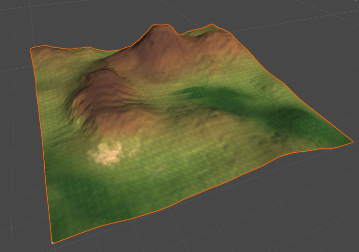
While working on terrain, I usually try to balance peak areas and plain areas. That tends to give me enough space to spread vegetation and not overcrowd the space. Moreover, I try to have one key element in the terrain to hold its main components and focus, such as a mountain, a glade, or a river, for example.
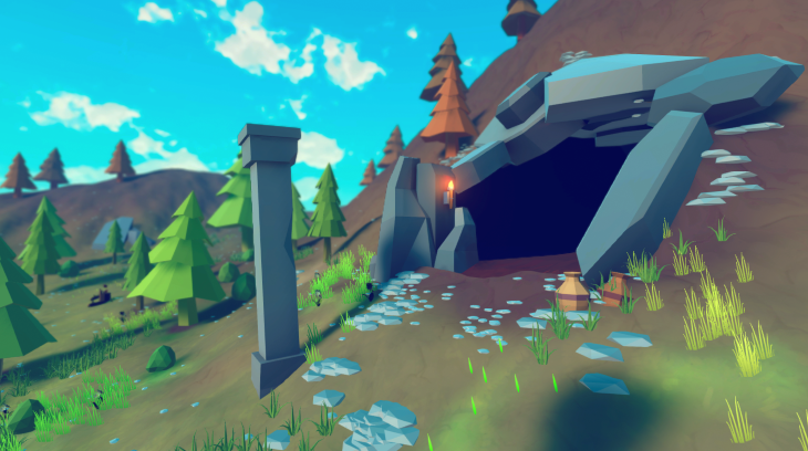
Having one main component helps the decision-making for which assets to use and how to distribute them. In this case, we are going to make a small hill with a cave-like entrance to explore more of the terrain options and some small areas of interest to diversify the view.
Also, notice that I tried to explore the multiple terrain layers to break the visual repetition they tend to make. At this stage, I try to only block out major spots, separating hills from regular grass and plain areas, as well as sprinkling some diversity here and there with some sand and darker patches of grass floor.
Planting trees, grass, and…stones?
Vegetation can be added in two ways, either with the Add Tree option or with the Add Detail option. Add Tree is quite straightforward and allows you to place objects with tree-like characteristics.
For better synergy, trees should be created using the Unity Tools, such as the Speed Tree or the Tree Editor, or using the specific terrain tree materials. That is not mandatory though, and in the following sections, I will show another approach that yields similar results and allow for more creative freedom.
In any case, terrain trees have a limitation of a maximum of 2 materials per mesh (one for the bark and another one for the leaves). If your mesh has more than two materials, it might not render correctly. A common solution to this limitation is to resort to texture atlas. Also, it is common to separate the leaf materials from the bark material for a more interesting effect, which allows us to program shaders just for the leaves (such as faking wind movement).
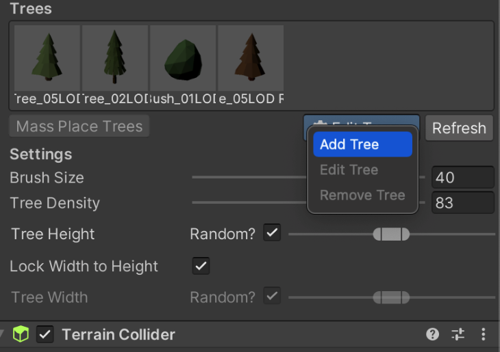
Similar to terrain layers, trees also have to be added to the terrain individually, then placed on by using the terrain’s brushes. Trees can be added as bare meshes and also as prefabs.
Notice that adding a tree as a prefab will not necessarily add all of the prefab elements nor behave exactly as your intended prefab. For example, placing a tree prefab with an animator will ignore the animator and act as a static tree.
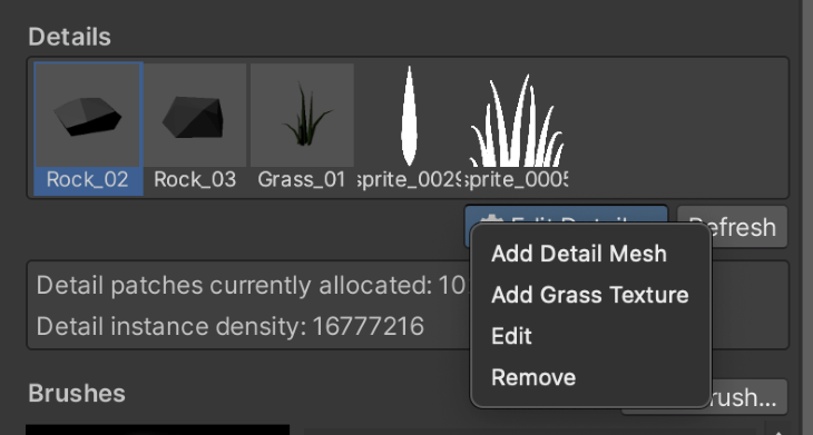
In a similar fashion, details are elements that can be placed in the terrain to diversify its visuals. Details can be of two types: Detail Mesh and Grass Texture. Detail Mesh works like regular meshes that stay static in the scene, such as stones, pebbles, and even shrubs.
Detail meshes are limited to one material. If you try to use meshes with more than one material, they will not be rendered correctly.
Detail meshes can also be rendered as Vertex Lit or Grass. Vertex Lit will render the mesh as regular lit Game Objects and do not react to the wind, which is appropriate for stones and tree stumps. Grass rendering works similar to Grass Textures, allowing the terrain’s wind to affect the mesh.
However, from experience, grass rendering only yields visually pleasing results when the wind bending property is set to a low value (under the Terrain General Settings). Otherwise, the detail mesh might move around unrealistically.
Grass Textures are sprites rendered in the terrain that behave according to the terrain’s wind. As stated in Unity’s documentation, the term “Grass Texture” is misleading since you can use any generic texture, such as flowers or sticks, with the same tool. Different from Detail Meshes rendered as Grass, Grass Textures will keep their pivot on the ground and move with the wind keeping the same position — as you would expect grass to behave.
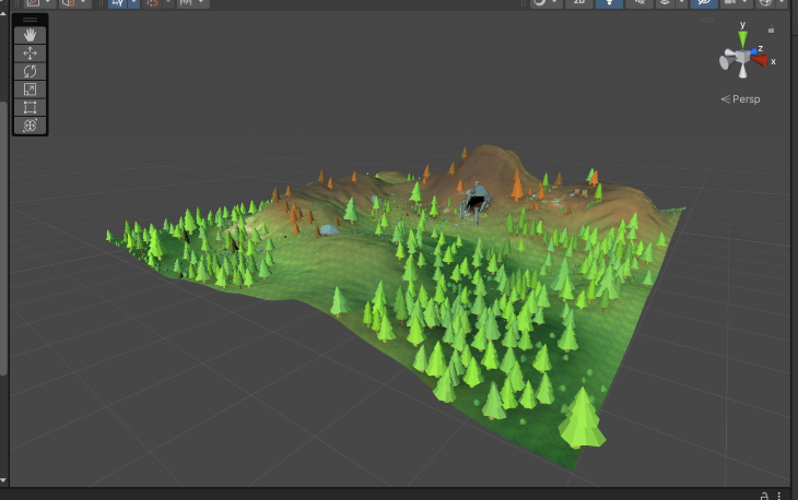
For this article, I have used trees and other meshes from the asset store (Low-Poly Simple Nature Pack by JustCreate, and Low Poly Rock Pack by Broken Vector). For the grass textures, I used the excellent Foliage Sprites from Kenney, a great source of copyright-free, high-quality assets. Finally, as additional decoration assets, I have used the Low Poly Dungeons Lite by JustCreate.
Applying these to our terrain, we have the following result:
More versatile trees with LOD Groups
As said previously, Unity’s trees are somehow limited due to the optimizations done by the terrain system. If you use custom materials or other variations, some tree placement options might be ignored, leading to a very bland and repetitive scene.
However, the system also allows us to bypass some of its restrictions to achieve a higher level of versatility regarding materials usage and style. For that, we have to follow a specific process.
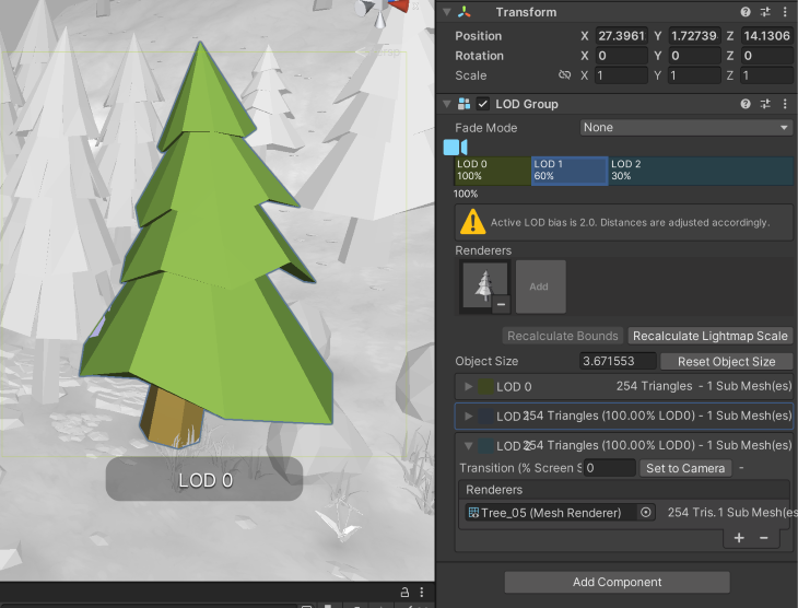
First, you must create a new prefab for the tree in which the root game object (the first in the hierarchy) is an empty game object with the LOD Group component. Then, you can place your tree prefab in the hierarchy below the root game object. After that, add the tree prefab to the LOD Group, and that is it.
The tree prefab will work with your custom shaders and receive the regular tree placing properties from the terrain, such as changing the tree’s width, height, and rotation. For color variation, it is necessary to alter the shader to read the _TreeInstanceColor property, but this step goes outside the scope of this article.
You can, of course, use the LOD Group features already to handle the other level of details for your tree. However, if you simply want a more versatile material on your trees while still using the terrain placement properties, you can change the number of LODs to 1 and use only a single tree prefab.
Achieving these steps should get you to a result similar to the one below:
Proposed terrain workflow for better results
Now that we have covered the main aspects of how to use the terrain tool, I want to offer a simple workflow I use to get reasonably good results without much effort while also covering some other rendering aspects that can improve your environment.
Making a cave entrance
Let us start with the cave I mentioned previously. The Unity Terrain does not allow us to create entrances or to carve the height map horizontally (applying height information in the x-z plane). However, it will enable us to paint holes on it.
Holes in the Unity Terrain hide parts of the terrain mesh as if we are cutting pieces. Holes can be painted like the other elements in the Sculpt Terrain tools with terrain brushes.
To make a visually exciting cave entrance, I recommend you raise the terrain, keeping the elevation to an angle between 40 and 60 degrees. More than that might stretch the terrain grid too much and make it harder to cover with other elements and prefabs. By doing so, we should get a result such as the one below:
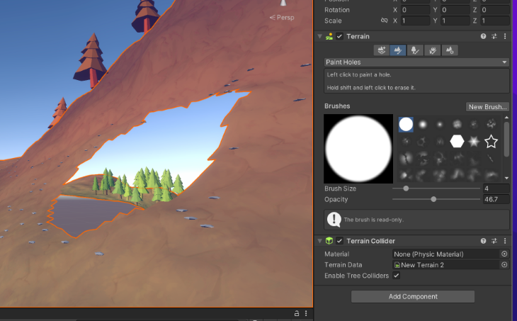
As you can see, terrain holes hide parts of the terrain in a binary fashion: they are either completely gone or completely visible. For that, it is necessary to cover the seams with assets and other elements to achieve better visual quality.
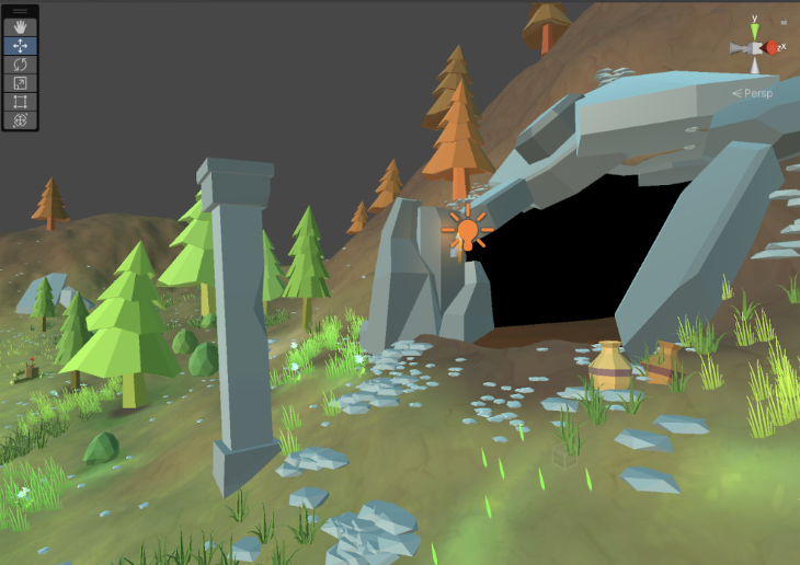
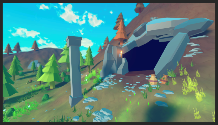
Using the same free assets mentioned before, I scaled and rotated different stones around the cave entrance to hide the seams between the holes and the visible terrain. I also tried to add more rocks and pebbles than necessary to create a more natural look. It is common to adjust the height map to fit the connection with the rocks better.
Moreover, adding extra props around areas of interest is always good to increase the player’s focus. For that, I added some jars half-buried on the ground and a pillar right in front of the cave, which helps to create some mystery and narrative. I added a small light next to the cave entrance to guide the eyes even further.
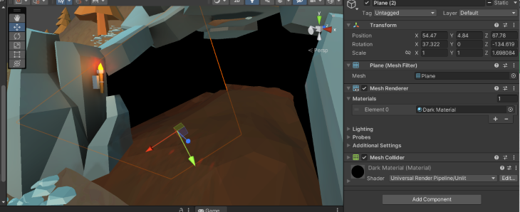
As seen before, the hole also allows the user to see through the terrain. To avoid that, I used planes with a specific material that ignores lighting (Unlit). That is important because otherwise, changes in the scene’s light would display these dark walls as solid, while the visual result we want is for it to look like a dark/shadow area.
Moreover, I have used some of the meshes from the Low Poly package to serve as the cave’s ground since we cannot use the same terrain we have been using so far.
It is important to note that the cave we did so far is not ideal if you want your player to enter and navigate inside of it. For that, you would need to properly set meshes around the hole, somewhat modeling the cave’s inside from all sides. It would be possible to achieve that using a new terrain object, but I reckon that the work required for that might not be optimal.
On the other hand, this solution works quite well for you to use as a point to move the player to a new scene dedicated to the cave’s interior.
Manual ambient occlusion


A common technique I use to improve the lighting in a Unity Terrain is to manually use a darker variation of the terrain layer under objects placed on the ground. That helps to elevate the cohesiveness of the terrain elements since some lighting effects, such as ambient occlusion, are not applied to the terrain objects, especially if you are using custom shaders and other techniques.
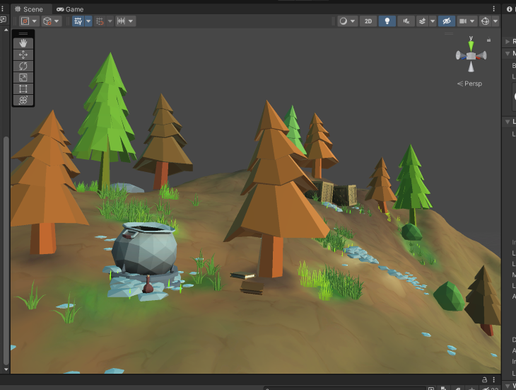
Notice that this is different than casting shadows. Unity terrains will cast shadows from objects correctly, but that might still cause the impression that objects are either floating or are not really connected. Using a dark terrain layer at some spots helps bring the objects and the ground closer without requiring more resources or expensive lighting calculations.
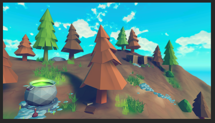
Moreover, I often apply this to the bottom of other objects and prefabs that are not terrain objects. As seen in the image above, I used a bit of the darker tone under the books and the cauldron to help make the elements come closer together.
Real ambient occlusion and light baking
Darker layers will help with the fake lighting to a certain degree, but it can be amplified by baking the light in the scene. A complete discussion on light baking is outside the scope of this article, but a few of its main elements will be discussed as to how to use them to improve the visuals for a terrain.
First, Light Baking is a process in which we pre-calculate the light in a scene and store the data to then apply it on top of the objects in the scene. Unity specifically uses Lightmapping, which bakes the brightness of the object’s surface in texture maps.
These textures, though, cannot be changed in runtime and need to be precalculated again for every change in the scene, such as moving objects to a different place or updating the lights’ transform. Also, it is only applied to objects flagged as static.
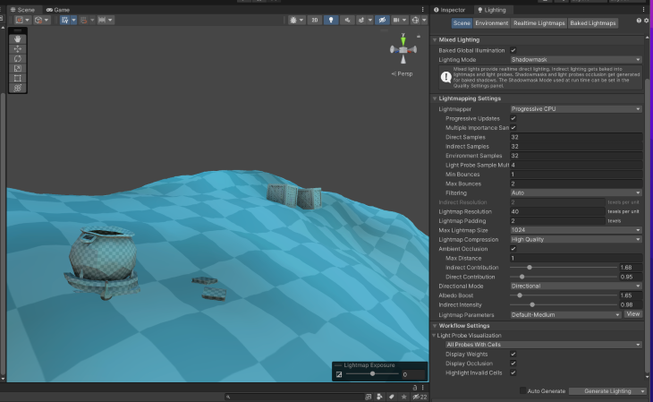
Light baking can be done in the Lighting tab (you can access it through the Window menu, followed by Rendering, and then Lighting). Unity’s default values for the light bake are considerably high and might take too long to process. For that, I recommend you reduce all the Direct Samples, Indirect Samples, and Environment Samples to a lower number, such as 16 or 32.
Those attributes are directly related to how many steps the Lightmapper will take to calculate the light at any given point in the scene (for static elements). Increasing any of them will yield better and more realistic results but will considerably increase the baking time.
I usually start with low values to assess the first impressions in the scene and then progressively increase them as I see fit. For more stylistics or custom materials, using lower values is usually enough to achieve good visuals.
Furthermore, the first bakes might show you inconsistencies in the placement of objects and other errors that should be fixed before applying a more thorough and realistic light mapping procedure.
I also recommend turning on the light baking Ambient Occlusion in the Lighting properties for the baking. Ambient Occlusion is the visual effect that happens when surfaces are close to each other, occluding the light and projecting shadows in their intersecting points, making them appear darker. We previously faked it using darker terrain layer colors, but light mapping can actually calculate proper ambient occlusion and bake it into textures.
The images below show the results with and without light baking.


As you can see, there is no ambient occlusion between the tree trunks and the ground. However, the bottom part of the cauldron and the intersections between the crates on the back of the image are darker and more realistic than their version without baking.
Placing a skybox and applying post-processing
Finally, to improve the visuals even further and tie the elements together, these two steps are essential: placing a better skybox and applying a few post-processing effects.
For this article, I used the Free Stylized Skybox from Yuki2022. These skyboxes fit the low poly style quite well for their cartoon look.
The skybox can be added under the Lighting tab (the same as the Light Baking), under the tab Environment.
The post-processing effects require more steps. First, you must add the post-processing package to your project depending on your rendering pipeline installed. Using the Built-in Render Pipeline, you need to install the Post-Processing Stack in your project using the Package Manager.
Otherwise, if you are using the Universal Render Pipeline or the High Definition Render Pipeline, you already have the equivalent post-processing system installed. I am using the Universal Render Pipeline for this article, but the effects and configurations are similar to the other pipelines.
The image below shows the final post-processing volume I used for the final version of the terrain:
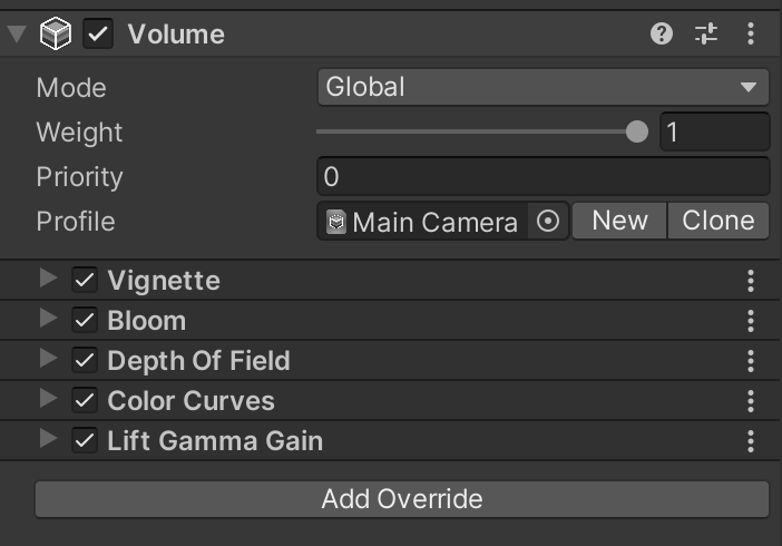
The effects used were:
- Vignette: darkens the corners of the screen, focusing the player’s attention on the central elements
- Bloom: expands the highlight elements in the scene, blurring their areas with neighboring objects, which acts as a fake (but good) global illumination alternative
- Depth of Field: mimics the focus of our eyes and real cameras by making elements closer to us (in the focal point) sharp, while other elements are blurred according to their distance
- Color Curves: alters the final colors rendered to match a more desired look. In this case, I increased the red color over others and slightly increased the blue color
- Lift Gamma Gain: shifts the overall color of the render, as well as increases the control of dark tones, mid-range tones, and highlights
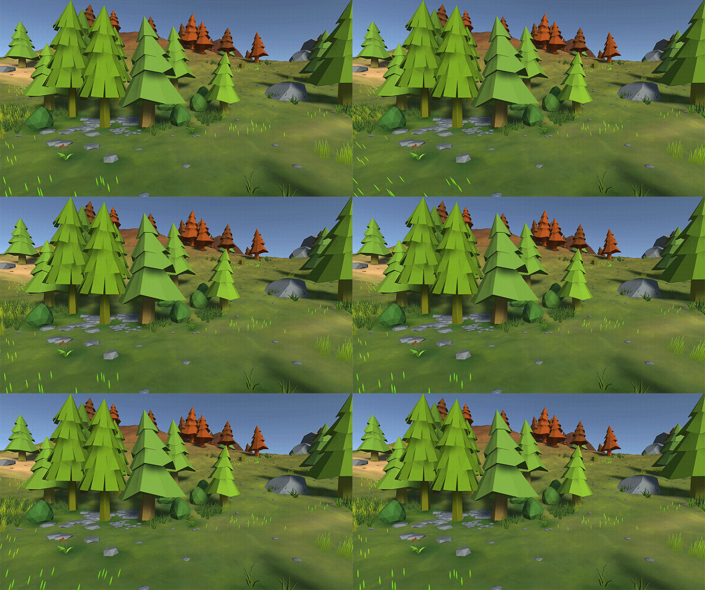
The final results for the two locations we did during this article can be seen in the images below:
Thanks for reading, and let me know if you would like to read more on the many topics discussed that were outside this article’s scope. Each one of them certainly deserve their own article. You can see more of my work at www.dagongraphics.com.
The post Easy environment design with Unity Terrain features appeared first on LogRocket Blog.
from LogRocket Blog https://ift.tt/fyREZ2d
Gain $200 in a week
via Read more


