Most of the time, filling out forms with lots of fields can be cumbersome, and this can discourage users from completing the process. This is where a multi-step form comes into play.
Multi-step forms are just as the name implies: a multi-step form is a long form broken down into short pieces. They provide a less daunting experience to the users of your application.
Flutter comes prebundled with a Stepper widget that gives us the ability to break our form into a list of steps. In this article, we’ll be exploring what a Stepper widget really is and how to apply it in building a multi-step form in Flutter to enhance user experience. You will also learn how to customize a Stepper widget to meet your mobile app’s specifications.
Properties of the Stepper widget
These are some of the essential properties of the Stepper widget. We’ll also show them in action through the demo, but you can review them here before we start:
- type (
StepperType.horizontalorStepperType.vertical) — This determines the orientation and how each step would be placed, relative to each other - steps — The steps of the stepper whose titles, subtitles, and icons are always visible. Here’s an example of the steps we’ll use for the demo:

currentStep— The index value of the step (0, 1, 2, etc.). Defines the active step in the formonStepContinue()— A callback-when-continue button, to move to the next steponStepCancel()— A callback-when-cancel button, to move to the previous steponStepTapped(int index) — A callback for when the user taps on steps, to move to the selected step in progress. The callback also provides us with the index of the step that the user clicks onList<Step>— The steps of a stepper whose title and content are shown when the respective step isActive
To drill down further, the properties of a step itself are:
title— Use this property to title the step. This property is a required property and accepts a widget as a value, usually a text widgetsubtitle— Use this property to add a subtitle to the step. It accepts a widget as a value, usually a text widgetcontent— We will use this property to provide content for the step. It is a required property and accepts any widget as a valuestate— Use this property to set the state of the step likecompleted,disabled,editing,indexed, orerror. Based on the state, the icons for the steps will changeisActive— Use this property to indicate whether the step is active or inactive. It accepts a Boolean as a value
Creating a multi-step form in Flutter
Now, let’s create a new Flutter project that shows how to apply the Stepper widget.
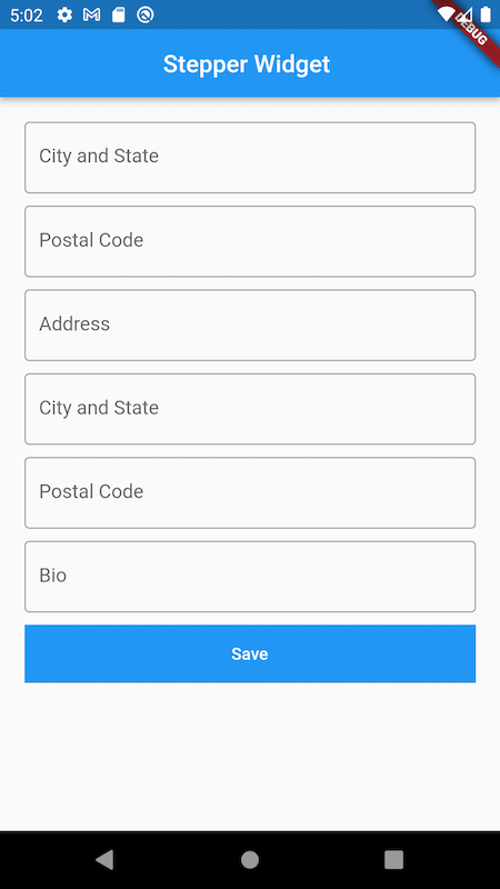
The initial state of our form would look something like the image we have below. However, we will be using the Stepper widget to break this into multiple steps so the user isn’t overwhelmed by the number of fields they have to fill in.

We have the reusable custom widgets, which we have created.
We have our main.dart file, which has the following contents:
import 'package:flutter/material.dart';
import 'package:stepper_widget/form_page.dart';

void main() {
  runApp(const MyApp());
}

class MyApp extends StatelessWidget {
  const MyApp({Key? key}) : super(key: key);

  @override
  Widget build(BuildContext context) {
    return MaterialApp(
      title: 'Flutter Demo',
      theme: ThemeData(
        primarySwatch: Colors.blue,
      ),
      home: const FormPage(),
    );
  }
}
Our FormPage widget houses these contents:
import 'package:flutter/material.dart';
import 'package:stepper_widget/widgets/custom_button.dart';
import 'package:stepper_widget/widgets/custom_input.dart';

class FormPage extends StatefulWidget {
  const FormPage({Key? key}) : super(key: key);

  @override
  _FormPageState createState() => _FormPageState();
}

class _FormPageState extends State<FormPage> {
  @override
  Widget build(BuildContext context) {
    return MaterialApp(
      home: Scaffold(
        appBar: AppBar(
          title: const Text(
            "Stepper Widget ",
          ),
          centerTitle: true,
        ),
        body: Container(
          padding: const EdgeInsets.all(20),
          child: ListView(
            children: [
              const CustomInput(
                hint: "First Name",
                inputBorder: OutlineInputBorder(),
              ),
              const CustomInput(
                hint: "Last Name",
                inputBorder: OutlineInputBorder(),
              ),
              const CustomInput(
                hint: "Address",
                inputBorder: OutlineInputBorder(),
              ),
              const CustomInput(
                hint: "City and State",
                inputBorder: OutlineInputBorder(),
              ),
              const CustomInput(
                hint: "Bio",
                inputBorder: OutlineInputBorder(),
              ),
              const CustomInput(
                hint: "Bio",
                inputBorder: OutlineInputBorder(),
              ),
              CustomBtn(
                title: const Text(
                  "Save",
                  style: TextStyle(color: Colors.white),
                ),
                callback: () {},
              )
            ],
          ),
        ),
      ),
    );
  }
}
Our CustomInput:
import 'package:flutter/material.dart';

class CustomInput extends StatelessWidget {
  final ValueChanged<String>? onChanged;
  final String? hint;
  final InputBorder? inputBorder;
  const CustomInput({Key? key, this.onChanged, this.hint, this.inputBorder})
      : super(key: key);

  @override
  Widget build(BuildContext context) {
    return Container(
      margin: const EdgeInsets.only(bottom: 10),
      child: TextField(
        onChanged: (v) => onChanged!(v),
        decoration: InputDecoration(hintText: hint!, border: inputBorder),
      ),
    );
  }
}
And lastly is our custom button, CustomBtn:
import 'package:flutter/material.dart';

class CustomBtn extends StatelessWidget {
  final Function? callback;
  final Widget? title;
  CustomBtn({Key? key, this.title, this.callback}) : super(key: key);

  @override
  Widget build(BuildContext context) {
    return Container(
      margin: const EdgeInsets.only(bottom: 10),
      child: SizedBox(
        width: double.infinity,
        child: Container(
          color: Colors.blue,
          child: TextButton(
            onPressed: () => callback!(),
            child: title!,
          ),
        ),
      ),
    );
  }
}
Creating the steps for our form
In order to use our Stepper widget, we’ll start by creating a list of steps.
Because we already defined some of the important features of a Stepper widget, so we won’t delve so much into that here. We can jump right in:
List<Step> getSteps() {
  return <Step>[
    Step(
      state: currentStep > 0 ? StepState.complete : StepState.indexed,
      isActive: currentStep >= 0,
      title: const Text("Account Info"),
      content: Column(
        children: const [
          CustomInput(
            hint: "First Name",
            inputBorder: OutlineInputBorder(),
          ),
          CustomInput(
            hint: "Last Name",
            inputBorder: OutlineInputBorder(),
          ),
        ],
      ),
    ),
    Step(
      state: currentStep > 1 ? StepState.complete : StepState.indexed,
      isActive: currentStep >= 1,
      title: const Text("Address"),
      content: Column(
        children: const [
          CustomInput(
            hint: "City and State",
            inputBorder: OutlineInputBorder(),
          ),
          CustomInput(
            hint: "Postal Code",
            inputBorder: OutlineInputBorder(),
          ),
        ],
      ),
    ),
    Step(
      state: currentStep > 2 ? StepState.complete : StepState.indexed,
      isActive: currentStep >= 2,
      title: const Text("Misc"),
      content: Column(
        children: const [
          CustomInput(
            hint: "Bio",
            inputBorder: OutlineInputBorder(),
          ),
        ],
      ),
    ),
  ];
}
After creating the steps required for our Stepper widget, we can now replace the ListView in our formpage.dart. But before that, let’s look at what each field of our single step stands for.
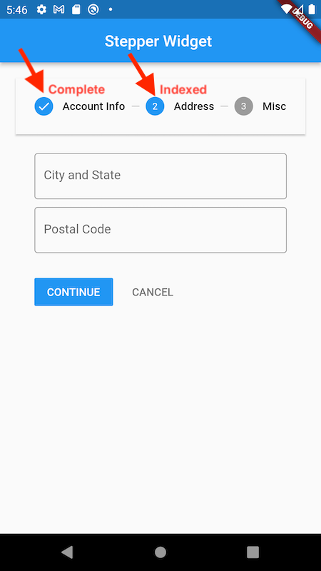
The first property we have for a single step is state: you may recall that this defines the leading icon on the stepper as shown in the image below. When a user is done editing the fields on a particular step and moves to the next step, the previous step is marked as completed in the state property and the current step is marked indexed, which simply means the user is actively editing this step.

The isActive property is simply used to show which of the steps is currently being viewed by the user. The title takes in a widget and shows it at the top of each of the steps, while the content of each step are the actual form widgets we want the user to interact with.
After replacing our previous Listview widget with the Stepper, this is what our code looks like:
import 'package:flutter/material.dart';
import 'package:stepper_widget/widgets/custom_input.dart';

class FormPage extends StatefulWidget {
  const FormPage({Key? key}) : super(key: key);

  @override
  _FormPageState createState() => _FormPageState();
}

class _FormPageState extends State<FormPage> {
  int currentStep = 0;
  @override
  Widget build(BuildContext context) {
    return MaterialApp(
      home: Scaffold(
        appBar: AppBar(
          title: const Text(
            "Stepper Widget ",
          ),
          centerTitle: true,
        ),
        body: Container(
            padding: const EdgeInsets.all(20),
            child: Stepper(
              type: StepperType.horizontal,
              currentStep: currentStep,
              onStepCancel: () => currentStep == 0
                  ? null
                  : setState(() {
                      currentStep -= 1;
                    }),
              onStepContinue: () {
                bool isLastStep = (currentStep == getSteps().length - 1);
                if (isLastStep) {
                  //Do something with this information
                } else {
                  setState(() {
                    currentStep += 1;
                  });
                }
              },
              onStepTapped: (step) => setState(() {
                currentStep = step;
              }),
              steps: getSteps(),
            )),
      ),
    );
  }

  List<Step> getSteps() {
    return <Step>[
      Step(
        state: currentStep > 0 ? StepState.complete : StepState.indexed,
        isActive: currentStep >= 0,
        title: const Text("Account Info"),
        content: Column(
          children: const [
            CustomInput(
              hint: "First Name",
              inputBorder: OutlineInputBorder(),
            ),
            CustomInput(
              hint: "Last Name",
              inputBorder: OutlineInputBorder(),
            ),
          ],
        ),
      ),
      Step(
        state: currentStep > 1 ? StepState.complete : StepState.indexed,
        isActive: currentStep >= 1,
        title: const Text("Address"),
        content: Column(
          children: const [
            CustomInput(
              hint: "City and State",
              inputBorder: OutlineInputBorder(),
            ),
            CustomInput(
              hint: "Postal Code",
              inputBorder: OutlineInputBorder(),
            ),
          ],
        ),
      ),
      Step(
        state: currentStep > 2 ? StepState.complete : StepState.indexed,
        isActive: currentStep >= 2,
        title: const Text("Misc"),
        content: Column(
          children: const [
            CustomInput(
              hint: "Bio",
              inputBorder: OutlineInputBorder(),
            ),
          ],
        ),
      ),
    ];
  }
}
Understanding the Stepper widget
Now let’s walk through each of the properties we have defined in our Stepper widget.
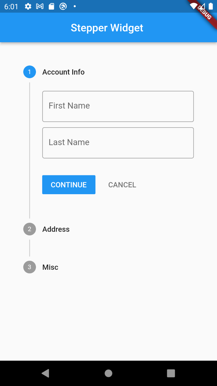
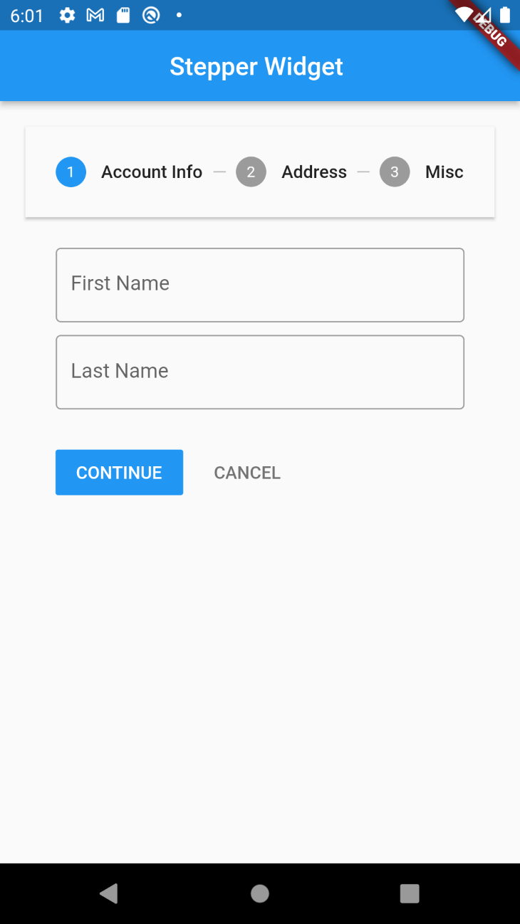
Starting with the type, we define how the content of our Stepper widget should be laid out inside the stepper. For both vertical and horizontal step types, this is what our Stepper widget would look like:


CurrentStep simply takes in the value of the index of the step that is currently visible to the user.
OnStepCancel is the callback implemented whenever a user of our form clicks on the back button, and we’re currently doing a check to prevent the button from being active on the very first step.
onStepContinue is the callback on our continue button. Here we also have a check to know when the user is on the last step, and here we can carry out the necessary action using the information provided to us.
OnStepTapped returns the step the user clicks on, and we can make this active by setting it as the value of the current step.
Other things that could be done to our Stepper widget to provide more customizations include adding a custom theme or implementing our own custom control buttons, which are the current Next and Continue buttons we have. To do this, simply use the theme property and the controlsBuilder property of our Stepper widget.
Final thoughts
Using a multi-step form can significantly improve user experience and increase the visual appeal of our designs.
The Stepper widget in Flutter comes to the rescue in situations where this is needed and provides us with lots of helpful customizations to get the results we desire without depending on third-party libraries.
The post Creating a multi-step form in Flutter using the Stepper widget appeared first on LogRocket Blog.
from LogRocket Blog https://ift.tt/hfV01C5
via Read more


