


CSS float is a positioning property that places an element to the left side or right side of its container and allows inline elements to wrap around it. In the past, float gained a bad reputation as it was misused for page layouts. This has led to some developers questioning whether it is deprecated now, or should be avoided altogether!
CSS float is still relevant. We should just use it in the right context! This article discusses the history of CSS float and demonstrates several ways that float can be used in modern web design to achieve creative text layouts and stunning design elements.
Contents
- A brief history of float
- Using float correctly
- Visualizing a floated element
- Understanding the quirks of floats
- Opting out of CSS floated elements with clear
- Getting creative with shape-outside
- Editing CSS shapes
A brief history of float
The float property was introduced to CSS to allow web developers to create magazine-style layouts, such as having an image positioned inside a column of text with the text wrapping around it, similar to the layout shown below.
float with an image within a column of text.The float property was introduced when CSS was a baby. It’s hard to tell when exactly, but for sure float was in browsers in 2001! At that time, CSS was very limited! When people wanted to make full-page layouts, often they reached for float. It was the wild west back then!
In some ways, using float for layouts worked. However, tears usually followed because this meant using float beyond its intended purpose, leading to complicated code and layout issues that were hard to manage as the website evolved.
Nowadays, just don’t use float for page layouts! You should regard using floats in this way as a legacy technique. Flexbox and CSS Grid are vastly superior options for making complex page layouts.
Using float correctly
Use float when you want to pull an element to the side of a containing element while allowing other content to freely flow around it. There aren’t any other CSS methods for accomplishing this, so don’t be afraid to use it!
The valid values for float are a single keyword from the following list:
left: positions the element on the left side of its containing blockright: positions the element on the right side of its containing blocknone: does not float the elementinline-start: positions the element on the first inline side of its containing block; this is the left side with left-to-right scripts and the right side with right-to-left scriptsinline-end: positions the element on the last inline side of its containing block; this is the right side with left-to-right scripts and the left side with right-to-left scripts
The values inline-start and inline-end are relatively new. They are called logical values. We should favor using these now. The browser support is good, and these logical values create more inclusive designs.
Logical values enable us to create the correct layout for languages with different writing directions with a single value. The most commonly used logical values are left and right. The examples that follow feature less commonly used logical values to illustrate how these can be used in different use cases.
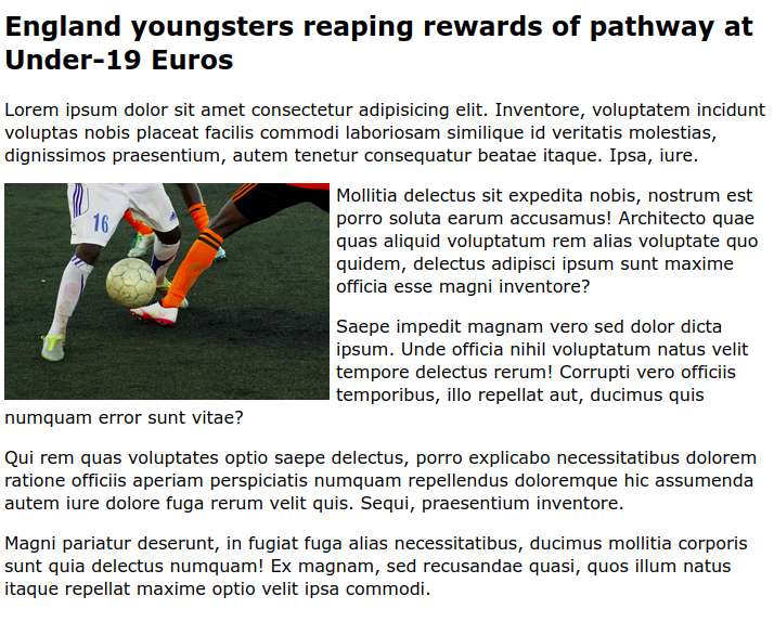
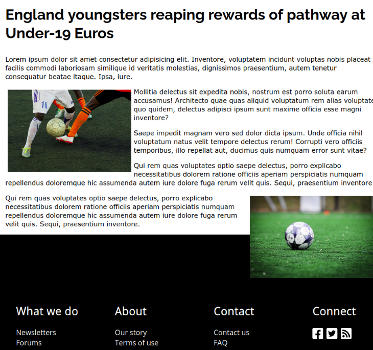
Let’s implement the example from earlier. Let’s create a simple article that has an image that is floated to the start of the second paragraph.
<article>
      <h1>England youngsters reaping the rewards of a pathway at Under-19 Euros</h1>
      <p>
        Lorem ipsum dolor sit amet consectetur adipisicing elit. Inventore,
        voluptatem incidunt voluptas nobis placeat facilis commodi laboriosam
        similique id veritatis molestias, dignissimos praesentium, autem tenetur
        consequatur beatae itaque. Ipsa, iure.
      </p>
      <img src="img/players.jpg" alt="generic photo of men playing football" />
      <p>
        Mollitia delectus sit expedita nobis, nostrum est porro soluta earum
        accusamus! Architecto quae quas aliquid voluptatum rem alias voluptate
        quo quidem, delectus adipisci ipsum sunt maxime officia esse magni
        inventore?
      </p>
      <!--more paragraphs -->
</article>
We just need to add the following style to the img:
img {
    float: inline-start;
}
By default, there is no space between the image and the text. You’ll probably want to add a margin to provide a clear separation between the image and text. I added margin-inline-end: 4px;.
See the Pen
`float: inline-start;` article (english) by rob2 (@robatronbobby)
on CodePen.
If we used the exact same CSS but with Arabic content in our HTML document, it will be aligned to the right instead of the left:
See the Pen
`float: inline-start;` article (arabic) by rob2 (@robatronbobby)
on CodePen.
Fairly simple, right?
The common uses of float should truly be this simple. However, there are some quirks associated with using float that you may encounter in different scenarios. By deepening our understanding of this property, we can prevent confusing outcomes!
Visualizing a floated element
Let’s be crystal clear about how floated elements behave.
Taking our previous example, the English version. The element with the float set on it (the img element in this case) is taken out of the normal layout flow of the document and stuck to the left side of its parent container (the article, in this case).
Any content that comes below the floated element in the normal layout flow will now wrap around the element instead. In doing so, it will fill up the entire space to the right of the floated element. Then, it stops and the normal layout flow continues.
To illustrate this, let’s modify our example. We’ll add some highlighting to the affected paragraphs to demonstrate the document flow, like so:
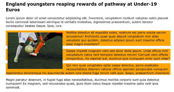
Here is the CodePen for this example.
In this example, we added some padding to the img to create additional space around it, so that you can see the full dimensions of the paragraphs. By adding background-color:orange; to the second, third, and fourth paragraphs, it’s more obvious that they take up the full width of the containing article. However, the paragraph content is being pushed to the opposite side by the floating image.
Understanding the quirks of floats
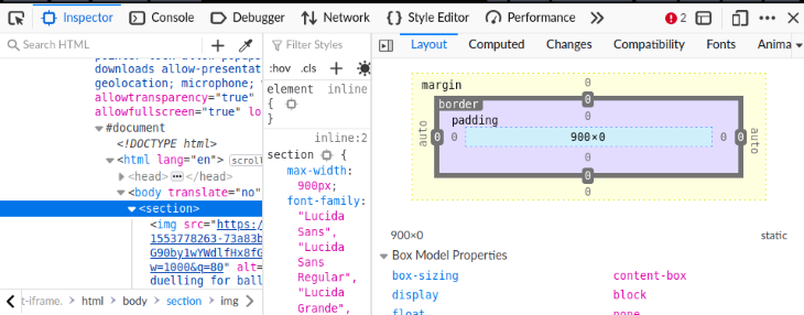
Something that may seem unusual about float is that a parent containing floated elements will collapse. To understand what I mean by this, let’s make a rather contrived example. Let’s create a section that contains two floated elements.
Here, two img floated to the start of the container:
<section>
  <img src="img/1.jpg" alt="generic photo of footballers duelling for ball">
  <img src="img/2.jpg" alt="pitch overview">
</section>

<style>
  img {
    width: 300px;
    float: inline-start;
    margin-inline-end: 10px;
  }
</style>
If we do not add anything more to the section, it will have a height of zero!
Right now, it looks like this:
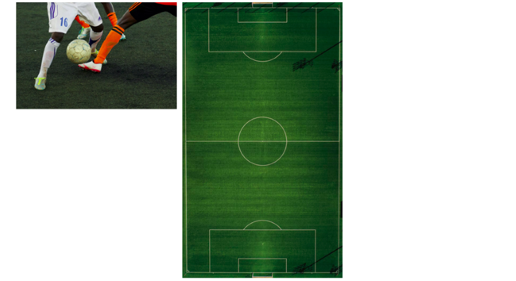
section element containing two floated images.If you inspect the section with the browser’s DevTools, you can confirm the dimensions shown in the Layout tab: 900px width x 0px height.
However, it is very unlikely that you will ever create a parent that has only floated elements! So, why do you need to know this?
Well, we live in a world where Murphy’s law, “anything that can go wrong will go wrong”, proves to be true more often than anyone would like! Things can happen, and if they do, you may be scratching your head wondering why your layout looks weird!
Opting out of CSS floated elements with clear
The CSS clear property is a complementary property to float. You can use it when you want some elements to be free from the influence of floated elements. You can set an element to be “cleared” on one side, or both sides. The cleared element will be moved below any floating elements that precede it.
The clear property has a similar set of values as float:
none: the element is not moved down to clear past floating elementsleft: the element is moved down to clear past left floatsright: the element is moved down to clear past right floatsboth: the element is moved down to clear past both left and right floatsinline-start: the element is moved down to clear floats on the start side of its containing block; that is, the left floats on left-to-right scripts and the right floats on right-to-left scriptsinline-end: the element is moved down to clear floats on the end side of its containing block; that is, the right floats on left-to-right scripts and the left floats on right-to-left scripts
As an example, below is a website article page featuring some floated images. You’ll notice there’s a floated image towards the bottom of the article, overlapping with the webpage’s footer.
To fix this particular case, we can add clear: inline-end; or clear: right; to the footer.
If we want to prevent this from occurring completely, we can use clear:both; instead.
.no-floats {
    clear:both;
}
To see this code in action, check out the below CodePen. You can toggle the no-floats class on the footer to see its effect.
See the Pen
`clear` example by rob2 (@robatronbobby)
on CodePen.
Now, let’s look at some additional examples.
CSS float example with clear: Pull quote
Perhaps the most common example is a pull quote. A pull quote is where an interesting quote is taken from the text and featured as a large inset quote. News publications and glossy magazines tend to do this to give a flavor of what the article is discussing in different sections.
See the Pen
Pull quote by rob2 (@robatronbobby)
on CodePen.
CSS float example with clear: Drop cap
In some books and magazine layouts, you may find a unique style applied to the initial letter of the first word in the paragraph. It may be larger than the surrounding text and styled differently. Sometimes, this letter is referred to as a drop cap.
In CSS, the ::first-letter pseudo-element may be used to style the first letter of an element. If we create a larger initial letter, we may want to float it to the beginning of the block and have subsequent lines of text flow around it.
Below is an example, where we make the initial letter much bigger than the text rest of the paragraph and float it to the beginning of the block.
See the Pen
Initial letter / Drop cap example by rob2 (@robatronbobby)
on CodePen.
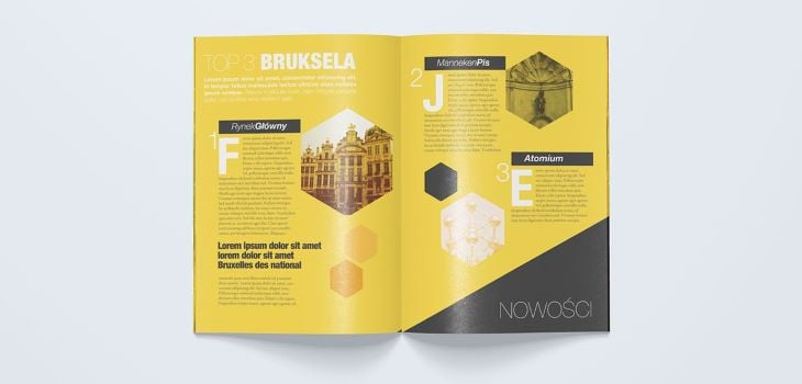
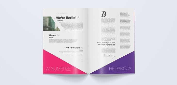
To appreciate how this type of styling can elevate a layout, look at the drops caps in this Travel Magazine design by Bartosz Kwiecień:
Getting creative with shape-outside
So far, all of our examples have involved floated elements that have a rectangular shape. Elements follow the box model and have rectangular bounding boxes. However, we are not confined to a single shape; with the shape-outside property, we can create all kinds of cool shapes that can affect the text flow!
We can provide an image as the value for shape-outside. The float shape is computed based on the alpha channel of the specified image, which is defined by the shape-image-threshold. The default value is 0.0 (fully transparent).
For this reason, it really only makes sense to use shape-outside with image formats that support transparency such as PNG, SVG, and WebP. Otherwise, we’ll still get a rectangular shape!
For example, let’s say we have an SVG image that has a single path that is a red star with a transparent background. Here’s what using shape-outside with this image looks like.
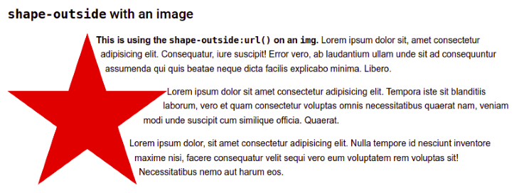
.star {
    width: 250px;
    float: left;
    shape-outside: url("https://upload.wikimedia.org/wikipedia/commons/3/34/Red_star.svg");
    shape-margin: 6px;
}
Here, I used float: left; because, unfortunately, Chrome (Linux) seems to have an issue with using float: inline-start; and shape-outside together.
There is also a shape-margin property that enables us to adjust the margin around the shape.
We can provide a <basic-shape> as the value to the shape-outside property with the following functions: inset()(), circle(), ellipse(), polygon(), or path(). These are defined in the CSS Shapes Module Level 1 specification. If you’ve ever used the clip-path property, then you’ve also used these functions.
Let’s say we want to create a div that is a grey circle and have the text flow around it, like in the image below. We can create this by using float together with shape-outside: circle().
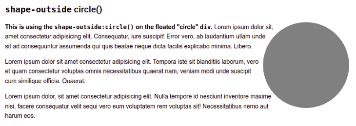
Here’s the CSS to create the grey circle with the flowing text:
.circle {
        border-radius: 50%;
        height: 200px;
        width: 200px;
        background-color: grey;
        float: right;
        shape-outside: circle();
}
You can omit the values for circle(). In our case, the default values for the <radius> and <position> parameters give us the desired result. The default <position> is the center of the circle.
Here’s a CodePen featuring the red star and grey circle examples.
See the Pen
shape-outside examples by rob2 (@robatronbobby)
on CodePen.
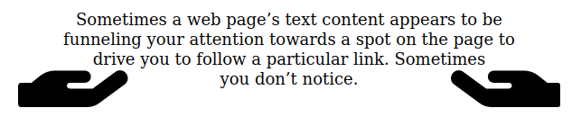
CSS float example with shape-outside: Funnel text
Another interesting example of using shape-outside is to have a floating element on both the left and right to funnel the text.
For example, you could have two hands almost cupping the text. We could float the image of a hand to each side of the paragraph and give the paragraph a triangular shape using shape-outside with the polygon() function.
<img class="left" src="hand.svg"/>
<img class="right" src="hand.svg"/>
<p>
  Sometimes a web page’s text content appears to be
  funneling your attention towards a spot on the page
  to drive you to follow a particular link. Sometimes
  you don’t notice.
</p>

<style>
.left {
  shape-outside: polygon(0 0, 100% 100%, 0 100%);
  float: left;
  height: 6em;
}

.right {
  shape-outside: polygon(100% 0, 100% 100%, 0 100%);
  float: right;
  height: 6em;
  transform: rotateY(180deg);
}

p {
  text-align: center;
}
</style>
shape-outside on both sides.Here is the accompanying CodePen:
See the Pen
Text funnelling with float and shape-outside by rob2 (@robatronbobby)
on CodePen.
Editing CSS shapes
If you’re wondering how to edit CSS shapes, I recommend using Firefox DevTools. If you click on the shape-outside property, you’ll see a blue “mesh” symbol next to it, and it will display the outline of the shape on the page (as shown below).
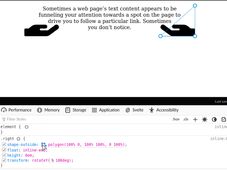
You can move the control points (the circles on the path) around and edit them like you would a path in a graphics editor. Chrome DevTools does not offer the same feature, as far as I know!
If you want more examples, Kristopher Van Sant has a shape-outside CodePen collection that is bursting with examples.
To see how a unique shape could be employed in a complete layout, check out this magazine layout, again from Bartosz Kwiecień.
As of 2022, 95% of browsers worldwide support the shape-outside property. So, don’t be afraid to give it a shot!
Wrapping up
float seems to be underutilized in today’s frontend development arena. Maybe, it is a victim of the past, when it was often misused for page layouts, and things got conflated to “don’t use float”. I hope that I’ve shown you that float is still relevant and can be used to create intriguing text layouts. I would love to see people use the float property more frequently to bring more creativity to the web.
The post A deep dive into the CSS <code>float</code> property appeared first on LogRocket Blog.
from LogRocket Blog https://ift.tt/dC72tvR
Gain $200 in a week
via Read more


