


What would the world be without color? Black and white with a dash of grey, maybe. Pretty bland.
Colors stimulate the mind – they can affect the way you think and the decisions you make. A color, or group of colors, can form part of an identity. Just think about the red, yellow, green, and blue associated with Google.
All this to say that choosing the right set of colors for your project is very important. In comes color generators.
Color generators are used to make color palettes for your web projects. In this post, we’ll go over six unique color generators and how to use them: Leonardo, Dopely Colors, iColorPalette, Reasonable Colors, OSCS, and Simpler Color.
- Tips for working with colors on a project
- Leonardo
- Dopely Colors
- iColorPalette
- Reasonable Colors
- OSCS
- Simpler Color
- Picking the right color tool
Tips for working with colors on a project
Before we jump into the color generators, let’s go over some useful tips for choosing the right colors for your project. You’ll need to do some basic research before settling on the set of colors you want.
First, you’ll want to have a dominant color. This is the color that’ll be mostly linked to your brand. For example, we all know the classic blue for Facebook. You’d want this color as a background or on every important, visible element on the website.
Next, you’ll want to choose complementary colors. Have at least two more colors that work well with the dominant color. This can be used mainly on text.
Finally, think about accent colors. These are used for highlights, such as buttons, popups, calls to action, and more. You’ll want these to flow nicely with the other colors on your palette.
Now that we have these tips established, let’s dive further into the six color generation tools we’ll cover in this article.
Leonardo
Leonardo is Adobe’s open source, contrast-based color generation tool for creating color palettes. It was created by Nate Baldwin.
Leonardo works as a design and engineering tool. It’s delivered as a JavaScript module and contains a graphical user interface (GUI) for creating color themes for UIs, color scales for visualization, and for conducting color analysis.
Before we look at how to use this web interface, let’s look at how to install Leonardo’s JavaScript API. Nate was happy to provide a detailed explanation of how to use Leonardo for the first time.
Getting started
First, install Leonardo into your project.
npm i --save @adobe/leonardo-contrast-colors
Next, import the package into your script. Leonardo has three primary classes: Theme, Color, and BackgroundColor.
Using ESM (Node v13), we have:
import { Theme, Color, BackgroundColor } from '@adobe/leonardo-contrast-colors';
Each Theme consists of Colors and a BackgroundColor. These three classes are important for generating a color theme. The theme is an overarching context or environment that will handle things like the overall brightness, saturation, or contrast of the generated colors.
To begin, you’ll need to create your colors. Let’s start with red, assuming you’ll need that for error messages.
const red = new Color();
The Color class is constructed from three primary parameters: your color’s name,
colorKeys, and ratios. The name is straightforward, so we can add this in now. It will be used for the generated color names in the end.
const red = new Color({
                name: 'red'
                });
Every Color and BackgroundColor will create a full brightness or value scale for your color behind the scenes. This means it will create the darkest shade (black) and lightest tint (white) of your color. You can specify your desired color with one or more colorKeys. For example, the simplest use case would be to add #ff0000 alone.
const red = new Color({
                name: 'red',
                colorKeys: ['#ff0000']
                });
This will create a function or scale of color that can be called up when generating the output colors later.
The next parameter to define is ratios. These are the desired contrast ratios that you wish to have Leonardo generate from your key colors. For most web applications, you’ll want your color to have a shade that is 3:1 with the background (for UI elements and large text) and one that is 4.5:1 with the background (for small text).
const red = new Color({
                name: 'red',
                colorKeys: ['#ff0000']
                ratios: [3, 4.5]
                });
Let’s assume you want to create light and dark mode themes for your colors using a gray color for the backgrounds (white and dark gray). To do this, you’ll need to create a BackgroundColor in the same way.
const gray = new BackgroundColor({
name: 'gray',
colorKeys: ['#000000']
ratios: [3, 4.5] // optional
});
Now that we have a Color and a BackgroundColor, we need to construct our theme. For the colors parameter, we will pass our new class instances as constants directly, as well as pass the constant gray to the backgroundColor parameter.
const theme = new Theme({
colors: [red, gray],
backgroundColor: gray
})
All that’s left now is to give our theme context. Theme lightness is defined on a scale from 0–100, 0 being black and 100 being white. So, if you want your light theme to be on a pure white background, it will look like this:
const theme = new Theme({
colors: [red, gray],
backgroundColor: gray,
lightness: 100
})
To retrieve your generated colors, you can access them in a few ways:
as an array of key-value pairs or as a structured JSON object with additional
metadata. For most web applications, the key-value pair output is most beneficial, as you can easily generate custom CSS properties based on this output:
let lightThemeColors = theme.contrastColorPairs;
This returns the following colors:
{
"background": "#ffffff",
"gray100": "#959595",
"gray200": "#767676",
"red100": "#fe5e5e",
"red200": "#ef0000
}
Now, if you want a dark theme, all you need to do is set the lightness of your theme class. We’ll set it to a near-black value of 11.
theme.lightness = 11;
let darkThemeColors = theme.contrastColorPairs;
This will return dark theme colors:
{
"background": "#1d1d1d",
"gray100": "#686868",
"gray200": "#848484",
"red100": "#d20000",
"red200": "#fe2c2c
}
This is all while ensuring your theme colors meet the minimum contrast ratio requirements defined for each Color. Additional parameters’ saturation and contrast for your theme can be modified as well. This can decrease overall color saturation or increase/decrease overall contrast.
Leonardo can be used to create themes that allow you modify your UI’s colors. By providing inputs that control the setters for your Theme and by utilizing CSS custom properties, Leonardo can provide a personalized approach and more accessible experiences to a wide range of sighted users.
For a demonstration of this personalized approach, see this demo on Leonardo’s official website. If you want more details on getting started with Leonardo, check out the API docs on their homepage.
Using Leonardo’s web interface
Now that you know how to install Leonardo, let’s go over how to use the GUI. There are three options available: adaptive color theme, color scales, and color toolbox. You gain access to these tools through the homepage.
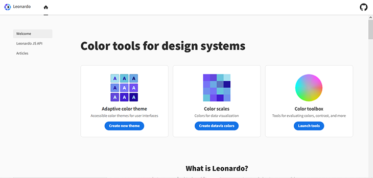
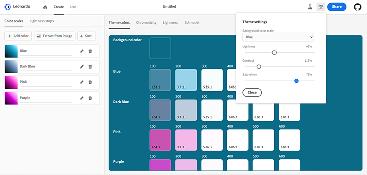
Creating color themes
From the homepage, you’ll select Adaptive color theme. It’s going to open up a workspace where you’ll choose your key colors. Gray is the default color but you can choose to edit it or create new ones altogether.
Click on either the default color or Add color to move to the next section.
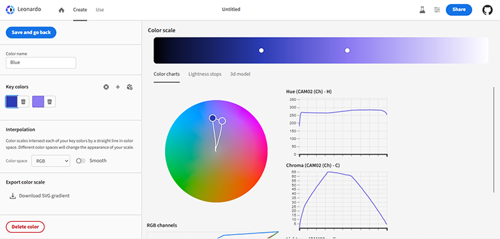
As you can see, there’s a visualizer with a color scale to show things like contrast, lightness, and more. After picking your color, save your work and go back to the previous section. Here, you can choose more key colors to complete the theme.
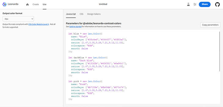
Next, move over to the Use section. We’ve already seen how to install Leonardo, so now we just want the colors. You can choose between JavaScript parameters, CSS variables, and design tokens.
And that’s it for creating and using color themes!
Color scales
When you’re looking at a color scale, you can see how the key colors transition from dark to light. It also recommends other colors that compliment your key colors.
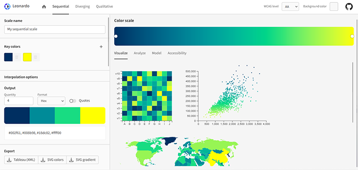
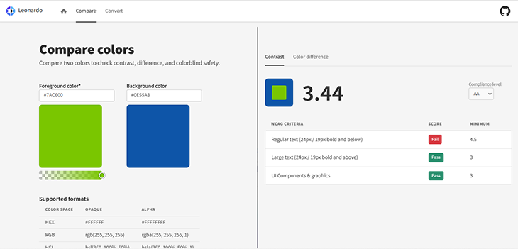
Color toolbox
Here, you can compare two colors and see if they’re compatible. There’s also a converter to change colors to other formats.
Dopely Colors
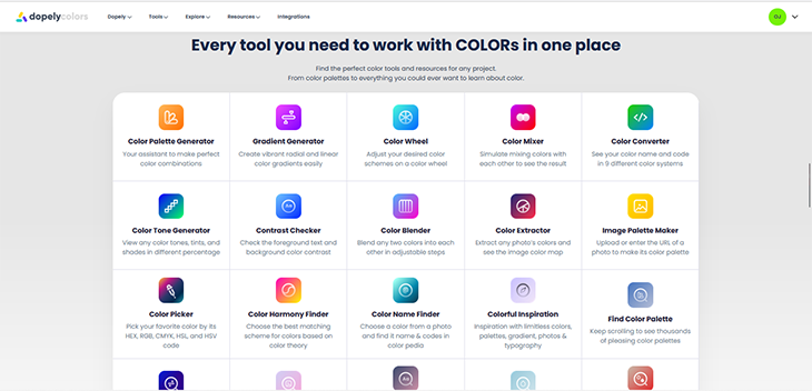
Dopely is purely a graphical interface with a vast array of tools. You can use it to create color palettes and gradients, find the name of a color, extract colors from an image, and lots more. If you’re not up to creating a palette yourself, you can explore ready-made palettes and images.
Dopely can be installed as a browser extension on Chrome. It is unclear if it’s available on other browsers.
What’s great about Dopely is it doesn’t have a steep learning curve. Everything you need is right there, just pick a tool! You can sign up for an account and save your palettes.
Color palette generator tool
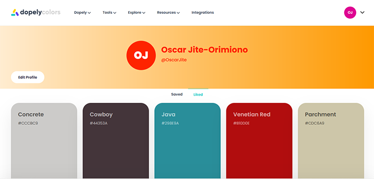
This tool is first on the list, and its name serves as a pretty straightforward description. When you navigate over to this section, you should get five random colors. Hovering on any of these colors will reveal some hidden features.
Here’s a screenshot of the view (after you close any ads that may pop up):
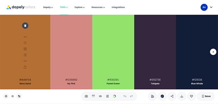
The first thing you’ll notice is that these features aren’t labeled even if you hover over them. Through a combination of trial and error and intuition, you’ll likely be able to figure out the function of these features, but we’ll go over them now for clarity.
First up is the trashcan, the universal and iconic symbol to delete. This will discard the color. Next, the double-headed arrow icon allows you to move the color around. Beneath that is the heart icon. This is used to like and unlike a color. You can find your liked colors on your profile, just click on Profile from the drop-down menu on the top right corner of the page.
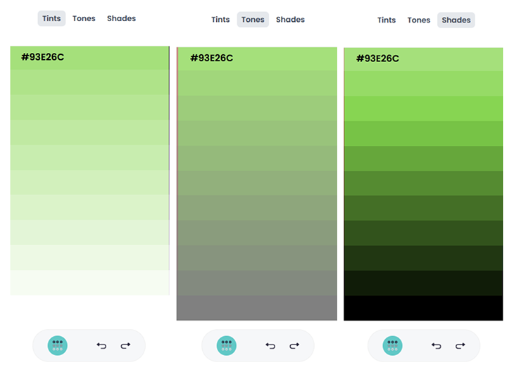
Next, the grid icon splits the color into its tints, tones, and shades. You can see an example of this below.
The slider icon opens up a color picker. This lets you manually choose a color instead. Following that is the code icon that lets you copy the color code in the format of your choice. Finally, we have the lock icon to lock the color in place.
Now, let’s talk about the icons across the bottom of the page.
The first icon on the very far left looks like a beach ball. It opens up an about page for the color palette generator tool, going into more details on how to use it. The gear icon in the middle lets you choose the color format to display. Finally, the rightmost icon in that set opens up a menu where you can change the layout of the page.
Now for the icon features in the middle. The camera lets you pick colors from an image. You can choose your custom colors or let the tool pick the colors for you based on some predefined options.
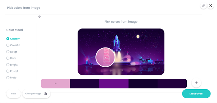
You can move the lens to select colors from sections of the image. From the menu on the left, you can choose to let the tool automatically generate the colors for you by selecting the type of colors you want. Maybe you only want the bright colors.
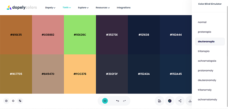
Back to the features. You can simulate color blindness by clicking on the eye icon. There are different forms of color blindness to choose from.
We’ve already seen what the grid icon can do and this time it covers all the colors at once. Moving on, the slider feature lets you adjust the palette by changing the hue, saturation, brightness, and temperature.
The last group of icons on the right is for checking through your saved palettes, randomly switching out the colors, sharing your palette, downloading the palette, liking, and saving the color palette, respectively.
Most of the other tools are incorporated into the color palette generator tool. You can try out some other tools that aren’t, such as the contrast checker and gradient generator.
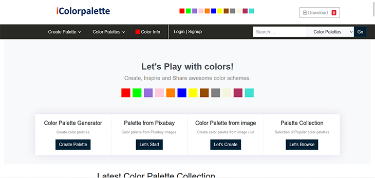
iColorPalette
iColorPalette is very similar to Dopely Colors, albeit with a few less pleasing aesthetics and more ads. It offers the option of creating a color palette, creating an image palette, or exploring a collection of palettes.
Let’s check out its color palette generator and see if it can give Dopely a run for its money. Here’s what you’ll find after closing (even more) ads:
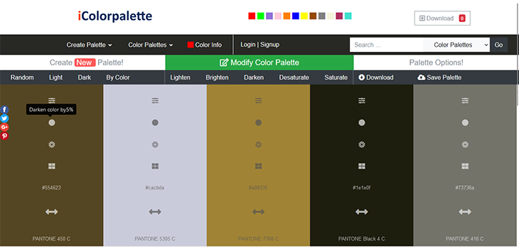
Though Dopely is ahead in my opinion, iColor scores some points for at least having labels that clearly describe the function of each feature!
Let’s try something different – the Color Palette from image tool. Head back to the homepage, click on the link, and here’s a screenshot of what you’ll find.
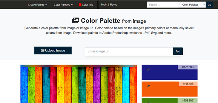
At the top, you have the option of uploading an image or entering a link to the image. If you scroll down, you’ll find a preview of the image and a five-color palette generated from it.
Now, you can edit the palette by clicking any of the colors and dragging a pointer across the image until you get the desired result.
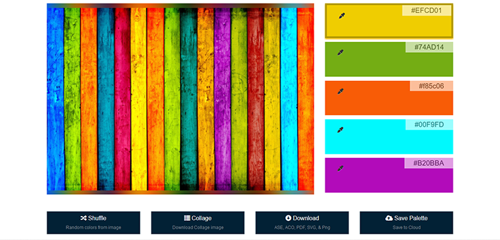
Directly below this, you’ll find the option to shuffle the colors and generate another set of colors from the image. You can also download the image and colors as a collage.
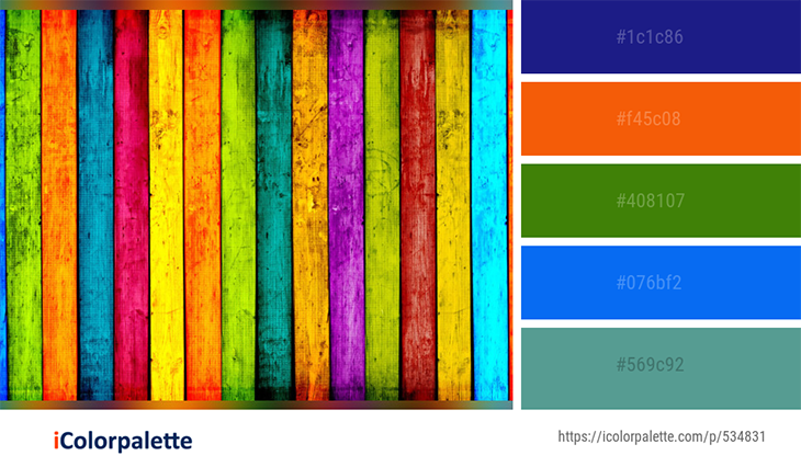
Lastly, there’s an option to save the colors in six different formats. You can also save the palette.
Now, the initial palette produces five colors, but there are more than five colors just looking at this particular image. What if you want all the colors from the image? Well, iColor’s got you covered.
Scroll down further and you’ll find all the colors from the image! There are several options for downloading, choose the format that works best for you.
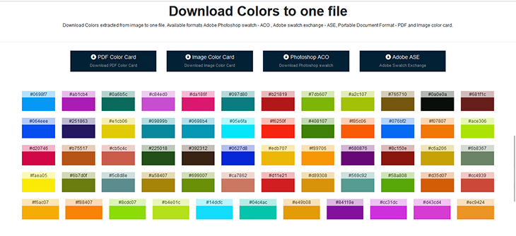
Another point for iColorPalette. Ignoring all the ads and rugged appearance, it’s a pretty decent tool for color generation.
Reasonable Colors
Reasonable Colors is an open source system for building color palettes. It was created by Matthew Howell and its source code is available on GitHub.
Just like Leonardo, Reasonable Colors has a high emphasis on color contrast. Unlike Leonardo which is pure JavaScript, Reasonable is essentially a CSS color library. Now, let’s go over how to use it in your project.
Getting started
Reasonable Colors can either be linked as an external stylesheet or can be installed into a project with npm.
Below is the CSS link.
<link rel="stylesheet" href="https://unpkg.com/reasonable-colors@0.4.0/reasonable-colors.css">
And then we have the npm installation through a terminal.
npm install reasonable-colors
Now you have a library with different colors! You have stylesheets (CSS and SCSS) for rgb, hsl, lch, and hex. All you have to do is link the relevant stylesheet from your HTML file and use the variable names to apply the color.
There are also external stylesheets for the different color formats. The default color format is hex. Here are the links for hsl, rgb, and lch, respectively.
<link rel="stylesheet" href="https://unpkg.com/reasonable-colors@0.4.0/reasonable-colors-hsl.css">

<link rel="stylesheet" href="https://unpkg.com/reasonable-colors@0.4.0/reasonable-colors-rgb.css">

<link rel="stylesheet" href="https://unpkg.com/reasonable-colors@0.4.0/reasonable-colors-lch.css">
Reasonable Colors also comes with default color sets that can be found here. It allows you to inspect these colors.
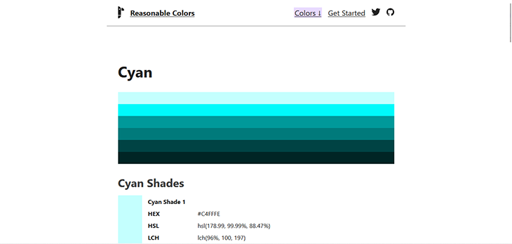
You can see the different color formats for the color. You can also preview different shades of the same color.
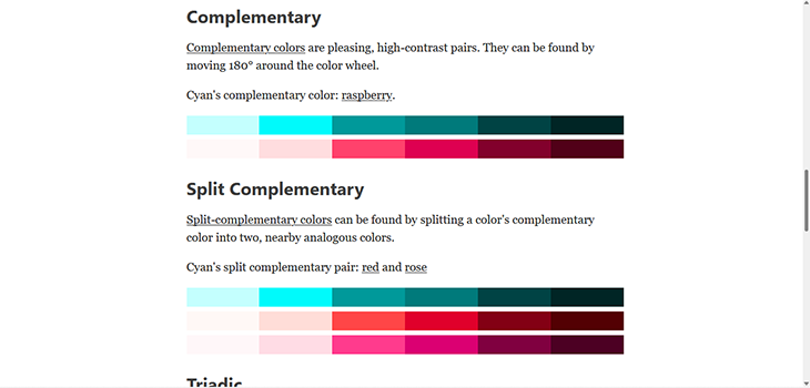
Reasonable Colors also shows you complementary colors. Now, it’s up to you to decide how you’ll combine them when styling a web page!
OSCS
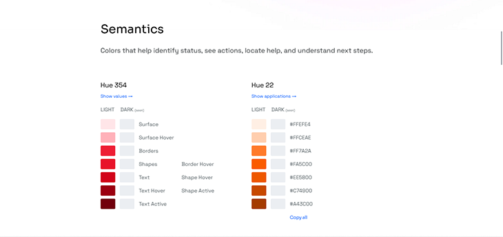
OSCS is an acronym for Open Source Color System. It’s a simple system with various handpicked color palettes to choose from. OSCS also tells you how you can use these colors on different web components.
It’s a really simple site! Once you’re on the homepage, head over to Palettes to find the colors. Here, you’ll find ten color palettes selected for semantics and accents. There’s a section reserved for neutrals and overlays coming in a future update.
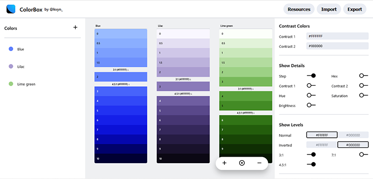
OSCS also provides a link to a tool, ColorBox, where you can create custom palettes. It’s a fairly simple tool to understand.
There’s a panel on the left for adding and naming colors. The panel on the far right allows you to adjust contrast, brightness, and saturation. You can preview the colors in the middle.
You can also preview text color.
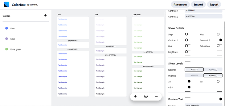
Play around until you get what you like and you can then export the color palette.
Simpler Color
Simpler Color is a tool for creating color systems. It allows you to implement your own CSS-compliant color system for any JavaScript/TypeScript project, no matter what platform, framework, or UI library you are using.
It works in the browser, server (Node), mobile (React Native), and desktop (Electron).
Getting started
Simpler Color is hosted on GitHub. From the README file, you’ll be able to install it using npm.
First, install the package.
npm install simpler-color
Next, you can build the color palette. There are two options, and the first is defining your base or key colors yourself.
const baseColors = {
  primary: '#609E3F',
  secondary: '#5D745D',
  neutral: '#5E5F5A',
}
You can also choose one base color and the system will generate the rest of the palette.
import { harmony } from 'simpler-color'

// Generate 5 harmonious base colors from your main brand color!
const baseColors = harmony('#609E3F')
The numbers at the end control the lightness and darkness of the colors. Here’s a graphic to help you understand it better.
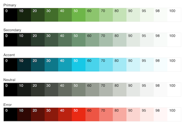
The numbers control the shade and tint of the colors. You can learn more about Simpler Color here.
And there you have it, six JavaScript (well, not all JavaScript) tools for color generation! Choosing the right colors for your project just got easier.
Picking the right color tool
Some of these color generators are easier to use than others and some have certain drawbacks. Take Leonardo for example, it’s great to create and use immediately, but there are no options to save the palette for later and no sign of cookies to save your session either. Imagine if you have 10 color scales ready and you accidentally close the tab!
Some tools offer the option of having a profile and saving the palettes. However, accessibility poses a different issue because these are used purely as a reference and can’t be used directly in your project.
Maybe you can use them together. You can save your colors with Dopely or iColorPalette and use the same parameters for Leonardo, Reasonable Colors, or Simpler Color. It’s a win-win situation, don’t you think?
Conclusion
An artist always has a palette in hand. It is on this palette that colors are mixed and matched to create a masterpiece!
Colors are important for many reasons – without them, our lives would be bland. In this article, we covered six color tools that can guide you when styling your next project.
This project is your potential masterpiece, ensure it stands out!
The post 6 JavaScript tools for color generation appeared first on LogRocket Blog.
from LogRocket Blog https://ift.tt/9GShET0
Gain $200 in a week
via Read more


