The core function of CSS is to enable browsers to style HTML elements. CSS does this by assigning specific values to properties, such as the background, color, font size, margin, padding, and more.
Within CSS, em and rem are both scalable units that also specify values of properties. em and rem meet web accessibility standards, and, unlike px, scale better. Consequently, they are more suited for responsive design.
In this article, we will learn about both the em and rem relative length units. We’ll also go over code examples to demonstrate how they work, their difference, and coding patterns. Lastly, we will learn what problems they solve and when to use each of them.
- Background information
- Length values
- What are
emandremand why use them? emvs.rem- Problems with working with
emandrem
Background information
CSS syntax is rather simple, and, as we discussed previously, involves assigning values to properties of HTML elements. The property-value pair is referred to as a CSS declaration.
Consider the code below:
h1 {
  color: black;
  background-color: rgb(190,43,111,0.5);
  font-weight: 800;
  font-size: 1.5rem;
  padding: 4em;
  margin: 10px;
  weight: 100%;
  height: 100vh;
}
This code shows a CSS declaration that styles the h1 element of a webpage by assigning specific values to some properties of the element. We see that some properties, such as font-size, padding, and margin, are assigned numerical values.
In CSS, there are different numerical value types:
- Integer: whole numbers, like the value
800assigned to thefont-weightproperty above - Numbers: decimal numbers, like the alpha value passed to the
rgb()function expression above. The alpha value is0.5, referring to 50 percent opacity - Percentages: like
100%assigned to theweightproperty - Dimensions: numbers with units, such as
1.5rem,10px, or100vh. Dimensions are subdivided intolength,angle,time, andresolutions. In our examples above, each of the dimensions (em,px,rem, andvh) fall under the length category
Length values
Length values are CSS data types assigned to CSS properties, such as weight, height, margin, padding, and font-size. Length values are either absolute or relative.
Absolute length values are fixed units, such as px. They are not relative or dependent on anything.
Relative length values, however, are not fixed. They are relative to something else, like the browser’s default font size or the font size of other elements. Examples of relative units include em, rem, and vh.
As web development evolves with a growing number of devices, scalable units are favored over fixed units because they offer the required flexibility for building responsive websites.
Now, we’ll dive deeper into em and rem. Let’s get started!
What are em and rem and why use them?
em is a CSS unit relative to the font size of the parent element, while rem is a CSS unit relative to the font size of an html element. Both of these are scalable units, meaning they give us the ability to scale elements up and down, relative to a set value. This adds more flexibility to our designs and makes our sites more responsive.
A key reason to use scalable units like em and rem is accessibility. Accessibility enables all users, particularly those with disabilities, to successfully interact with a website. Using fixed units like px to set the values of elements, fonts, and space sizes does not give us this accessibility because fixed units do not scale.
By using scalable units like em and rem, we enable users to control the scale of the sites, thereby, providing us with our desired accessibility.
em vs. rem
em and rem are similar because they are both scalable units. Their values are always relative to the value of something else.
Most notably, em and rem differ in the way the browser converts them to px.
As mentioned before, em values are relative to the font-size of the nearest parent element, while rem values are relative to the root font-size, or the font-size of the html element. And when the root font-size is not explicitly set, rem values are relative to the browser’s default font-size of 16px.
This means that when the root font-size is 16px, a value of 1rem would be 16px * 1 = 16px. And a value of 10rem would be 16px * 10 = 160px.
From the above, we can see that rem values are simple and predictable, and, as a result, we can control how elements scale across the entire page easily from a single source. You can see this demonstrated below:
/* Root font-size on the document level */
html {
  font-size: 20px;
}

@media (max-width: 900px) {
  html { font-size: 16px; }
}

@media (max-width: 400px) {
  html { font-size: 12px; }
}

/* Type will scale with document */
h1 {
  font-size: 2.6rem;
}

h2 {
  font-size: 1.6rem;
}

h3 {
  font-size: 1.1rem;
}
In the code above, a different root font-size is set for a different @media query, and the type font-size uses rem units. The result of this is that the type will scale relative to the root font-size set for each @media query.
Do note that it is often considered a bad idea to explicitly set the root font-size to a px value. This is because it overrides the user’s browser setting. A recommended method is to use % unit or avoid setting the root font-size explicitly. This sets the font-size to 100% of the browser’s default font-size, which is 16px for most browsers.
Although rem units are simple and predictable, sometimes they may not give the desired control over how specific areas scale on the webpage. This is because it is difficult for all the modules in a webpage to accurately scale up and down relative to a single value.
But, since em is dependent on the font-size of the nearest parent, it gives more detailed control over how specific areas of the webpage scale. Thus, with em, we can control how the webpage scales on the modular level.
Problems with working with em and rem
As mentioned above, when using rem it is sometimes difficult for all the modules to scale up and down accurately. A proposed alternative is to use em, since components within a module are more likely to accurately scale up and down relative to the parent component. Thus, all the sidebar components would scale relative to the parent sidebar element, all the header components would scale relative to the parent header element, and so on.
em gives us control of the scale of our webpage on a modular level, but this comes with its own problems.
Inheritance of em values
The main problem experienced when working with em units is due to the effect on the inheritance of em values. Since every element inherits the font-size of its nearest parent, em values compound linearly as the level of nesting increases.
To elaborate on this, let’s build a simple app. Create a project folder and from the folder, run the following command:
npm init -y
Then install the live-server package by running:
npm i live-server
Now, replace the scripts property in the package.json file with:
"scripts": {
    "start": "live-server"
  },
After this, create an index.html file and add the following code:
<!DOCTYPE html>
<html lang="en">
<head>
    <meta charset="UTF-8">
    <meta http-equiv="X-UA-Compatible" content="IE=edge">
    <meta name="viewport" content="width=device-width, initial-scale=1.0">
    <style>
        .container {
            display: flex;
            justify-content: center;
            align-items: center;
            height: 100vh;
            width: 100wh;
        }
        .parent {
            font-size: 15px;
        }
        .em-child {
            font-size: 2em;
        }
        .rem-child {
            font-size: 2rem;
        }
    </style>
    <title>Document</title>
</head>
<body>
    <article class="container">
        <div class="parent">
            I'm 15px
            <div class="em-child">
                I'm 15px * 2 = 30px
                <div class="em-child">
                    I'm 30px * 2 = 60px
                    <div class="em-child">
                        I'm 60px * 2 = 120px.
                    </div>
                </div>
            </div>
        </div>
    </article>
</body>
</html>
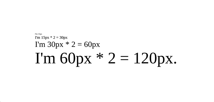
Now, run npm start to start the dev server, and we get:

In the example above, we demonstrated the compounding effect of an em unit. Because each child element inherits its font-size from its nearest parent that inherits its font-size from its nearest parent (and so on), the final font-size is undesirably 120px.
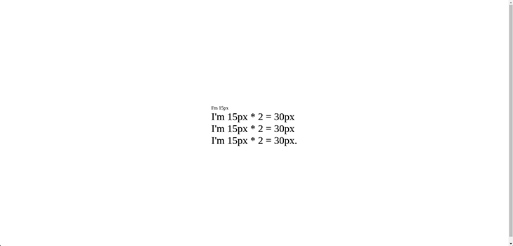
rem, or “root em,” was designed to address this issue. To see this in action, replace all the em-child classes with the rem-child class in the index.html file, as seen below:
<!DOCTYPE html>
<html lang="en">
<head>
    <meta charset="UTF-8">
    <meta http-equiv="X-UA-Compatible" content="IE=edge">
    <meta name="viewport" content="width=device-width, initial-scale=1.0">
    <style>
        .container {
            display: flex;
            justify-content: center;
            align-items: center;
            height: 100vh;
            width: 100wh;
        }
        .parent {
            font-size: 15px;
        }
        .em-child {
            font-size: 2em;
        }
        .rem-child {
            font-size: 2rem;
        }
    </style>
    <title>Document</title>
</head>
<body>
    <article class="container">
        <div class="parent">
            I'm 15px
            <div class="rem-child">
                I'm 15px * 2 = 30px
                <div class="rem-child">
                    I'm 15px * 2 = 30px
                    <div class="rem-child">
                        I'm 15px * 2 = 30px.
                    </div>
                </div>
            </div>
        </div>
    </article>
</body>
</html>
And we get:

Both em and rem are scalable units that add flexibility to our design. However, the big question is when to use em or rem. There is debate about this, but from what we have learned so far, I recommend using rem for consistency and predictability, and em if you want to scale your page on a modular level.
Conclusion
In this article, we learned about em and rem, two similar, scalable, and relative CSS units. However, the key difference between them lies in how browsers compute their pixel values.
While both these units provide the needed flexibility for a responsive design, rem is favored for its simplicity, consistency, and predictability. And although em can be tricky to use, if you like to scale your page on a modular level, it can be the right choice.
The post Using em vs. rem in CSS appeared first on LogRocket Blog.
from LogRocket Blog https://ift.tt/UY9keBt
via Read more


