


In this guide, we will cover how to build a custom checkbox in React without sacrificing accessibility for assistive technology:
- Default and custom checkboxes in React
- Using controlled inputs for form controls in React
- Styling the checkbox in React
- The input checkbox and label elements as siblings instead of nested
Below is the custom checkbox we will build in this tutorial. You can interact with it, and after that, get started.
To follow this tutorial, ensure you are familiar with React.
Default and custom checkboxes in React
The checkbox is a control element that provides an option to toggle between true and false states. It is an input element with the type attribute set to a checkbox like so:
<input type="checkbox" />
In its simplest form, an input checkbox alongside some label text can look like this:
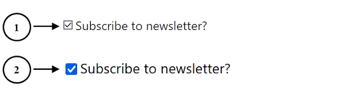
Input checkboxes have default styles applied to them. These styles come from the browser’s underlying operating system, thus making the checkbox appearance vary across various browsers.
The first example labeled in the image above shows how the design of the checkbox would appear in the Opera mini browser. The second example is how the same default checkbox would appear in Firefox, which also has a similar appearance in Chrome.
Generally, one reason we might want to have a custom checkbox on a web page is to ensure the appearance is consistent across browsers and devices.
Using controlled inputs for form controls in React
Handling form controls in React is a bit different from handling them in regular HTML.
In HTML, form controls — including checkboxes — listen to and are managed by the DOM. In that case, we don’t need to set up any logic to toggle the boxes; they can be toggled by default.
However, in React, the checkbox must either be a controlled or uncontrolled input. A controlled input allows us to take the responsibility away from the browser DOM and hand it over to a component state (usually, the component that is rendering the inputs).
React recommends this approach to form controls. This way, the state becomes the only source of truth. Let’s see this in practice!
Creating a checkbox component
Let’s start by creating a component called Checkbox that accepts a label text as a prop and renders a checkbox alongside the text:
const Checkbox = ({ label }) => {
  return (
    <div className="checkbox-wrapper">
      <label>
        <input type="checkbox" />
        <span>{label}</span>
      </label>
    </div>
  );
};
export default Checkbox;
Then we will render the <Checkbox /> component wherever we want to display a checkbox. In our case, we will render it in an App component:
import Checkbox from "./Checkbox";

const App = () => {
  return (
    <div className="app">
      <Checkbox label="Subscribe to newsletter?" />
    </div>
  );
};
export default App;
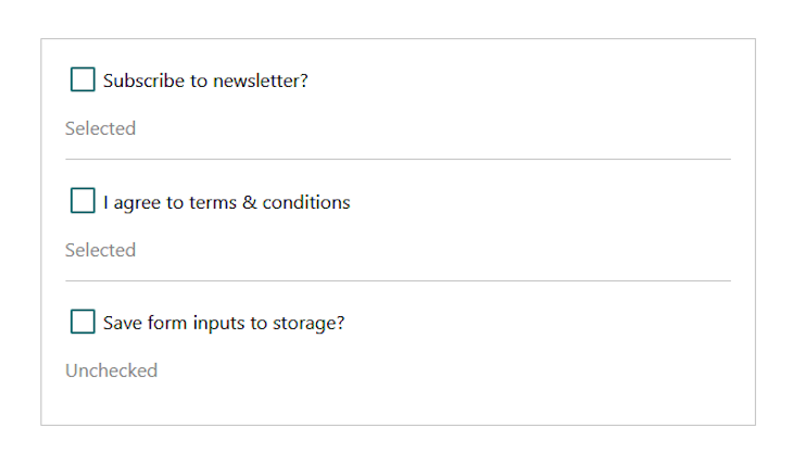
These steps should result in something like this:
Note that we have included basic styles that added a border for the containing elements. At this point, we haven’t done anything special in rendering the checkbox. The above is similar to rendering a basic HTML checkbox.
Controlling the input checkbox
As mentioned earlier, React recommends making our form elements a controlled field. To do this, we must add a component state to manage the user’s input and then pass the state variable to the input. For checkbox input, we will assign the state to the input checked attribute.
import { useState } from "react";
const Checkbox = ({ label }) => {
  const [isChecked, setIsChecked] = useState(false);
  return (
    <div className="checkbox-wrapper">
      <label>
        <input type="checkbox" checked={isChecked} />
        <span>{label}</span>
      </label>
    </div>
  );
};
export default Checkbox;
With the above implementation, the checkbox will no longer listen to the DOM, but rather the useState defined in the component. Since we initialized the useState with a false value, the checkbox field will be unchecked on the initial DOM render.
Later on this page, we will define logic that lets us pass the initial state into the Checkbox component, whether we want it checked, unchecked, or disabled.
At this point, we have succeeded in making the checkbox a controlled input. However, we cannot toggle it because it no longer listens to the browser DOM. So we need to handle the toggling ourselves.
Using the updater function
The updater function is the second parameter of the useState() React Hook. It allows us to update the state and ensure it holds the updated state value.
To use the updater function, we must listen to a change in the input checkbox using an onChange event handler. This handler will call the updater function setIsChecked for every input change with the latest input value.
const Checkbox = ({ label }) => {
  // ...
  return (
    <div className="checkbox-wrapper">
      <label>
        <input
          // ...
          onChange={() => setIsChecked((prev) => !prev)}
        />
        {/* ... */}
      </label>
      <p>{isChecked ? "Selected" : "Unchecked"}</p>
    </div>
  );
};
export default Checkbox;
As seen in the code, the setIsChecked updater function takes the previous state value and updates it by toggling its Boolean value.
Notice that we added a paragraph after the label to show that the checkbox listens to the state defined in the component:
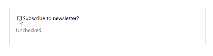
Specifying the checkbox’s initial state and other control attributes
Let’s provide an option to pass some props alongside the label into the Checkbox component. For instance, we can specify whether or not a checkbox should be checked by default, and whether the checkbox is disabled or not.
In the App component below, we’ve added additional <Checkbox /> to include a checked and disabled prop:
const App = () => {
  return (
    <div className="app">
      <Checkbox label="Subscribe to newsletter?" checked={true} />
      <Checkbox label="I agree to terms & conditions" checked={true} disabled />
      <Checkbox label="Save form inputs to storage?" />
    </div>
  );
};
export default App;
Assigning a true value to the checked prop means we want the checkbox field checked by default. Otherwise, we want it unchecked. Likewise, passing a disabled prop means we want the checkbox disabled.
Next, let’s access the props from the Checkbox component and use them:
const Checkbox = ({ label, checked, ...props }) => {
  const defaultChecked = checked ? checked : false;
  const [isChecked, setIsChecked] = useState(defaultChecked);

  return (
    <div className="checkbox-wrapper">
      <label>
        <input
          // ...
          {...props}
        />
        {/* ... */}
    </div>
  );
};
export default Checkbox;
In the code, we started by using the ternary operator to check if the value of the checked prop is true or false. The result is then used as the initial state value that gets applied to the checkbox on the initial DOM render.
Then, on the input element, we spread the other props that the component receives. For instance, the component may receive a disabled prop, so it also gets applied to the input element. At this point, our checkboxes look like this:
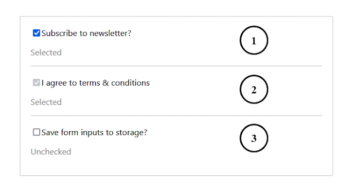
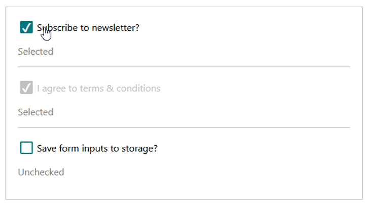
The first and second checkboxes are checked by default because we assigned a true value to their checked prop. The second checkbox is disabled because we also passed along a disabled prop. In the next section, we will give our checkboxes a custom look and feel.
Styling the checkbox in React
We mentioned earlier that the styles applied to the native checkbox are inherited from the browser’s operating system. This results in some styling restrictions on the checkbox.
There are various ways to style React components. One way we can overcome these specific restrictions and provide a custom design for our checkbox is to remove the default appearance using the appearance: none; CSS property.
Another method — which is more of a hack — is to hide the native checkbox and then create a custom design while still listening to events on the hidden checkbox.
For this second method, we must not set the CSS display property to none or use the hidden attribute so that the checkboxes are not invisible to the browsers and screen readers.
Instead, we can simply apply opacity: 0; and position: absolute; to hide the native checkbox. Then, we create a pseudo-element on the label element that we can style to act in place of the checkbox.
How to style an accessible checkbox in React
The custom checkbox in this tutorial is built on the native checkbox in React, which naturally provides support for assistive technology. We can strip off the browser styles using the CSS property appearance: none; and give it a custom look, which we will cover in more detail below.
Using this method or the other one using opacity: 0; and position: absolute; that we mentioned earlier, the checkbox will naturally support assistive technology and can be focusable and keyboard-accessible.
If we had set the CSS display property of the input checkbox to none or used the hidden attribute on the input, the checkbox would be invisible to the browsers. This does not support web accessibility, so we should avoid doing that.
Another way we can customize a checkbox is to replace the native input with a non-focusable element like <div> or span and then style it to take the shape of a checkbox. In that case, we must repurpose the element by adding ARIA attributes like role="checkbox", aria-checked, tabindex="0" to support assistive technology.
However, it is better to build a custom checkbox on the native input. Keep reading to see how we have done so in this tutorial using the appearance: none; CSS property.
Using the appearance: none; CSS property
The approach using appearance: none; is modern and suitable for customizing the checkbox. We will start by removing the default styles of the native checkbox and adding custom styles:
.checkbox-wrapper input[type="checkbox"] {
  /* removing default appearance */
  -webkit-appearance: none;
  appearance: none;
  /* creating a custom design */
  width: 1.6em;
  height: 1.6em;
  border-radius: 0.15em;
  margin-right: 0.5em;
  border: 0.15em solid #007a7e;
  outline: none;
  cursor: pointer;
}
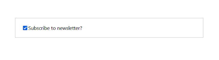
The focus here is on the appearance property, which we set to none. This lets us create a custom design for the checkbox. The checkboxes should now look like this:
Next, we need to style the custom box when the field is checked. We can do this by dynamically adding a custom class to the input element, which we can then style. We can also use the :checked pseudo-class selector to match every checked box.
Adding a custom class to the input element
We will use the ternary operator to add a custom class to the input if the isChecked state variable is true:
const Checkbox = ({ label, checked, ...props }) => {
  // ...
  return (
    <div className="checkbox-wrapper">
      <label>
        <input
          // ...
          className={isChecked ? "checked" : ""}
        />
      </label>
    </div>
  );
};
export default Checkbox;
Then we can style the selected input field with CSS using the dynamic class like so:
input.checked {
  background-color: #007a7e;
  position: relative;
}
Before we take a look at the design, let’s add a check mark to indicate that the field is checked. To do this, we will use the CSS content property with the ::before pseudo-element to insert the check mark.
Our updated CSS file should have the following:
input.checked::before {
  content: "\2714";
  font-size: 1.5em;
  color: #fff;
  position: absolute;
  right: 1px;
  top: -5px;
}
Next, let’s add the following styles for the disabled and focus states:
.checkbox-wrapper input[type="checkbox"]:disabled {
  border-color: #c0c0c0;
  background-color: #c0c0c0;
}

.checkbox-wrapper input[type="checkbox"]:disabled + span {
  color: #c0c0c0;
}

.checkbox-wrapper input[type="checkbox"]:focus {
  box-shadow: 0 0 20px #007a7e;
}
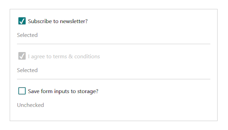
The checkboxes should now look like so:
Using the :checked selector instead of adding a custom class
If we don’t want to add a custom class to the input as we did above, we can use the :checked selector on the input to target the checked element and then style it accordingly. In this case, we can remove the className attribute from the input element so it looks like this:
<input
  type="checkbox"
  checked={isChecked}
  onChange={() => setIsChecked((prev) => !prev)}
  {...props}
/>
Then, we replace the .checked class selector with the :checked pseudo-class selector:
input:checked {
  background-color: #007a7e;
  position: relative;
}

input:checked::before {
  content: "\2714";
  font-size: 1.5em;
  color: #fff;
  position: absolute;
  right: 1px;
  top: -5px;
}
At this point, we can save all files and test our project. See the demo and complete code on CodeSandbox.
The input and label elements as siblings instead of nested
Sometimes, we may want to have the input and label elements as siblings instead of nesting the input directly inside the label. In this case, we must make provision for a unique id to associate every label with their input element.
For this, each of the <Checkbox /> elements must include a unique id prop like so:
import Checkbox from "./Checkbox";
const App = () => {
  return (
    <div className="app">
      <Checkbox
        id="subscribeNews"
        label="Subscribe to newsletter?"
        checked={true}
      />
      {/* other checkboxes */}
    </div>
  );
}
export default App;
Then in the Checkbox component, we can access the id and use it to associate the input element with the label, like so:
const Checkbox = ({ id, label, checked, ...props }) => {
  // ...
  return (
    <div className="checkbox-wrapper">
      <input
        id={id}
        type="checkbox"
        checked={isChecked}
        onChange={() => setIsChecked((prev) => !prev)}
        {...props}
      />
      <label htmlFor={id}>{label}</label>
    </div>
  );
}

export default Checkbox;
Conclusion
Building a custom checkbox is ideal if we want to maintain a consistent appearance across browsers and devices. In HTML, we only need to customize the native checkbox. React, however, wants us to control the checkboxes so they are in sync with the component state.
In this tutorial, we learned how to work with form control in React while also building a custom checkbox. If you enjoyed reading this tutorial, endeavor to share it around the web. And if you have questions and or contributions, share your thoughts in the comment section.
The post Building a custom checkbox in React appeared first on LogRocket Blog.
from LogRocket Blog https://ift.tt/7ACdUjy
via Read more


