Adding animations to a web app can be a challenging task, so it’s natural to reach for a library to make it easier. AnimXYZ, a composable CSS animation toolkit, allows you to compose complex animations by combining simple utility classes.
In this article, we’ll guide you through the process of adding animations to your React application using AnimXYZ. At the end of the tutorial, you will have built an animated webpage that looks like the following:

To follow along with this tutorial, you’ll need the following:
- A text editor
- Node.js installed locally on your machine
- Working knowledge of HTML, CSS, and JavaScript
- Working knowledge of CSS animations
- Working knowledge of React
You can find the complete code for this tutorial at this CodeSandbox. Let’s get started!
Table of contents
- What is AnimXYZ?
- Why use AnimXYZ?
- Getting started: AnimXYZ with React
- Composition with utilities
- Animation context
What is AnimXYZ?
AnimXYZ is an animation library that simplifies adding CSS animations to a website or web application. AnimXYZ animations all compile to regular CSS behind the scenes, meaning they generally behave the same way CSS animations do. Once the page loads, the elements trigger automatically, run for the specified number of iterations, and then return to their original state.
Why use AnimXYZ?
AnimXYZ is extremely easy to use. It allows you to build animations by describing them in words with utilities instead of having to write keyframes. It allows for easy customization of all aspects of the animations via CSS variables.
AnimXYZ is also very performant, allowing you to create complex CSS animations while writing as few lines of code as possible. With a maximum size of only 11.4kB, it also includes support for Vue and React.
Getting started: AnimXYZ with React
Before we jump into the code, let’s briefly review the essential concepts you need to begin using AnimXYZ in your React projects.
The XyzTransition component
The XyzTransition component is a React component provided by AnimXYZ. As an extension of the React TransitionGroup component, which applies animations to elements as they enter or leave the page, XyzTransition is the recommended way to use AnimXYZ in React applications. It is also responsible for animating switching between elements.
The XyzTransition component can only have one direct child at a time. However, it does come with a caveat. You shouldn’t use a React component as a direct child of this component. Only HTML elements should be direct children of XyzTransition. Therefore, if you want to animate React components, they will have to be wrapped with an HTML element like so:
<XyzTransition> <div><ReactComponent /></div> </XyzTransition>
The XyzTransition component takes a few properties.
For one, the appear property, which, when set to true, means the element will animate on the page when it is first rendered. If appear is false, the element will have no animation when the page is first rendered, but it will animate when its presence is toggled on the page.
The appearVisible property, which functions similarly to appear, will pause the animation until the element is visible on the screen. The duration property controls the length of the animation, and finally, the mode property controls the animation behavior when switching between elements.
The default AnimXYZ behavior is to transition both elements simultaneously, but, using mode, you can decide to either transition the new element in first, or transition the old element out first.
The XyzTransitionGroup component
The XyzTransitionGroup component is similar to the XyzTransition component. It is also an extension of the React TransitionGroup component that is used to apply an animation to groups or lists of elements.
XyzTransitionGroup has the same caveat as the XyzTransition component, meaning that all of the direct children of this component need to be HTML elements and not React components.
It also has the same properties as the XyzTransition component with one extra, a tag property that specifies the HTML tag to use as the wrapper element.
Composition with utilities
The core idea behind AnimXYZ is to allow you to write CSS animations while saving you the effort of writing keyframes. In AnimXYZ, you add animation to an element by passing utilities that describe your desired animation as the value of the xyz attribute.
Here’s an example using placeholder values:
<XyzTransition xyz="util-1 util-2 util-3">
  <div></div>
</XyzTransition>
Animation context
When you use AnimXYZ, placing the xyz attribute on one of the AnimXYZ components or any of their children creates an animation context on that element. Any AnimXYZ animations that occur on the children of the element that you placed the xyz attribute on will use the same animation variables by default.
This feature is most useful when you use the XyzTransitionGroup component to animate a group of similar elements:
<XyzTransitionGroup appear xyz="util-1 util-2">
  <div className="square" />
  <div className="square" />
  <div className="square" />
</XyzTransitionGroup>
Because of the animation context on the XyzTransitionGroup component, each child div will have the animations described by the utilities in the xyz attributes.
Animating nested elements
The XyzTransitionGroup component is useful for animating a collection of elements, but it isn’t suitable when you want to animate more complex parent-child structures.
In these situations, instead of having to describe the animation for each child component, you can add an xyz-nested class to the child elements of an XyzTransition component:
<XyzTransition xyz="util-1 util-2 util-3">
  <div class="xyz-nested">Child 1</div>
  <div class="xyz-nested" xyz="util-4 util-5">
    <div class="xyz-nested"></div>
    <div class="xyz-nested"></div>
  </div>
  <div class="xyz-nested">Child 3</div>
</XyzTransition>
Each child with an xyz-nested class will inherit the same animation set on its parent. It can modify those animations by adding new utilities to an xyz attribute of its own. If the utilities in the xyz attribute of the child conflict with the utilities of the parent, the child’s utilities take precedence.
The animation direction
All CSS animations have a direction property that controls whether the animation should be played forwards, backwards, or in alternate cycles.
By default, the animation you describe in the xyz attribute will be applied in the forward direction as the element is added to the DOM, and the animation direction will be reversed when the element is removed from the DOM.
Like most aspects of AnimXYZ, you can customize this behavior by reading more information in the documentation.
Build an animated webpage in React with AnimXYZ
Let’s run through a practical example using AnimXYZ by building an animated mock webpage in React.
Create a React project
First, create a React project by running the following command in your terminal:
npx create-react-app react-animxyz
The command above will create a folder called react-animxyz and set up a basic React project inside the folder. After the command above finishes running, change directories to react-animxyz by running the following code:
cd react-animxyz
Install AnimXYZ
Next, add AnimXYZ to your React project by running the following command in your terminal:
npm install @animxyz/react
If you get an npm error saying npm can’t resolve the dependency tree, run the command again with the --legacy-peer-deps flag. This error is caused by the inconsistency between the React version specified as a dependency by AnimXYZ, React v17, versus the version installed by Create React app, React v18.
Then, start your React project with the following command:
npm run start
If you visit localhost:4000 on your device, you’ll see the initial version of your webpage.
Add styling for the webpage
Create a file called styles.css inside react-animxyz/src. We’ll refer to it as just src from now on. To style all the elements of the webpage, we’ll add the following CSS code into it, which is responsible for the color, size, and spacing of the elements in the webpage:
body {
  padding: 0;
}
p {
  margin: 0;
}
.page-wrap {
  border: 2px solid blue;
  border-radius: 5px;
  background-color: black;
}
.page-hero {
  padding: 30px 0;
  background-color: skyblue;
  text-align: center;
}
.hero-logo {
  width: 7vw;
  height: 7vw;
  border-radius: 51%;
  background-color: deepskyblue;
  margin: 0 auto;
  margin-bottom: 10px;
}
.page-features {
  padding: 30px 0;
  display: flex;
  justify-content: center;
}
.feature-item {
  width: 25vw;
  height: 20vh;
  border-radius: 5px;
  background-color: deepskyblue;
  margin: 0 10px;
}
.page-section {
  margin: 15px;
  background-color: skyblue;
  border-radius: 5px;
  padding: 15px;
  display: flex;
}
.section-left {
  display: flex;
  flex-direction: column;
  width: 50%;
}
.section-item {
  width: 80%;
  height: 5vh;
  border-radius: 5px;
  margin: 5px 0;
  background-color: gray;
}
.section-right {
  background-color: deepskyblue;
  border-radius: 5px;
  width: 50%;
}
.page-footer {
  background-color: skyblue;
  padding: 10px 15px;
  display: flex;
  justify-content: space-between;
}
.footer-logo {
  height: 30px;
  width: 30px;
  border-radius: 50%;
  background-color: deepskyblue;
}
.footer-right {
  display: flex;
}
.footer-item {
  background-color: gray;
  width: 50px;
  border-radius: 10px;
  margin: 0 5px;
}
Create the header
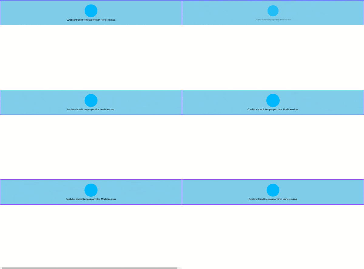
Next, we’ll create the header of our webpage. Create a file in the src folder and call it Header.jsx, then put the following code in it:
export default function Header() {
    return (
      <div
        className="page-hero"
        xyz="fade small stagger ease-out-back duration-30"
      >
        <div className="hero-logo xyz-nested"></div>
        <p className="hero-text xyz-nested">
          Curabitur blandit tempus porttitor. Morbi leo risus.
        </p>
      </div>
    );
}
The function returns a div that will be the header of the webpage. The animation you have created for the header is described by the utilities in the xyz attribute. Let’s go over these utilities to explain what they do:
fade: Animates an element’s opacity to fade it out of visibilitysmall: Scales an element down along the x,y, and z-axesstagger: Adds a delay to each child element so that individual animations execute in sequence instead of at the same timeEase-out-back: Changes the speed curve of the animation and adds a slight overshoot to its endduration: Sets the length of the animation. Theduration-30variant in this example specifies that the animation should last for three seconds
By combining these utilities in the xyz attribute, you’ve described an animation where the element simultaneously fades out of view and shrinks itself down along all three axes. You’ve also specified that any animations on the child elements should execute in sequence.
The xyz-nested class on the child elements allow them to inherit the animation described on their parent element.
Open your src/App.js file and replace its contents with the following code:
import "./styles.css";
import Header from "./Header.jsx";
import "@animxyz/core";
import { XyzTransition } from "@animxyz/react";

export default function App() {
  return (
    <XyzTransition appear duration="auto">
      <div className="page-wrap">
        <Header />
      </div>
    </XyzTransition>
  );
}
In the code above, you imported the CSS for the page and the header component, as well as the core of AnimXYZ and the XyzTransition component. Finally, you rendered the header as a child of an XyzTransition component.
Keep in mind that a React component shouldn’t be a direct child of the XyzTransition component, so you’ll have all your React components as children of the wrapper div. The appear prop is required for the animations to trigger as soon as the page loads.
If you go to localhost:4000, your webpage should now look like the following:

Create the body
Next, we’ll create the body of our webpage. Create a new file in the src folder and call it Body.jsx. Next, put the following code in it:
export default function Body() {
  return (
    <>
      <div
        className="page-features"
        xyz="fade flip-down stagger duration-10 delay-2 ease-out-back"
      >
        <div className="feature-item xyz-nested"></div>
        <div className="feature-item xyz-nested"></div>
        <div className="feature-item xyz-nested"></div>
      </div>
    </>
  );
}
The code above introduced some new utilities, so let’s go over them:
Flip-down: Animates the element downwards along the x-axisDelay: Delays the start of the animation for some time. Thedelay-2variant delays the animation by 0.2 seconds
Now, add the following code at the end of the JSX you’re returning in Body:
<div
        className="page-section"
        xyz="fade small stagger delay-4 ease-in-out"
>
        <div className="section-left" xyz="fade left stagger">
          <div className="section-item xyz-nested"></div>
          <div className="section-item xyz-nested"></div>
          <div className="section-item xyz-nested"></div>
        </div>
        <div className="section-right xyz-nested" xyz="fade big delay-10"></div>
</div>
There are a few new utilities here to take note of:
ease-in-out: Changes the speed curve of the animation to the standardease-in-outvalueBig: Like thesmallutility, thebigutility scales the element along all three axes, but it scales the element up instead of downLeft: UsestranslateXto shift the element to the left, then animate it to its usual position
Next, render the code above on the page by including the Body component in the return value of your App function. Import Body.jsx at the top of App.js by adding the following line to your code:
import Body from "./Body.jsx"
Then, render the component on the page by including it in the return value like so:
export default function App() {
  return (
    <XyzTransition appear duration="auto">
      <div className="page-wrap">
        <Header />
        <Body />
      </div>
    </XyzTransition>
  );
}
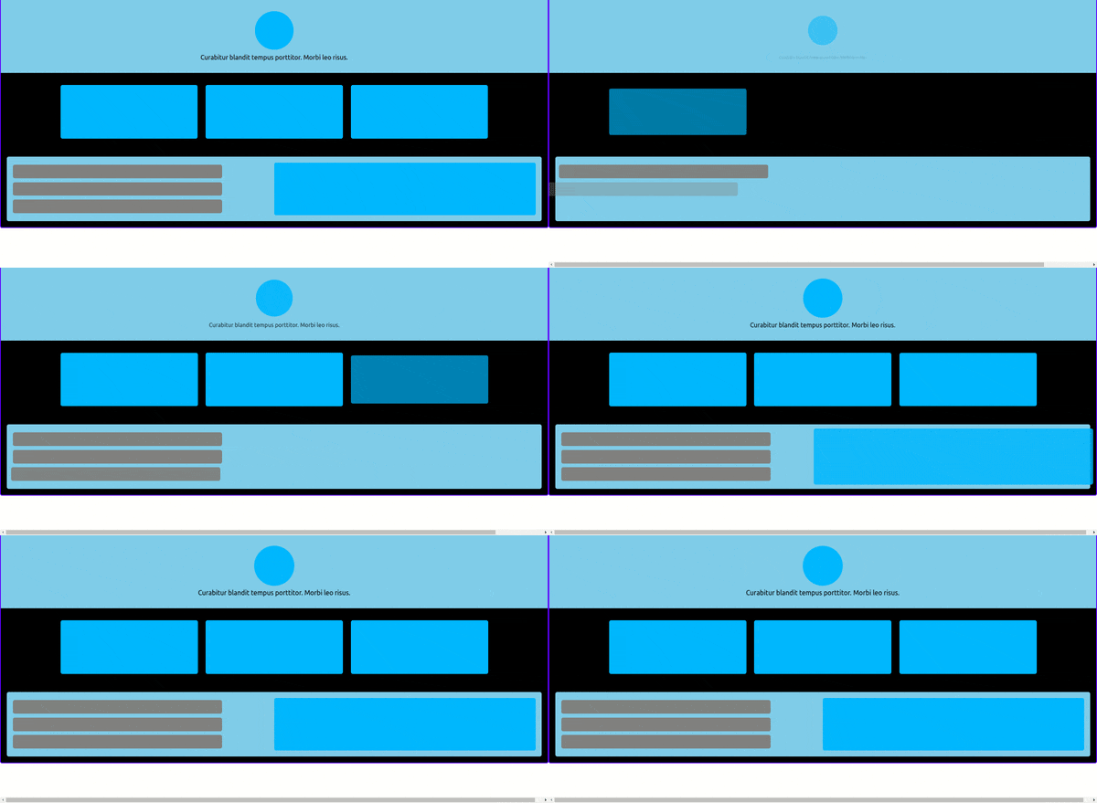
Your webpage should now look like the following:

Create the footer
Finally, we need to create the footer. Create a file in the src folder and call it Footer.jsx. Add the following code in it:
export default function Footer() {
  return (
    <div className="page-footer" xyz="fade down ease-in-out delay-10">
      <div
        className="footer-logo xyz-nested"
        xyz="fade left ease-in-out delay-10"
      ></div>
      <div className="footer-right" xyz="fade up stagger ease-in-out delay-10">
        <div className="footer-item xyz-nested"></div>
        <div className="footer-item xyz-nested"></div>
        <div className="footer-item xyz-nested"></div>
      </div>
    </div>
  );
}
There are only a couple of new utilities introduced here:
Up: UsestranslateYto shift the element up, then animate it to its usual positionDown: Does the same thing as theuputility, but in the opposite direction
Then, import Footer.jsx the same way you imported Body.jsx, and add your footer component to your App function. The final contents of your App.js should look like the code below:
import "./styles.css";
import Header from "./Header.jsx";
import Body from "./Body.jsx"
import Footer from "./Footer.jsx"
import "@animxyz/core";
import { XyzTransition } from "@animxyz/react";
export default function App() {
  return (
    <XyzTransition appear duration="auto">
      <div className="page-wrap">
        <Header />
        <Body />
        <Footer />
      </div>
    </XyzTransition>
  );
}
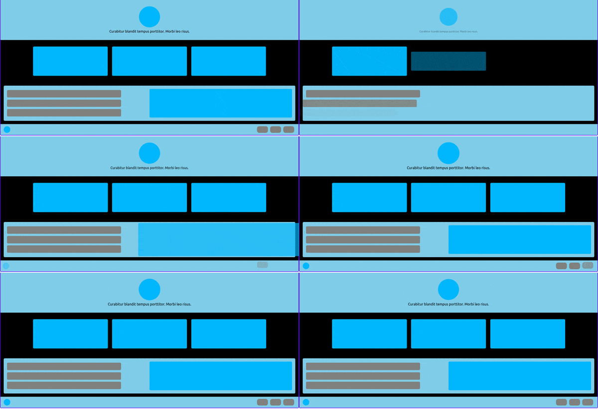
Your complete webpage should look like this:

Conclusion
AnimXYZ is an extremely helpful library to use when you want to write CSS animations. You can find a full list of AnimXYZ utilities in the animation section of the documentation, as well as instructions on how to customize AnimXYZ and an overview of how it works behind the scenes.
Thanks for reading, and have fun with AnimXYZ!
The post Animate a React app with AnimXYZ appeared first on LogRocket Blog.
from LogRocket Blog https://ift.tt/VESfZNx
via Read more


