


As developers, we often strive to optimize our workflows as much as possible, saving time by leveraging tools like the terminal. A command palette is one such tool that displays recent activity in a web or desktop application, enabling quick navigation, easy access to commands, and shortcuts, among other things.
To elevate your productivity level, a command palette is essentially a UI component that takes the form of a modal. A command palette is especially useful in large, complex applications with many moving parts, for example, where it might take you several clicks or skimming through multiple dropdowns to access a resource.
In this tutorial, we’ll explore how to build a fully functional command palette from scratch using the Headless UI Combobox component and Tailwind CSS.
- Real world use cases for a command palette
- Essential features of a command palette
- Building the component
- react-command-palette: Prebuilt component
Real-world use cases for a command palette
As a developer, there’s a very high chance that you’ve used a command palette before. The most popular one is the VS Code command palette, but there are many other examples, including the GitHub Command Palette, Linear, Figma, Slack, monkeytype, and more.
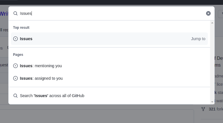
The GitHub app
GitHub recently released a command palette feature that is still in public beta at the time of writing. It lets you quickly jump to different pages, search for commands, and get suggestions based on your current context. You can also narrow the scope of the resources you’re looking for by tabbing into one of the options or using a special character:
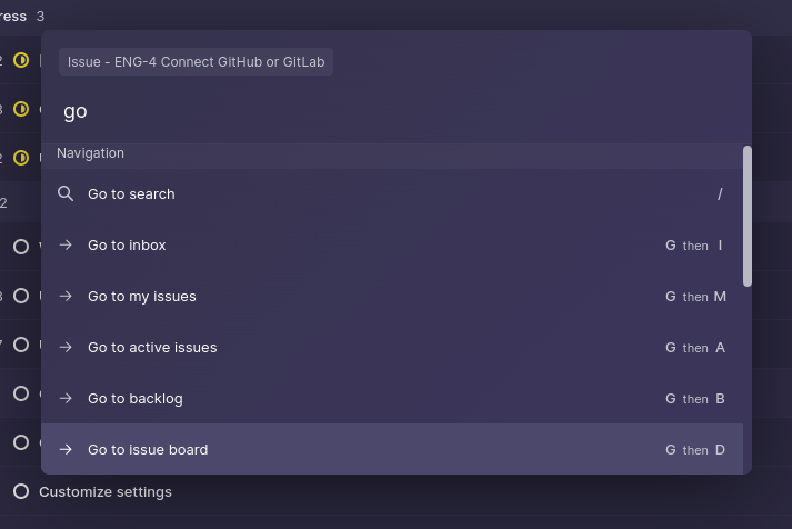
The Linear app
If you’re not familiar with Linear, it’s a project management tool similar to Jira and Asana that offers a really great user experience. Linear has a very intuitive command palette that lets you access the entire application’s functionality with its keyboard-first design. In this tutorial, we’ll build a command palette similar to Linear:
Essential features of a command palette
Several modern applications are implementing command palettes as a feature, but what makes a good command palette component? Here’s a concise list of things to look out for:
- A simple shortcut to open the palette, i.e.,
ctrl + k - It can be accessible from anywhere in the application
- It has extensive search features, such as fuzzy search
- Commands communicate intent and are easy to understand
- It provides access to every part of the application from one place
In the next section, we’ll build our own component that includes all the features listed above. Let’s get into it!
Building the component
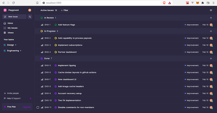
The command palette is not actually as complex as it seems, and anyone can build one quickly. I’ve prepared a starter project for this tutorial so that you can easily follow along. The starter project is a React and Vite SPA that replicates the Linear issues page.
Setting up the project
To get started, clone the repository into your local directory, install the necessary dependencies, and start the development server. The project uses Yarn, but if you’re more comfortable with npm or pnPm, you can delete the yarn.lock file before running npm install or pnpm install:
// clone repository
$ git clone https://github.com/Mayowa-Ojo/command-palette
// switch to the 'starter-project' branch
$ git checkout starter-project
// install dependencies
$ yarn
// start dev server
$ yarn dev
If you visit localhost:3000, you’ll see the following page:
The CommandPalette component
Next, we’ll build the component. We’ll use the Headless UI combobox and dialog components. combobox will be the base component for our command palette. It has built-in features like focus management and keyboard interaction. We’ll use the dialog component to render our command palette in a modal.
To style the components, we’ll use Tailwind CSS. Tailwind is a CSS utility library that lets you easily add inline styles in your HTML or JSX files. The starter project already includes the configuration for Tailwind.
Install the necessary dependencies as follows:
$ yarn add @headlessui/react @heroicons/react
In the components folder, create a CommandPalette.jsx file and add the following code block:
import { Dialog, Combobox } from "@headlessui/react";

export const CommandPalette = ({ commands }) => {
  const [isOpen, setIsOpen] = useState(true);

  return (
    <Dialog
      open={isOpen}
      onClose={setIsOpen}
      className="fixed inset-0 p-4 pt-[15vh] overflow-y-auto"
    >
      <Dialog.Overlay className="fixed inset-0 backdrop-blur-[1px]" />
      <Combobox
         as="div"
         className="bg-accent-dark max-w-2xl mx-auto rounded-lg shadow-2xl relative flex flex-col"
         onChange={(command) => {
            // we have access to the selected command
            // a redirect can happen here or any action can be executed
            setIsOpen(false);
         }}
      >
         <div className="mx-4 mt-4 px-2 h-[25px] text-xs text-slate-100 bg-primary/30 rounded self-start flex items-center flex-shrink-0">
            Issue
         </div>
         <div className="flex items-center text-lg font-medium border-b border-slate-500">
            <Combobox.Input
               className="p-5 text-white placeholder-gray-200 w-full bg-transparent border-0 outline-none"
               placeholder="Type a command or search..."
            />
         </div>
         <Combobox.Options
            className="max-h-72 overflow-y-auto flex flex-col"
            static
         ></Combobox.Options>
      </Combobox>
   </Dialog>
  );
};
A few things are happening here. First, we import the Dialog and Combobox components. Dialog is rendered as a wrapper around the Combobox, and we initialize a local state called isOpen to control the modal.
We render a Dialog.Overlay inside the Dialog component to serve as the overlay for the modal. You can style this however you want, but here, we’re just using backdrop-blur. Then, we render the Combobox component and pass in a handler function to the onChange prop. This handler is called whenever an item is selected in the Combobox. You’d typically want to navigate to a page or execute an action here, but for now, we just close the Dialog.
Combobox.Input will handle the search functionality, which we’ll add later in this section. Combobox.Options renders a ul element that wraps the list of results we’ll render. We pass in a static prop that indicates we want to ignore the internally managed state of the component.
Next, we render our CommandPalette in the App.jsx file:
const App = () => {
   return (
      <div className="flex w-full bg-primary h-screen max-h-screen min-h-screen overflow-hidden">
         <Drawer teams={teams} />
         <AllIssues issues={issues} />
         <CommandPalette commands={commands}/>
      </div>
   );
};
Let’s talk about how our command palette will function. We have a list of predefined commands in the data/seed.json file. These commands will be displayed in the palette when it’s opened and can be filtered based on the search query. Fairly simple, right?
The CommandGroup component
CommandPalette receives a commands prop, which is the list of commands we imported from seed.json. Now, create a CommandGroup.jsx file in the components folder and add the following code:
// CommandGroup.jsx
import React from "react";
import clsx from "clsx";
import { Combobox } from "@headlessui/react";
import { PlusIcon, ArrowSmRightIcon } from "@heroicons/react/solid";
import {
   CogIcon,
   UserCircleIcon,
   FastForwardIcon,
} from "@heroicons/react/outline";
import { ProjectIcon } from "../icons/ProjectIcon";
import { ViewsIcon } from "../icons/ViewsIcon";
import { TemplatesIcon } from "../icons/TemplatesIcon";
import { TeamIcon } from "../icons/TeamIcon";

export const CommandGroup = ({ commands, group }) => {
   return (
      <React.Fragment>
         {/* only show the header when there are commands belonging to this group */}
         {commands.filter((command) => command.group === group).length >= 1 && (
            <div className="flex items-center h-6 flex-shrink-0 bg-accent/50">
               <span className="text-xs text-slate-100 px-3.5">{group}</span>
            </div>
         )}
         {commands
            .filter((command) => command.group === group)
            .map((command, idx) => (
               <Combobox.Option key={idx} value={command}>
                  {({ active }) => (
                     <div
                        className={clsx(
                           "w-full h-[46px] text-white flex items-center hover:bg-primary/40 cursor-default transition-colors duration-100 ease-in",
                           active ? "bg-primary/40" : ""
                        )}
                     >
                        <div className="px-3.5 flex items-center w-full">
                           <div className="mr-3 flex items-center justify-center w-4">
                              {mapCommandGroupToIcon(
                                 command.group.toLowerCase()
                              )}
                           </div>
                           <span className="text-sm text-left flex flex-auto">
                              {command.name}
                           </span>
                           <span className="text-[10px]">{command.shortcut}</span>
                        </div>
                     </div>
                  )}
               </Combobox.Option>
            ))}
      </React.Fragment>
   );
};
We’re simply using the CommandGroup component to avoid some repetitive code. If you look at the Linear command palette, you’ll see that the commands are grouped based on context. To implement this, we need to filter out the commands that belong to the same group and repeat that logic for each group.
The CommandGroup component receives two props, commands and group. We’ll filter the commands based on the current group and render them using the Combobox.Option component. Using render props, we can get the active item and style it accordingly, allowing us to render the CommandGroup for each group in the CommandPalette while keeping the code clean.
Note that we have a mapCommandGroupToIcon function somewhere in the code block above. This is because each group has a different icon, and the function is just a helper to render the correct icon for the current group. Now, add the function just below the CommandGroup component in the same file:
const mapCommandGroupToIcon = (group) => {
   switch (group) {
      case "issue":
         return <PlusIcon className="w-4 h-4 text-white"/>;
      case "project":
Now, we need to render the CommandGroup component in CommandPalette.
Import the component as follows:
import { CommandGroup } from "./CommandGroup";
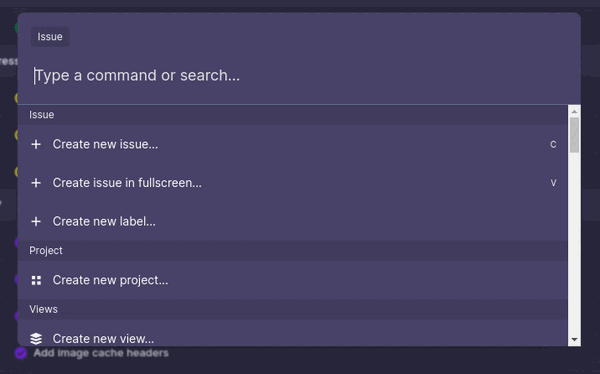
Render it inside the Combobox.Options for each group:
<Combobox.Options
   className="max-h-72 overflow-y-auto flex flex-col"
   static
>
   <CommandGroup commands={commands} group="Issue"/>
   <CommandGroup commands={commands} group="Project"/>
   <CommandGroup commands={commands} group="Views"/>
   <CommandGroup commands={commands} group="Team"/>
   <CommandGroup commands={commands} group="Templates"/>
   <CommandGroup commands={commands} group="Navigation"/>
   <CommandGroup commands={commands} group="Settings"/>
   <CommandGroup commands={commands} group="Account"/>
</Combobox.Options>
You should see the list of commands being rendered now. The next step is to wire up the search functionality.
Implementing the search functionality
Create a local state variable in CommandPalette.jsx:
// CommandPalette.jsx
const [query, setQuery] = useState("");
Pass the state update handler to the onChange prop in Combobox.Input. The query will be updated with every character you type in the input box:
<Combobox.Input
  className="p-5 text-white placeholder-gray-200 w-full bg-transparent border-0 outline-none"
  placeholder="Type a command or search..."
  onChange={(e) => setQuery(e.target.value)}
/>
One of the key properties of a good command palette is extensive search functionality. We can just do a simple string comparison of the search query with the commands, however that wouldn’t account for typos and context. A much better solution that doesn’t introduce too much complexity is a fuzzy search.
We’ll use the Fuse.js library for this. Fuse.js is a powerful, lightweight, fuzzy search library with zero dependencies. If you’re not familiar with fuzzy searching, it is a string matching technique that favors approximate matching over the exact match, implying that you can get correct suggestions even if the query has typos or misspellings.
First, install the Fuse.js library:
$ yarn add fuse.js
In CommandPalette.jsx, instantiate the Fuse class with a list of commands:
// CommandPalette.jsx
const fuse = new Fuse(commands, { includeScore: true, keys: ["name"] });
The Fuse class accepts an array of commands and configuration options. The keys field is where we register what fields are in the commands list to be indexed by Fuse.js. Now, create a function that will handle the search and return the filtered results:
// CommandPalette.jsx
const filteredCommands =
  query === ""
     ? commands
     : fuse.search(query).map((res) => ({ ...res.item }));
We check if the query is empty, return all the commands, and if not, run the fuse.search method with the query. Also, we’re mapping the results to create a new object. This is to maintain consistency because the results returned by Fuse.js have some new fields and will not match the structure we already have.
Now, pass the filteredCommands to the commands prop in each CommandGroup component. It should look like the code below:
// CommandPalette.jsx
<CommandGroup commands={filteredCommands} group="Issue"/>
<CommandGroup commands={filteredCommands} group="Project"/>
<CommandGroup commands={filteredCommands} group="Views"/>
<CommandGroup commands={filteredCommands} group="Team"/>
<CommandGroup commands={filteredCommands} group="Templates"/>
<CommandGroup commands={filteredCommands} group="Navigation"/>
<CommandGroup commands={filteredCommands} group="Settings"/>
<CommandGroup commands={filteredCommands} group="Account"/>
Try searching in the command palette and see if the results are being filtered:
We have a fully functional command palette, but you might notice that it’s always open. We need to be able to control its open state. Let’s define a keyboard event that will listen for a key combination and update the open state. Add the following code to CommandPalette.jsx:
// CommandPalette.jsx
useEffect(() => {
  const onKeydown = (e) => {
     if (e.key === "k" && (e.metaKey || e.ctrlKey)) {
        e.preventDefault();
        setIsOpen(true);
     }
  };
  window.addEventListener("keydown", onKeydown);
  return () => {
     window.removeEventListener("keydown", onKeydown);
  };
}, []);
We’re using a useEffect Hook to register a keydown keyboard event when the component is mounted, and we use a clean-up function to remove the listener when the component unmounts.
In the Hook, we check if the key combination matches ctrl + k. If it does, then the open state is set to true. You can also use a different key combination, but it’s important not to use combinations that clash with the native browser shortcuts.
That’s it! You can find the finished version of this project on the finished-project branch.
react-command-palette: Prebuilt component
We’ve explored how to build a command palette component from scratch. However, you’d probably rather not build your own every time you need a command palette. That’s where a prebuilt component can be useful. Most component libraries do not offer a command palette, but react-command-palette is a well written component that is accessible and browser compatible.
To use this component, install it as a dependency in your project:
$ yarn add react-command-palette
Import the component and pass your list of commands to it as follows:
import React from "react";
import CommandPalette from 'react-command-palette';

const commands = [{
  name: "Foo",
  command() {}
},{
  name: "Bar",
  command() {}
}]

export default function App() {
  return (
    <div>
      <CommandPalette commands={commands} />
    </div>
  );
}
There are a lot of config options that you can use to customize the look and behavior to meet your requirements. For example, the theme config lets you choose from a number of built-in themes or create your own custom theme.
Next steps
In this article, you’ve learned about command palettes, the ideal use cases for them, and what features make up a good command palette. You’ve also explored in detailed steps how to build one using the Headless UI combobox component and Tailwind CSS.
If you just want to quickly ship this feature in your application, then a prebuilt component like react-command-palette is the way to go. Thanks for reading, and be sure to leave a comment if you have any questions.
The post React command palette with Tailwind CSS and Headless UI appeared first on LogRocket Blog.
from LogRocket Blog https://ift.tt/UHD8MdQ
via Read more


