


When it comes to frontend development, the clearer the UI, the better. This is especially true for mobile development’s smaller screen sizing.
Borders allow us to highlight information and CTAs in a mobile app. Having a border by itself, however, is not enough. In order to make the borders more attractive and cohesive with the rest of the interface, you may find yourself in need of some advanced border styling.
In this post, we’ll cover how to create an engaging gradient border for lists and buttons.
- Setting up a sample to-do list
- Using Swift to apply gradients borders to a list
- Applying gradient borders to buttons using Swift
Setting up a sample to-do list
Since the focus of this post is creating and applying gradient borders, I won’t go into depth on how to actually create the to-do list we’ll use as an example. However, I followed this tutorial on creating a list and list items for your reference. The full source code for this blog post can be found on GitHub.
Below is what our to-do list looks like before we construct and apply any gradients:
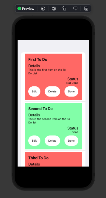
As you can see, each list item contains a title, details, status, and buttons. Specifically, the buttons execute an action associated with the corresponding text. We will refer to these collectively as actions.
The background color is determined by the status of the to-do list item. The list is red if the item isn’t complete and green if it is. Simple, right?
Using Swift to apply gradients borders to a list
While the background color can help us differentiate between different list items, it’s a bit boring. I personally don’t like how the actions and list items themselves blend with the background.
A border can not only highlight and differentiate UI elements, but can also provide more depth and personality. This is where our gradient borders can come in handy!
First, let’s declare our gradient borders. We can store these gradients in a file called MyGradients.swift.
We’ll be constructing overlays to layer borders over our views. An overlay allows you to layer a secondary View over a provided View. To use them, you can simply create a separate View and tack it onto another one, like so:
SomeView().overlay(
SomeOtherView()
)
If you wanted to do more with the overlay than just rendering a secondary View by itself, such as adjusting the alignment, you can write your overlay like this:
SomeView().overlay(
    alignment: .topLeading
){
    SomeOtherView()
}
For our specific case, our gradients will be passed as overlays without specified alignment to the Views used for our to-do list items and actions.
The first thing we’ll do in our MyGradients.swift is import SwiftUI and create a gradient to use for our borders. You can see this below:
import SwiftUI

var myGradient = Gradient(
    colors: [
        Color(.systemTeal),
        Color(.systemPurple)
    ]
)
Here, we are making use of the Gradient class provided by SwiftUI. This class accepts a list of Color instances as arguments. You can add as many colors as you want, but we’ll stop at two for now.
The next thing we’ll want to create is our CardGradient. This will be the gradient border that we use for our to-do list items.
We do this by creating a struct that conforms to the View protocol. In the body, we’ll extend the View protocol again and use the Rectangle structure. We will use this shape because our to-do items render it by default.
This process is outlined below:
struct CardGradient: View{
    var body: some View {
        Rectangle()
            .stroke(
                LinearGradient(
                    gradient: myGradient,
                    startPoint: .leading,
                    endPoint: .trailing
                ),
                lineWidth: 5
            )
    }
}
The stroke(...) that you see tacked on to our Rectangle instance returns a new shape that essentially acts as the provided one. In this case, a Rectangle is the expanse of our to-do list item with a stroked path (i.e., a border) whose line width is defined by the lineWidth value. We’ll include our gradient using LinearGradient in the content of the stroked path.
I would like to note that we are using LinearGradient as opposed to RadialGradient because the difference is more noticeable. With RadialGradient, the gradient radiates from the center outward. This is better for larger, solid shapes, as opposed to long, thin stroke paths.
LinearGradient needs three arguments: a gradient (the color gradient applied to the path); a startPoint; and an endPoint. We’ll provide myGradient in gradient.
For startPoint, we will use .leading to indicate that the start should be the first color in the list. endPoint is simply the reverse of startPoint. We use .trailing to indicate that the gradient should blend toward the last color in the list.
By using .leading and .trailing, we tell the linear gradient to be horizontal instead of vertical. For a vertical gradient, you could use .top and .bottom.
Now, let’s see our new gradient border in action! To do this, we need to go to CardView. We can tack on the gradient as an overlay to our View’s VStack in the body, as demonstrated below.
var body: some View {
        VStack(alignment: .leading) {
            Text(todo.title)
                .font(.headline)
            Spacer();
            Text("Details");
            Text("\(todo.content)")
                .padding(.trailing, 20)
                .font(.caption);
            Spacer();
            Text("Status")
                .frame(minWidth: 0, maxWidth: .infinity, alignment: .trailing);
            Text(todo.isDone == true ? "Done" : "Not Done")
                .font(.caption)
                .frame(minWidth: 0, maxWidth: .infinity, alignment: .trailing);
            Spacer();
            ActionsView()
        }
        .frame(minWidth: 0, maxWidth: .infinity, minHeight: 0, maxHeight: .infinity, alignment: .topLeading)
        .padding()
        .background(todo.isDone == true
                    ? Color(red: 0.5804, green: 0.9961, blue: 0.6784)
                    : Color(red: 1, green: 0.4471, blue: 0.4353)
        )
        .overlay(
            CardGradient()
        )
    }
We also implemented .overlay() to our CardGradient in the last few lines of code to apply the gradient.
Now, let’s see how this looks in the UI.
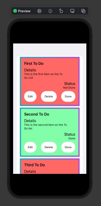
Perfect! Now we have a cool gradient border applied to our to-do list items.
Applying gradient borders to buttons using Swift
Since we’ve figured out how to make a gradient border for our list items, we can simply reapply this process to our buttons with a few tweaks. Let’s go back to MyGradients.swift to create our second gradient border: ButtonGradient.
In order to create this gradient, we can reuse a lot of the code in CardGradient. However, we need to account for the shape of the actions. If we use Rectangle, our overlay will bleed out of the buttons’ bounds and the borders will adhere more to a square shape. These will be pretty inconsistent with our actions buttons.
To fix this, we will be using Capsule instead of Rectangle:
struct ButtonGradient: View{
    var body: some View {
        Capsule()
            .stroke(
                LinearGradient(
                    gradient: myGradient,
                    startPoint: .leading,
                    endPoint: .trailing
                ),
                lineWidth: 5
            )
    }
}
As you can see, the code is pretty much the same aside from the initial shape for our View. We can see how this is applied to our buttons in our Actions.swift file.
In order to apply custom styles to each Button, we make use of a property called ButtonStyle. This property accepts a struct that conforms to ButtonStyle and contains various properties that affect the styling of our Button.
struct MyButtonStyle: ButtonStyle {


    func makeBody(configuration: Configuration) -> some View {
        HStack {
          configuration.label.foregroundColor(.black)
        }
        .padding()
        .scaleEffect(configuration.isPressed ? 0.95 : 1)
        .background(Capsule().foregroundColor(Color.white))
    }
}
This is the initial styling for our actions. It can be applied to each action button like so:
Button(action: edit) {
                Text("Edit")
                    .font(.caption)
            }
            .buttonStyle(MyButtonStyle())
Now, in order to apply our ButtonGradient to our action buttons, we can tack on overlay the same way we did for our CardView:
struct MyButtonStyle: ButtonStyle {


    func makeBody(configuration: Configuration) -> some View {
        HStack {
          configuration.label.foregroundColor(.black)
        }
        .padding()
        .scaleEffect(configuration.isPressed ? 0.95 : 1)
        .background(Capsule().foregroundColor(Color.white))
        .overlay(
           ButtonGradient()
        )
    }
}
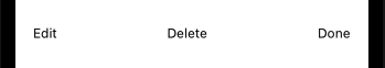
Let’s see how this looks. Below are our actions before we applied the overlay:
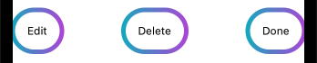
And here are our actions after applying the overlay:
Now, let’s see it all together:
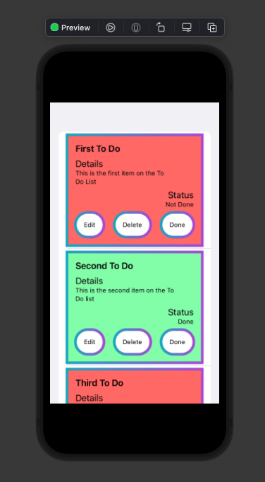
There you have it! A gradient border for our to-do list items and our actions with both gradient borders adhering to their respective element shapes. Fantastic!
Conclusion
Gradient borders for lists and buttons are a great way to differentiate your UI features and create an attractive interface.
If you want to take this further, feel free to experiment with more colors, gradient types and gradient directions!
In case you want to reference it, all of the code accompanying this post can be found on GitHub.
The post Creating gradient borders in Swift appeared first on LogRocket Blog.
from LogRocket Blog https://ift.tt/2I9CYue
via Read more


