


Table of Contents
- Setting up the Flutter app
- Using ClipRect in Flutter to clip circles
- Using CircleAvatar to clip images in Flutter
- Creating ovals in Flutter with ClipOval
- Using ClipRect to clip rectangles in Flutter
- ClipPath in Flutter
Clipping images can allow more flexibility in terms of space occupied in the UI, image appeal, and style. Clipping also allows you to remove unnecessary parts of a picture, helping users focus on a point of interest.
For example, it’s common to see your profile picture in a circular layout on social media platforms. Is this because you uploaded a circular photo? Most often, no. You simply upload whatever photo you like and the clipping is done for you, reducing the amount of space your profile picture takes up on the site. This is particularly important for mobile apps.
In this post, I’ll cover the few ways you can circle clip (and more) images in your Flutter app. Before we use our first widget for image clipping, let’s set up our app and get an actual image to use.
Setting up the Flutter app
Create an app using flutter create circle_clipper_demo.
In your widget build body, make use of the SingleChildScrollView widget. For this widget’s child property, use the Column widget and give it a center alignment. For the Column's child, use a Widget list, which will contain a Text widget and a Center widget. See below.
SingleChildScrollView(
       child: Column(
         mainAxisAlignment: MainAxisAlignment.center,
         children: <Widget>[
           const Text(
             "Hi! I'm Pizza!",
             style: TextStyle(fontSize: 25),
           ),
           Center(
             child: /// widget for picture,
           ),
         ],
       ),
     ),
Next, we need to add the widget used for our image. For this, we can use an Image widget.
const Image(image: AssetImage('./assets/pic.png'));
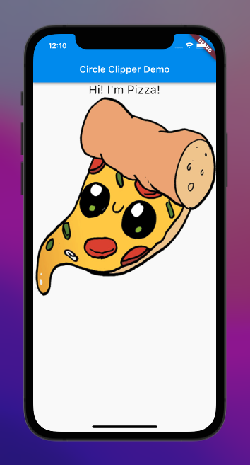
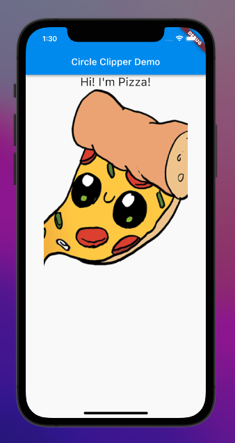
All that’s left to do now is to create an assets directory in the root of our project and find a picture we can use. I got an image from ClipArtMax. When you create the directory and add the picture to it, you need to specify your new asset in your pubspec.yaml.
# To add assets to your application, add an assets section like this:
 assets:
   - assets/
Run flutter pub get to ensure your pubspec.yaml changes are picked up, then let’s see how our app looks before any clipping.
Now that we have our app established, let’s look at how we can clip our image by making use of ClipRRect.
Using ClipRRect in Flutter to clip circles
ClipRRect is a widget used specifically for clipping its child with a rounded rectangular shape inherently. We can use this one to create a circular clipping around our image. It’s relatively easy to implement, as it essentially wraps our original Image widget and applies a border radius to it.
ClipRRect(
     borderRadius: BorderRadius.circular(300.0),
     child: const Image(image: AssetImage('./assets/pic.png')),
   );
We are using the same original Image widget, but we’re wrapping it in ClipRRect and applying a border radius to round the supplied clipping. See the two images compared below.

ClipRRectNotice that our image on the right has a round edge that cuts off (or clips) some of our original image. You can vary your level of clipping, too, by changing the border radius value. The higher the radius, the more circular it is. Easy, no?
Let’s cover the next way we can circle clip our images. We can use a widget that not only allows us to circle clip with ease but also to assign a background color to our clipped image (assuming your picture has the background removed). This widget is called CircleAvatar.
Using CircleAvatar to clip images in Flutter
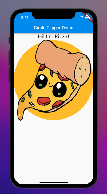
CircleAvatar is a widget provided by Material. It’s a circle that represents a user. I find it particularly useful because it’s as easy to implement as ClipRRect, but it also allows for easy backgroundColor addition to your image.
CircleAvatar(
         backgroundColor: Colors.amber,
         backgroundImage: AssetImage('./assets/pic.png'),
         radius: 200.0
);
It’s similar to ClipRRect in the sense that it uses radius (called borderRadius in ClipRRect) to determine the level of circularity applied to a clipped image. It’s important to point out, however, that if you want your picture to be clipped correctly, you must assign it to the backgroundImage property and not child. If you were to apply it to child, the image would break out of the clipping. Let’s see these two examples below.
child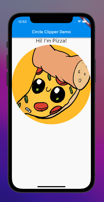
backgroundImageI like this widget because it works similarly to ClipRRect, allows flexibility for background color, and you can add a child if you want to include something besides the image (such as a badge or an “online” light) that is kept in a separate property from the image itself (rather than setting a Widget list to be assigned to child). In terms of syntax, I think it’s cleaner.
For example, you can use an AssetImage rather than wrapping AssetImage in an Image widget. Also, radius is just a double rather than having to be a property of BorderRadius. There is more flexibility with clipBehavior for ClipRRect, but for quick circle clipping (something that comes in handy for, say, a social media avatar) I really like CircleAvatar.
If, however, you want clipping that’s closer to an oval than a circle, this next widget is perfect for you.
Creating ovals in Flutter with ClipOval
ClipOval is a widget that clips the child to be in the shape of an oval. It’s very easy to use if you need ovular clipping. See below.
ClipOval(
         child: Image(image: AssetImage('./assets/pic.png'))
);
It’s very similar to ClipRRect without having to add a borderRadius property.
What if you don’t want a circular or ovular clipping path and instead, want to clip your image as a regular rectangle? For this, you can use ClipRect.
Using ClipRect to clip rectangles in Flutter
ClipRect can be thought of like ClipRRect, minus the rounded part (hence why it’s missing the second “R”). It applies a rectangular clipping path to a child widget without inherently applying rounded edges. It’s great when used with other widgets that have a tendency to paint outside their bounds, such as Align. See below.
ClipRect(
         child: Align(
           alignment: Alignment.center,
           widthFactor: 0.8,
           heightFactor: 1.0,
           child: Image(
             image: AssetImage('./assets/pic.png')
           ),
       ),
     );
Here, we are using Align to keep our image centered and adjusting the widthFactor to be less than one. See the comparison with our original image below.
ClipRectBy wrapping it in our clipper, we can create a rectangular clipping effect for our image. You can adjust the level of clipping by changing the widthFactor on the Align child.
We covered circle clipping with ClipRRect and CircleAvatar, as well as oval clipping and rectangle clipping with ClipRect. But what other shapes can we clip, and what if we want to create a more customized shape to clip our image? With our final widget of the post, we can do just that.
ClipPath in Flutter
ClipPath is a widget that allows the developer to customize their clipping shape (or path) to suit their intended effect. See the starter code below.
ClipPath(
         clipper: MyTriangle(),
         child: const Image(image: AssetImage('./assets/pic.png')),
     );
The structure is similar to our other clipping widgets, but we’re making use of an important property called clipper.
Let’s try clipping in the shape of a triangle. We can do this by creating our own clipping widget that extends the CustomClipper class. In our new clipping widget — let’s call it MyTriangle — we can define two functions.
The first is getClip, which is called whenever the custom clip needs to be updated, such as when our ClipPath widget first renders with our image. shouldReclip is called when a new instance of the clipper class is provided. For now, this function will just return false.
Our getClip, however, is the meat and potatoes of our custom clipping.
Path getClip(Size size) {
     final path = Path();
     path.moveTo(size.width/2, 0.0);
     path.lineTo(size.width, size.height);
     path.lineTo(0.0, size.height);
     path.close();
     return path;
 }
A few things are happening here. First, we instantiate the Path class. You can think of this class as a line being drawn onto the UI from point A, and, by using built-in methods (moveTo and lineTo), you can make it move to point B, to point C, to Point D, and so on.
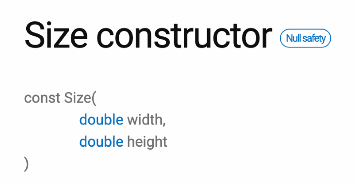
Then, when you’re ready, you can close the path (close), which brings it back to the starting point. The function takes an inherent Size instance as an argument, which has two properties, width and height.
moveTo and lineTo create what are called sub-paths. moveTo starts a new subpath at a given set of coordinates (this is why it comes first in our case), and moveTo adds a straight line segment from the current point to a new provided point. Here is the order of operations for our coordinates.
- The first X coordinate provided is
size.width/2because this gives us the halfway through point of the width (or horizontal middle) of the image. The Y coordinate is0.0because it is at the top of our image. Together, this starts us at the top middle of our image – the first corner of our triangle - The second X coordinate is
size.widthbecause that is the right-most point for our image. The Y coordinate issize.heightbecause it is at the bottom of the image. Together, this gives us the bottom-right corner of our image, the second point on the triangle - The third X coordinate is simply
0.0because it is the left-most part of our image (horizontally). The Y coordinate is stillsize.heightbecause we don’t want our path to move up or down yet. By keeping it the height of our image, the path drawn creates the bottom side of our triangle — and the convergence of our last coordinates forms the third and final corner of our triangle closeestablishes a final subpath between our last point (0.0, size.height) and our first point (size.width/2, 0.0).
Now, we just need to pass MyTriangle to the clipper property for our ClipPath widget. We should get the below result.
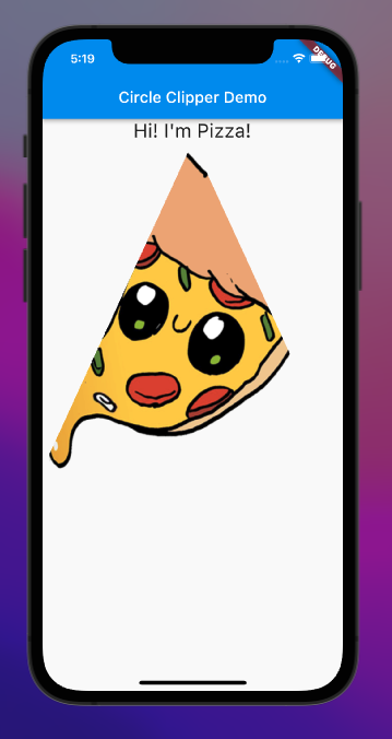
CustomClipperYou can use ClipPath to create any sort of weird and wild shapes you can think of simply by including various coordinates for however many lineTo functions you want to execute. You can clone the code for this project from GitHub and experiment with these clipping widgets for yourself! Thanks for reading!
The post Clipping circles (and more) in Flutter appeared first on LogRocket Blog.
from LogRocket Blog https://ift.tt/VWqDLX0
via Read more


