


Collaborative online documents are common in various industries, allowing people with different expertise to come together and get their work written down on (virtual) paper. They improve engagement, increase productivity, encourage problem-solving, and allow participants to learn from one another.
Automerge is a popular library for building collaboration applications in JavaScript and React ecosystems. It is easy to set up and uses a JSON-like data structure that can be modified and merged concurrently by different users.
In this tutorial, we will be building a Google Docs clone, where the user can create, view, edit and delete text documents. The editor interface will support WYSIWYG and all the edits will be automatically synced between different instances of the app.
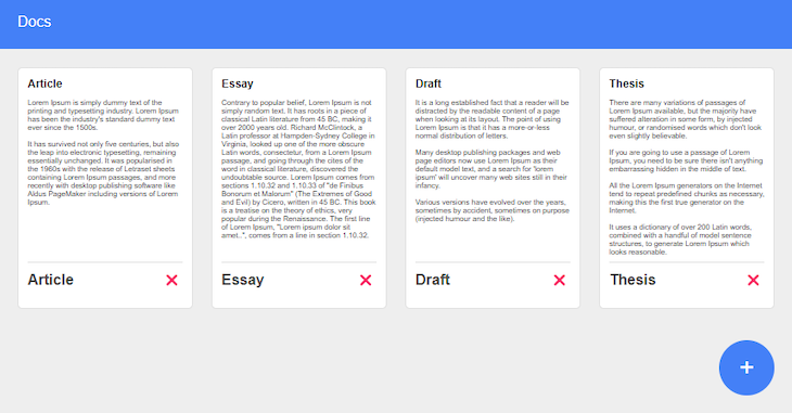
For reference, the project we will build is deployed here.
- Initializing a React app
- Installing dependencies
- Creating the base
- Creating components
- Implementing the logic
- Testing the app
Initializing a React app
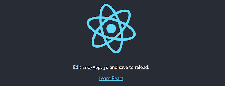
First, open your terminal and run the command npx create-react-app@latest google-docs-clone. The command will create a fully functional React app.
Then change your working directory in the newly created project folder by cd google-docs-clone and run npm start to start the React developer server.
Now, open your web browser and navigate to http://localhost:3000 to see your app. It should look something like this:
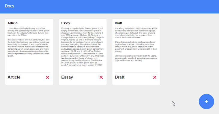
Switch back to your code editor and delete all the files in the src folder, since we will build everything from scratch.
Installing dependencies
In order to install all the necessary dependencies, run the following command in the terminal: npm install automerge react-quill react-router-dom uuid localforage.
- The automerge package will provide the core functionality for the app, allowing to create, edit, delete, and sync the data of all the documents
- The react-quill will be used for the WYSIWYG editor to edit the content of each document. It will allow users to create elements such as headings, paragraphs, lists, and links
- The react-router-dom will provide the routing between the main dashboard and the individual documents, allowing users to open them and switch back to home
- The uuid package will generate unique indicators for each document that will be passed to the URL to make them unique
- The localforage package will be used to store the created data on the user machine. You can also use the native local storage, but this package will simplify the interaction with it
Creating the base
We first need to create the main file that will render our application and define some global style rules that will be used throughout the whole application.
Inside the src folder, create a new file index.js and include the following code:
import ReactDOM from "react-dom/client";
import { BrowserRouter } from "react-router-dom";

import App from "./App";
import  "./styles.css";

const root = ReactDOM.createRoot(document.getElementById("root"));
root.render(
  <BrowserRouter>
    <App />
  </BrowserRouter>
);
We imported ReactDOM and created the root element, which we later used to render the app. In order to use react-router-dom, we first imported it and then wrapped the whole app in it.
Create a new file, styles.css, and include the following style rules:
* {
  margin: 0;
  padding: 0;
  box-sizing: border-box;
}

body {
  background-color: #eeeeee;
  min-height: 100vh;
}

.wrapper {
  font-family: sans-serif;
}

.ql-editor {
  min-height: calc(100vh - 100px);
  background-color: white;
}
We first removed all the default styling for margin, padding, and box-sizing, just so the layout of our app looks the same on different browsers. Then, we set the body background to be a very light shade of gray and made sure it is always at least the height of the viewport.
We also set the app to use the sans-serif font, as well as set custom rules for the editor window. We made sure the editor always fills the height of the viewport, as well as set the background color for the text to be white to better contrast with the text.
Creating components
Run the following command in the terminal:
cd src && mkdir components && cd components && touch ContentWrapper.js ContentWrapper.module.css Header.js Header.module.css DocumentCard.js DocumentCard.module.css AddButton.js AddButton.module.css
This will create all the necessary components for the app.
Open ContentWrapper.js and include the following code:
lang=javascript
import styles from "./ContentWrapper.module.css";

export default function ({ children }) {
  return <div className={styles.wrapper}>{children}</div>;
}
This will be a wrapper component for all the document cards on the main dashboard. We will pass the children’s components once we implement the app logic.
Open ContentWrapper.module.css and include the following style rules:
.wrapper {
  max-width: 1200px;
  margin: 20px auto;
  padding: 0 20px;
  display: grid;
  grid-template-columns: repeat(auto-fill, minmax(150px, 1fr));
  gap: 20px;
}
We made sure the wrapper width is limited, centered it, and added some margin to the top and bottom. We also added some padding to the sides of the wrapper so the content looks well positioned on smaller screens, too.
Then, we set the wrapper to use the grid layout system, where each columns does not exceed a certain width and is responsive to different screens. To improve the layout, we also added some gaps between the columns.
Open Header.js and include the following code:
lang=javascript
import styles from "./Header.module.css";

export default function ({ onClick }) {
  return (
    <div className={styles.wrapper}>
      <p className={styles.title} onClick={onClick}>
        Docs
      </p>
    </div>
  );
}
The header component will display the title element as well as receive the onClick prop, which will take the user to the main dashboard from any state of the app.
Open Header.module.css and include the following style rules:
.wrapper {
  background-color: #4480f7;
  padding: 20px;
  color: white;
}

.title {
  cursor: pointer;
}
We set the background color to be blue, added some padding, and set the text color to be white. To improve the UX, we set the cursor to change to the pointer when hovering over the title element of the header.
Open DocumentCard.js and include the following code:
import styles from "./DocumentCard.module.css";

export default function ({ text, onClick, deleteHandler }) {
  const createTitle = (text) => {
    if (text.replace(/<\/?[^>]+(>|$)/g, "")) {
      let parser = new DOMParser();
      const doc = parser.parseFromString(text, "text/html");
      const title =
        doc.body.childNodes[0].lastChild.innerHTML ||
        doc.body.childNodes[0].innerHTML;
      return title.length > 10 ? `${title.slice(0, 10)}...` : title;
    }
    return "Untitled doc";
  };
  return (
    <div className={styles.wrapper} onClick={onClick}>
      <div
        className={styles.preview}
        dangerouslySetInnerHTML=
      ></div>
      <div className={styles.footer}>
        <div className={styles.title}>{createTitle(text)}</div>
        <div className={styles.delete} onClick={deleteHandler}>
          <span role="img" aria-label="bin">

          </span>
        </div>
      </div>
    </div>
  );
}
</span>
</div>
</div>
</div>
);
}
The document card will consist of two main blocks; the preview area and the footer.
The preview area will receive the text prop, which will be a string of raw HTML code, and we will use dangerouslySetInnerHTML to generate the preview of it.
The footer will include the title of the card, which will be generated from the first node in the text prop and limited to 10 characters with the createTitle function. It will also include the delete button, that will allow the user to remove the card with the deleteHandler prop.
The card will also receive the onClick prop, which will open the card and display the editor.
Open DocumentCard.module.css and include the following style rules:
.wrapper {
  background-color: white;
  padding: 10px;
  border: 1px solid rgb(223, 223, 223);
  border-radius: 5px;
}

.wrapper:hover {
  border: 1px solid #4480f7;
  cursor: pointer;
}

.preview {
  height: 200px;
  overflow: hidden;
  font-size: 50%;
  word-wrap: break-word;
}

.footer {
  display: grid;
  grid-template-columns: auto 20px;
  min-height: 40px;
  border-top: 1px solid rgb(223, 223, 223);
  padding-top: 10px;
}

.title {
  color: #494949;
  font-weight: bold;
}

.delete {
  font-size: 12px;
}
We made the main wrapper of the card to be white, added some padding, set a gray border, and added a border radius for some smooth edges. We also made sure the card changes the border color to blue, as well as the cursor to the pointer on hover.
For the preview block, we defined a specific height, made sure more of the text is included by reducing its normal size in half, and ensured longer words are split up.
For the footer area, we set a specific height, added some margin and padding on top, and divided the width into two columns using the grid layout.
The first column will include the title, which will use a dark gray color and be bolded. The second column will include the delete button, for which we decreased the font size.
Open AddButton.js and include the following code:
import styles from "./AddButton.module.css";

export default function AddButton({ onClick }) {
  return (
    <div className={styles.wrapper} onClick={onClick}>
      <p className={styles.sign}>+</p>
    </div>
  );
}
The add button will include the plus sign and receive the onClick prop, which will allow the user to create a new document when the user clicks on it.
Open AddButton.module.css and include the following style rules:
.wrapper {
  display: grid;
  place-items: center;
  height: 60px;
  width: 60px;
  border-radius: 50%;
  background-color: #4480f7;
  position: fixed;
  bottom: 20px;
  right: 20px;
}

.wrapper:hover {
  cursor: pointer;
  box-shadow: rgba(0, 0, 0, 0.1) 0px 20px 25px -5px,
    rgba(0, 0, 0, 0.04) 0px 10px 10px -5px;
}

.sign {
  font-size: 28px;
  color: white;
}
We used the grid layout and centered the contents of the wrapper, set the element to use specific width and height, made it a circle shape, set the blue background color, and made sure it is always displayed on the bottom-right corner of the screen.
To improve the UX, we also set the cursor to change to a pointer, as well as some box shadows to be displayed while hovering. In order to improve the UI, we also increased the font size for the plus sign and displayed it in white.
Implementing the logic
In the src folder, create a new file App.js and include the following code:
import { useState, useEffect, useCallback, useMemo } from "react";
import { useNavigate } from "react-router-dom";

import * as Automerge from "automerge";
import localforage from "localforage";
import Header from "./components/Header";
import ContentWrapper from "./components/ContentWrapper";
import DocumentCard from "./components/DocumentCard";
import AddButton from "./components/AddButton";

import ReactQuill from "react-quill";
import "react-quill/dist/quill.snow.css";

import { v4 as uuidv4 } from "uuid";

let doc = Automerge.init();

export default function App() {
  const navigate = useNavigate();

  const [editorVisible, setEditorVisible] = useState(false);
  const [editorValue, setEditorValue] = useState("");

  let docId = window.location.pathname.split("/").pop();
  let channel = useMemo(() => {
    return new BroadcastChannel(docId);
  }, [docId]);

  const initDocuments = useCallback(() => {
    if (localforage.getItem("automerge-data") && !docId) {
      setEditorVisible(false);
      async function getItem() {
        return await localforage.getItem("automerge-data");
      }

      getItem()
        .then((item) => {
          if (item) {
            doc = Automerge.load(item);
            navigate(`/`);
          }
        })
        .catch((err) => console.log(err));
    }
  }, [navigate, docId]);

  useEffect(() => {
    initDocuments();
  }, [initDocuments]);

  const addDocument = () => {
    const id = uuidv4();
    let newDoc = Automerge.change(doc, (doc) => {
      setEditorValue("");
      if (!doc.documents) doc.documents = [];
      doc.documents.push({
        id,
        text: editorValue,
        done: false
      });
      navigate(`/${id}`);
    });

    let binary = Automerge.save(newDoc);
    localforage.clear();
    localforage
      .setItem("automerge-data", binary)
      .catch((err) => console.log(err));
    doc = newDoc;
  };

  const loadDocument = useCallback(() => {
    if (docId) {
      setEditorVisible(true);
      async function getItem() {
        return await localforage.getItem("automerge-data");
      }

      getItem()
        .then((item) => {
          if (item) {
            doc = Automerge.load(item);

            const itemIndex = doc.documents.findIndex(
              (item) => item.id === docId
            );
            if (itemIndex !== -1) {
              setEditorValue(doc.documents[itemIndex].text);
            } else {
              navigate("/");
              setEditorVisible(false);
            }
          }
        })
        .catch((err) => console.log(err));
    }
  }, [docId, navigate]);

  useEffect(() => {
    loadDocument();
  }, [loadDocument]);

  const updateDocument = useCallback(() => {
    if (Object.keys(doc).length !== 0) {
      const itemIndex = doc.documents.findIndex((item) => item.id === docId);

      if (itemIndex !== -1) {
        let newDoc = Automerge.change(doc, (doc) => {
          doc.documents[itemIndex].text = editorValue;
        });

        let binary = Automerge.save(newDoc);
        localforage
          .setItem("automerge-data", binary)
          .catch((err) => console.log(err));
        doc = newDoc;
        channel.postMessage(binary);
      }
    }
  }, [docId, editorValue, channel]);

  useEffect(() => {
    updateDocument();
  }, [updateDocument]);

  const deleteDocument = (docId) => {
    if (Object.keys(doc).length !== 0) {
      const itemIndex = doc.documents.findIndex((item) => item.id === docId);

      if (itemIndex !== -1) {
        let newDoc = Automerge.change(doc, (doc) => {
          doc.documents.splice(itemIndex, 1);
        });

        let binary = Automerge.save(newDoc);
        localforage
          .setItem("automerge-data", binary)
          .catch((err) => console.log(err));
        doc = newDoc;
        channel.postMessage(binary);
      }
      navigate("/");
    }
  };

  const syncDocument = useCallback(() => {
    channel.onmessage = (ev) => {
      let newDoc = Automerge.merge(doc, Automerge.load(ev.data));
      doc = newDoc;
    };
  }, [channel]);

  useEffect(() => {
    syncDocument();
  }, [syncDocument]);

  return (
    <div className="wrapper">
      <Header
        onClick={() => {
          setEditorVisible(false);
          navigate("/");
        }}
      />
      {!editorVisible ? (
        <ContentWrapper>
          {Object.keys(doc).length !== 0 &&
            doc.documents.map((document, index) => {
              return (
                <DocumentCard
                  key={index}
                  text={document.text}
                  onClick={() => {
                    setEditorVisible(true);
                    navigate(`/${document.id}`);
                  }}
                  deleteHandler={(e) => {
                    e.stopPropagation();
                    deleteDocument(document.id);
                  }}
                />
              );
            })}
          <AddButton
            onClick={() => {
              setEditorVisible(true);
              addDocument();
            }}
          />
        </ContentWrapper>
      ) : (
        <ReactQuill
          theme="snow"
          value={editorValue}
          onChange={setEditorValue}
        />
      )}
    </div>
  );
}
First, we imported all the necessary React hooks to keep track of the app state and perform the side effects when certain actions are being performed, all the instances of the dependencies we installed as well as all the components we created in the previous step.
Then, we initialized the Automerge instance. We also created editorVisible and editorState to track the editor presence and its contents and created several functions to provide the create, read, update, delete, and sync functionality for the app:
initDocuments() fetches the documents from localforage on the initial launch or once the URL is changed to the main dashboard to refresh to contents with automerge.load()
addDocument() is initiated once the add button is pressed. It pushes a new document in the object of arrays using the automerge.change() and saves it with automerge.save().
loadDocument() is used to fetch the information of the particular document once it has been opened in the WYSIWYG editor with automerge.load().
updateDocument() is used each time the user makes any edits in the editor. The document is first being edited with automerge.change() and then saved with automerge.save().
deleteDocument() is initiated once the delete icon is pressed; it removes the document from the document array with automerge.change() and saves with automerge.save().
syncDocument() uses the automerge.merge() function to sync the data from the other instances of the app and update the current document array.
Finally, we rendered all of the imported components and passed in the required props
Testing the app
First, check if your app is still running on http://localhost:3000. If it is not, run npm start in your terminal again.
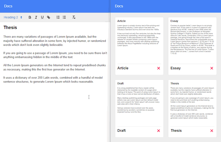
Click on the Add button in the bottom-right to create a new document. You will be taken to the editor to create the content. Notice that the document has received a unique ID.
Now open a new tab on your browser on the same URL. Notice that all the documents you created in the previous tab are already there. Open any of them and make some changes.
Switch back to the other tab, open the document you edited in the previous tab and the changes you made should now be automatically synced.
Also, if someone tries to document with the faulty ID in the URL, the app will automatically redirect the user to the main dashboard.
Conclusion
In this tutorial, we learned how to implement create, read, update, and delete functionalities for text documents. We also made the documents collaborative, meaning all the changes are automatically synced with the other instances of the app.
Feel free to fork the project and add additional features to fit your specific needs. For example, you can add a cloud solution to store data and add authentication for the app so you can use the app online and invite only specific users to work with it.
Next time you will have to come up with a collaborative document solution, you will know the technologies and tools needed to implement it.
The post Build a Google Docs clone with React and Automerge appeared first on LogRocket Blog.
from LogRocket Blog https://ift.tt/RF82erP
via Read more


