It’s no secret that audio visualizers are a fantastic way to spice up your music listening experience. In this article, we’ll go through how to create an audio visualizer from the ground up using only vanilla JavaScript and the inbuilt browser Canvas and Web Audio APIs.
By the end of this post, you’ll have a solid understanding of how to create your own audio visualizers and be able to experiment with different ways of visualizing audio data.
How digital audio works
Let’s start with a basic explanation of how digital audio works.
Computers don’t understand sound the way we do in the physical world. In order to turn sound into data that they can store, computers do something called sampling. Sampling is done by measuring the sound waves hitting a microphone as data points. Once the computer has these data points, also called samples, it can store them in files.
When we want to play back audio, the computer reverses the process: it recreates the sound from those recorded data points. We’ll use these data points to draw our dynamic bar charts.
That’s enough theory for now — let’s get into some code!
Setting up the project
Even though we’ll be using vanilla JavaScript, we still need to set up a server to follow along. The reason we need a server is to bypass the CORS problem.
CORS prevents accessing resources from outside of its domain. So in order to analyze the audio data, we need to have our audio files hosted on the same server as our webpage.
For this tutorial, I’m using Vite, a simple and straightforward dev server to set up, but feel free to use any other server of your choice.
Building the visualizer
To build the visualizer, we’ll be using two inbuilt browser APIs: Canvas and Web Audio API.
Canvas is an HTML5 element that allows us to draw graphics on a webpage. In this case, we’ll be using it to draw our dynamic bar charts.
Canvas is also split into two different APIs: 2D and WebGL. We’ll use the 2D version for this tutorial since WebGL deals more with 3D graphics.
Web Audio API allows us to process and play audio files directly in the browser. We’ll use it to load and play our audio files and extract the raw data we need to generate our visualizations.
With all this necessary theory out of the way, let’s get into some code!
First, we need to set up our HTML document. We’ll create a simple HTML document that contains canvas and audio elements.
Let’s name our file index.html; it will serve as an entry point for our project. When you create a vanilla Vite project, it will already have an index.html file set up for you:
<html lang="en">
<head>
<meta charset="UTF-8" />
<link rel="stylesheet" href="stylesheet.css" />
<title>Audio Visualizer</title>
</head>
<body>
<div id="container">
<canvas id="canvas"></canvas>
<audio id="audio"></audio>
</div>
<script src="script.js"></script>
</body>
</html>
The important parts are within the body of the document. We have a div with an id of container. This is where we’ll be holding our canvas and audio elements.
The canvas element is where we’ll draw our dynamic bar charts. The audio element is what we’ll use to play back the audio file. We’re adding a reference to the script.js file. This is the file that will contain all of our code for analyzing the audio and generating the visuals.
We also have simple CSS styling added, which adds a black background for better contrast and positions our canvas element at the center of the screen:
* {
margin: 0;
padding: 0;
box-sizing: border-box;
}

#container {
position: absolute;
top:0;
left: 0;
background: #000;
width: 100%;
height: 100%;
}

#canvas {
position: absolute;
top: 0;
left: 0;
width: 100%;
height: 100%;
}
Now let’s start adding the code for making all these elements actually do something.
First, let’s set up references to our canvas and audio elements and create some other variables we’ll need:
let audio1 = new Audio();
audio1.src = "tune.mp3";

const container = document.getElementById("container");
const canvas = document.getElementById("canvas");
canvas.width = window.innerWidth;
canvas.height = window.innerHeight;
We’re creating a new Audio object with the src property set to the location of the audio file that we want to play. We’re setting the width and height of our canvas element to equal the browser window size. This way, our visualization will always fill up the entire screen.
Next, we need to set up our audio source, analyzer, and audio context objects. But first, let’s cover what each of these objects represents.
An audio source is an AudioNode object that represents the source of the audio. In our case, it will be the audio element we added.
The analyzer node helps us understand what is happening with the sound. It makes it possible for us to see and use the data from the sound so that we can create our visualizer. The analyzer contains various properties like frequencyBinCount, which we will use later to figure out how many data points we need to collect.
The audio context is responsible for managing all the Web Audio API nodes. We’ll use it to create our audio source and analyzer nodes.
Now let’s set up our audio source, analyzer, and context:
const audioCtx = new (window.AudioContext || window.webkitAudioContext)();
let audioSource = null;
let analyser = null;

audio1.play();
audioSource = audioCtx.createMediaElementSource(audio1);
analyser = audioCtx.createAnalyser();
audioSource.connect(analyser);
analyser.connect(audioCtx.destination);
We created a new instance of the AudioContext object. We also declared two other variables, audioSource and analyser, which we’ll use to create our audio source and analyzer nodes.
Next, we created our audioSource and analyser object nodes using our audio context.
Lastly, we connected our audioSource and analyser nodes to each other and to the destination of the audio context (the speakers). This setup forms a chain of nodes that the audio will flow through.
Now that we have our audio context and nodes set up, we can start writing the code for our visualizer.
First, let’s figure out how many bars we want to show and how wide each bar should be:
analyser.fftSize = 128;
const bufferLength = analyser.frequencyBinCount;
const dataArray = new Uint8Array(bufferLength);
const barWidth = canvas.width / bufferLength;
We’re setting the fftSize property of our analyzer to 128. This will determine how many data points we collect from the sound. The higher the number, the more data points we get and the more bars we’ll display.
We’re creating a new bufferLength variable and setting it equal to the frequencyBinCount property of the analyzer. This property tells us how many data points we have based on the fftSize that we set earlier. frequenceBinCount is always half of the fftSize.
We’re creating a new dataArray variable and setting it equal to a Uint8Array of the bufferLength size. This array will hold all of the data points that we collect from the sound.
Lastly, we’re creating a new barWidth variable. The variable determines how wide each bar in our visualizer should be. We set it equal to the width of the canvas divided by the bufferLength.
Now let’s write the function that will perform the actual animation:
function animate() {
x = 0;
ctx.clearRect(0, 0, canvas.width, canvas.height);
analyser.getByteFrequencyData(dataArray);
for (let i = 0; i < bufferLength; i++) {
barHeight = dataArray[i];
ctx.fillStyle = "white";
ctx.fillRect(x, canvas.height - barHeight, barWidth, barHeight);
x += barWidth;
}

requestAnimationFrame(animate);
}
x is used to keep track of where we are on the x-axis as we draw our bars. We clear the canvas so that we can start drawing from a blank slate on each frame. Then we call the getByteFrequencyData method on our analyser node. This method accepts an array as its parameter. We pass in our dataArray to this method. This will populate our dataArray with data from the sound in place.
Then we use a for loop to go through the dataArray array.
For each item, we set the barHeight variable equal to the data point. We use the fillRect method to draw a rectangle at the x, y position with the barWidth and barHeight that we set earlier.
Then we increment the x variable by the barWidth. Doing so ensures that each bar is drawn next to the previous one.
Finally, we call the requestAnimationFrame method and pass it into our animate function. This tells the browser to call our animate function on every frame.
N.B., since we’re calling
requestAnimationFrameinside theanimatefunction itself, this will cause theanimatefunction to be called over and over again in a loop.
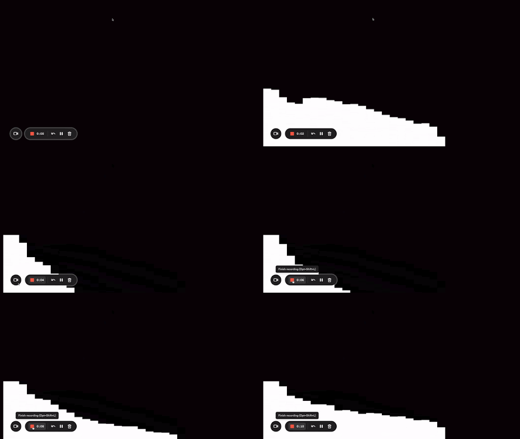
Here’s what the end result should look like:

Congrats! You have built a simple bar visualizer! In the next section, we’ll work on adding some improvements to it.
Adding color and polishing the UI
The hardest part of the tutorial is behind us. In this section, we’ll add some color to our visualizer and polish the UI a bit.
Adding color
Our current visualizer is filled with white rectangles, which isn’t too exciting. Let’s add some color to it!
This is where you get to experiment on your own. There’s no one way to add randomness, so we’ll play around with the dynamic values we have in our for loop to generate some random colors:
let barHeight;
for (let i = 0; i < bufferLength; i++) {
barHeight = dataArray[i];
const red = (i * barHeight) / 10;
const green = i * 4;
const blue = barHeight / 4 - 12;
ctx.fillStyle = `rgb(${red}, ${green}, ${blue})`;
ctx.fillRect(x, canvas.height - barHeight, barWidth, barHeight);
x += barWidth;
}
Feel free to experiment with the values above or come up with your own!
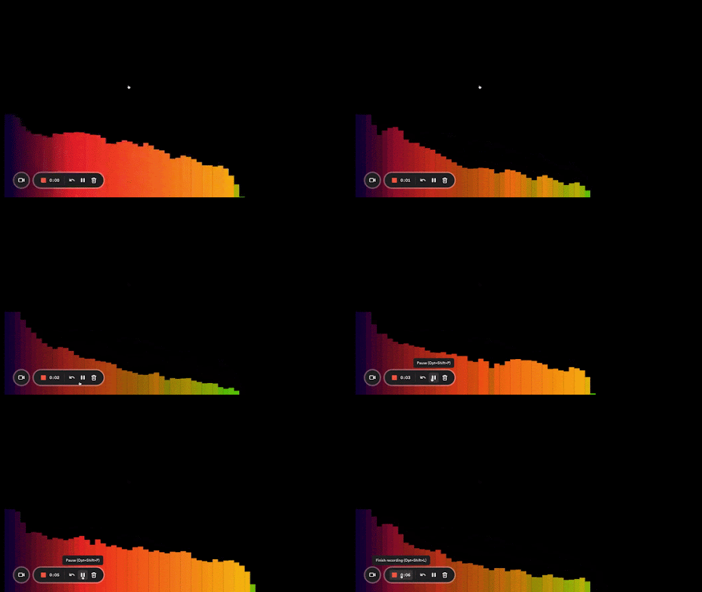
Here’s what it looks like:

Taller bars in the middle
Another improvement we can make is to make our bars taller in the middle and shorter on the sides. That’s what most of the bar visualizers you see look like.
Again, at this point, we’re only making changes to animate. First, let’s separate our for loop into its own function for better readability:
function animate() {
x = 0;
ctx.clearRect(0, 0, canvas.width, canvas.height);
analyser.getByteFrequencyData(dataArray);
drawVisualizer({ bufferLength, dataArray, barWidth });
requestAnimationFrame(animate);
}

const drawVisualizer = ({ bufferLength, dataArray, barWidth }) => {
let barHeight;
for (let i = 0; i < bufferLength; i++) {
barHeight = dataArray[i];
const red = (i * barHeight) / 10;
const green = i * 4;
const blue = barHeight / 4 - 12;
ctx.fillStyle = `rgb(${red}, ${green}, ${blue})`;
ctx.fillRect(x, canvas.height - barHeight, barWidth, barHeight);
x += barWidth;
}
};
We can make our higher bars rise from the middle by splitting our data points into two halves. We’ll animate the left side with higher frequency bars on the right, and the right side with the higher frequency bars on the left.
This will make more sense if we look at the code:
const drawVisualizer = ({ bufferLength, dataArray, barWidth }) => {
let barHeight;
for (let i = 0; i < bufferLength; i++) {
barHeight = dataArray[i];
const red = (i * barHeight) / 10;
const green = i * 4;
const blue = barHeight / 4 - 12;
ctx.fillStyle = `rgb(${red}, ${green}, ${blue})`;
ctx.fillRect(
canvas.width / 2 - x, // this will start the bars at the center of the canvas and move from right to left
canvas.height - barHeight,
barWidth,
barHeight
);
x += barWidth; // increases the x value by the width of the bar
}

for (let i = 0; i < bufferLength; i++) {
barHeight = dataArray[i];
const red = (i * barHeight) / 10;
const green = i * 4;
const blue = barHeight / 4 - 12;
ctx.fillStyle = `rgb(${red}, ${green}, ${blue})`;
ctx.fillRect(x, canvas.height - barHeight, barWidth, barHeight); // this will continue moving from left to right
x += barWidth; // increases the x value by the width of the bar
}
};
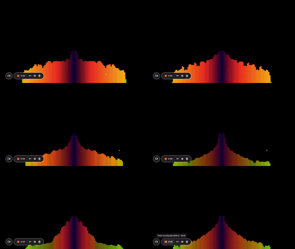
Here we’re looping through our data points twice. The first time, we start at the center of the canvas and animate from right to left, and the second time, we’re going from left to right. As I mentioned, the left half has its higher frequency bars on the right and vice versa for the right half.
Here’s what my end result looks like:

And that’s it! Now you know how to create an audio visualizer from scratch using the Web Audio API and Canvas.
Conclusion
In this article, we’ve gone over how to create our own audio visualizer from scratch.
We started by discussing the different parts of an analyzer node and what each one does. From there, we moved on to creating our data array and animating it with the help of the animate function. Finally, we made some small improvements to our visualizer by changing the color and making our bars taller in the middle. Here’s the full code from the tutorial.
Of course, there’s so much more you can do with this, so feel free to play around some more and go wild!
If you’re looking for another project, consider building an audio plugin from scratch.
The post Write an audio visualizer from scratch with vanilla JavaScript appeared first on LogRocket Blog.
from LogRocket Blog https://blog.logrocket.com/audio-visualizer-from-scratch-javascript/
via Read more


