Galleries provide an effective way to showcase a collection of high-quality images. In web projects, developers create image galleries to display images in a grid-like layout, making it easier for users to browse them.
There are several ways to create this type of layout. In this tutorial, we will cover how to use the CSS Flexible Box Layout Module (flexbox) to create a responsive image gallery that looks amazing on all devices.
We will use three example projects to demonstrate how flexbox lets us create various layouts.
In this tutorial:
- CSS flexbox overview
- Responsive image gallery with uniform image dimensions
- Responsive image gallery maintaining image aspect ratios
- Maintaining image aspect ratios in a three-column layout
The first and second projects are naturally responsive without using CSS media queries, which is one of the benefits of flexbox. However, the second and third projects provide a more accurate image preview by maintaining image aspect ratios.
At the end of this tutorial, we will understand how flexbox is applied to establish three types of responsive image gallery layouts.
To follow this tutorial, a basic knowledge of HTML and CSS is required.
CSS flexbox overview
Flexbox is a model designed for creating layouts in one dimension (i.e., rows or columns) at a time. It provides access to properties that allow you to align and justify flex items inside flex containers.
In addition, flexbox can wrap items onto multiple lines to achieve a grid-like structure, as seen in the example projects below.
When flexbox wraps items, it treats every line as a separate flex line in the flex container. Thus, it justifies these items based on their size and the available space on that flex line. In the next section, we will get started with the usage.
Responsive image gallery with uniform image dimensions
The first project uses a simple layout, as seen below:
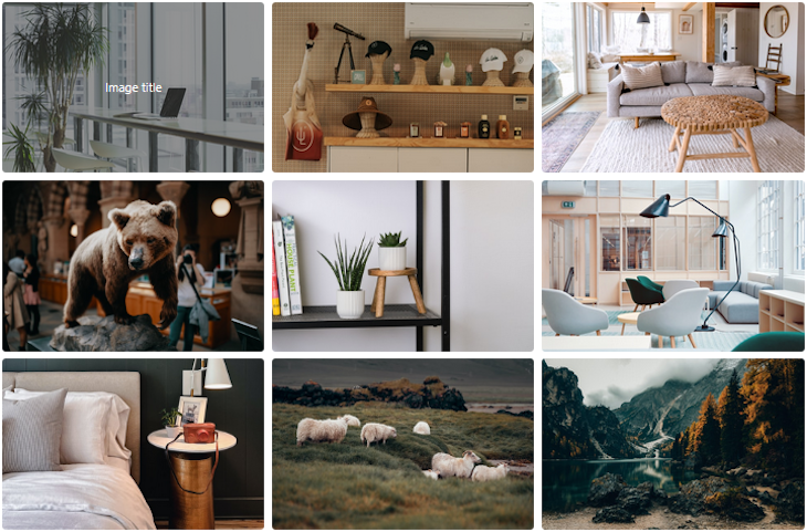
This gallery layout is ideal for uniform image dimensions.
To create this first flexbox project, let’s create an HTML file and add the following markup:
<div class="container">
  <!-- heading text -->
  <ul class="image-gallery">
    <li>
      <img src="https://source.unsplash.com/VWcPlbHglYc/640x416" alt="" />
      <div class="overlay"><span>Image title</span></div>
    </li>
    <!-- other items here -->
  </ul>
</div>
We used a ul element to group a collection of images located in the li. We can also use another element, such as div. For brevity, the code block above only shows one item within the ul container. See the complete markup on CodeSandbox.
Every li element contains an img element along with a div element that will show an overlay whenever we hover over an image. For this project, we are using free images and appending equal dimensions to the source URL to get images of the same size.
Presently, no styles are applied, so the images will default to stacking on top of each other.
Customizing the responsive image gallery layout with flexbox
Now, we can introduce flexbox to lay our images out. The focus is on the ul wrapper element holding all the image items.
First, we must make the ul wrapper a flex container by setting its display property to flex. Once we do this, its direct children (the li elements) become flex items.
.image-gallery {
  display: flex;
}
Now, all the flex items immediately line up on the main axis. By default, the main axis is the row dimension. This behavior is the result of flexbox being a one-dimensional layout model.
Presently, our images overflow the viewport because they cannot fit in. We will address this by updating the styles applied to the flex container. These style rules will automatically apply to the flex container’s items.
.image-gallery {
  display: flex;
  flex-wrap: wrap;
  justify-content: center;
  gap: 10px;
}

.image-gallery > li {
  flex-basis: 350px; /* width: 350px; */
}

.image-gallery li img {
  object-fit: cover;
  width: 100%;
  height: 100%;
  vertical-align: middle;
  border-radius: 5px;
}
Let’s take a closer look at the styles being applied in the flex container:
- The
flex-wrapproperty ensures that flex items will wrap onto another line - The
justify-contentproperty with a value ofcenterwill center items on the main axis - The
gapproperty will set a gap between rows and columns (in this case,10px)
We also gave each flex item an initial length of 350px. Applying object-fit to an image keeps its aspect ratio and makes sure it clips to fit. In the end, the layout looks like so:
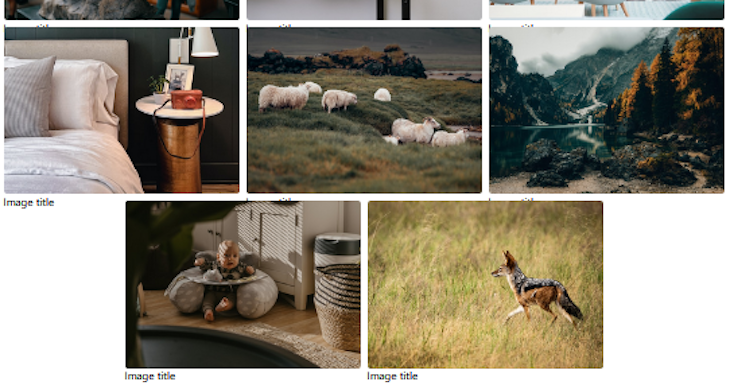
Last row alignment with flexbox
As seen above, the items in the last row do not align with the previous row. This is a common problem with flexbox.
We mentioned earlier that when flex items wrap, every line is a new flex line and items are justified based on the available space in that flex line. In this case, items in the last row are centered because we applied justify-content: center; to the flex container.
A quick fix is to use ::after to create a pseudo-element in the flex container. Then, we can set the size of the flex-basis CSS property as equal to the size of the flex items.
.image-gallery::after {
  content: "";
  flex-basis: 350px;
}
This approach works well. An alternate approach is to use CSS grid, a two-dimensional layout system.
Displaying overlay on hover
Let’s say we want to display some overlay text whenever users hover over the images. To achieve this, start by updating the li to include the following style declarations:
.image-gallery > li {
  /* ... */
  position: relative;
  cursor: pointer;
}
Then, update the CSS file to include the following rules:
.overlay {
  position: absolute;
  width: 100%;
  height: 100%;
  background: rgba(57, 57, 57, 0.502);
  top: 0;
  left: 0;
  transform: scale(0);
  transition: all 0.2s 0.1s ease-in-out;
  color: #fff;
  border-radius: 5px;
  /* center overlay text */
  display: flex;
  align-items: center;
  justify-content: center;
}

/* hover */
.image-gallery li:hover .overlay {
  transform: scale(1);
}
Let’s save and test our project to ensure it works as expected. That’s all for the first project. See the demo here and the complete code on CodeSandbox.
Responsive image gallery maintaining image aspect ratios
In the second and third example projects, we will create layouts that will maintain the images’ aspect ratios.
The second project’s layout will maintain the images’ aspect ratios, as seen below:
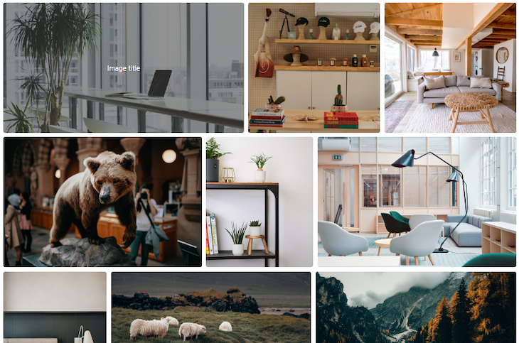
The markup for the second project is mostly the same as in the first project. The difference is that we will not append fixed dimensions to the image URLs, like so:
<div class="container">
  <!-- heading text -->
  <ul class="image-gallery">
    <li>
      <img src="https://source.unsplash.com/VWcPlbHglYc" alt="" />
      <div class="overlay"><span>Image title</span></div>
    </li>
    <!-- other items here -->
  </ul>
</div>
Next, we introduce flexbox and alignment rules by adding the following to our CSS file:
.image-gallery {
  display: flex;
  flex-wrap: wrap;
  gap: 10px;
}

.image-gallery > li {
  height: 300px;
  cursor: pointer;
  position: relative;
}

.image-gallery li img {
  object-fit: cover;
  width: 100%;
  height: 100%;
  vertical-align: middle;
  border-radius: 5px;
}
Let’s compare the above rules to the first project. First, instead of a defined width on the li flex items, we have a defined height. Also, notice we are not aligning the items with the justify-content property. With this, the layout looks like so:
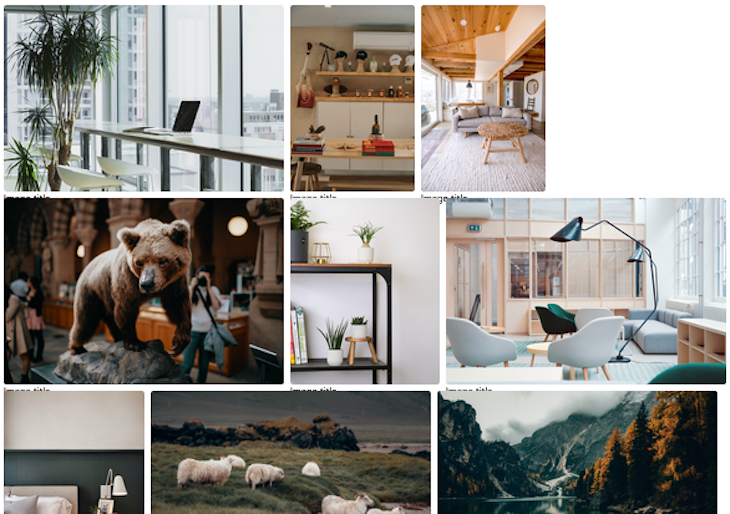
Now, we can proportionally distribute the images by making the items grow from their initial length and fill the available space. Let’s update our code to include the flex-grow with a positive value, like so:
.image-gallery > li {
  flex-grow: 1;
  /* ... */
}
By default, flex items have values of flex-grow: 0, flex-shrink: 1, and flex-basis: auto. In other words, they will use their natural content size if no other size is defined. They also shrink from their flex-basis and never grow from it.
We can also use the flex shorthand to achieve the same behavior:
.image-gallery > li {
  flex: 1 1 auto; /* or flex: auto; */
  /* ... */
}
Now that the flex items have filled the available space, we have again encountered the last-row alignment issue with flexbox. In this case, the two items in the last row will grow to fill up three columns’ worth of space.
To remedy this behavior, we will use the ::after pseudo-element once again on the flex container, like so:
.image-gallery::after {
  content: "";
  flex-grow: 999;
}
We can play with the flex-grow value to determine an output that suits our layout. Let’s save our files and ensure it works as expected. See the demo here and the complete code here. This brings us to the end of the second project.
Maintaining image aspect ratios in a three-column layout
In the second project, we learned how to create a responsive image gallery layout that maintains image aspect ratios without using media queries. However, using flexbox with media queries allows us to achieve a specific layout while still maintaining image aspect ratios.
To demonstrate this, we will create a third responsive image gallery project that will maintain image aspect ratios, but in a three-column layout, like this:
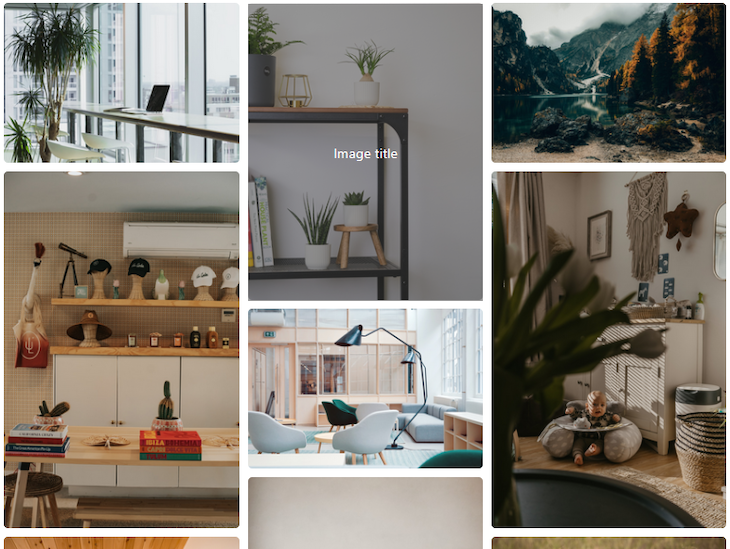
This responsive image gallery will display three columns on big screens and one column on small screens. To achieve this, we will create a markup containing three columns of elements, like so:
<div class="container">
  <!-- heading text -->
  <div class="image-gallery">
    <div class="column">
      <div class="image-item">
        <img src="https://source.unsplash.com/VWcPlbHglYc" alt="" />
        <div class="overlay"><span>Image title</span></div>
      </div>
      <!-- other items here -->
    </div>
    <div class="column">
      <!-- other items here -->
    </div>
    <div class="column">
      <!-- other items here -->
    </div>
  </div>
</div>
Each of these columns should contain a list of the images you want to display. For brevity, the code block above only shows one image. See the complete markup on CodeSandbox.
As we know from our experience with flexbox thus far, these columns can be a flex container for the images, or flex items, contained within them. Likewise, the columns themselves can be flex items within the wrapper element.
For this reason, we will apply the following style rules:
.image-gallery {
  /* Mobile first */
  display: flex;
  flex-direction: column;
  gap: 10px;
}

.image-gallery .column {
  display: flex;
  flex-direction: column;
  gap: 10px;
}

.image-item img {
  width: 100%;
  border-radius: 5px;
  height: 100%;
  object-fit: cover;
}

@media only screen and (min-width: 768px) {
  .image-gallery {
    flex-direction: row;
  }
}
Starting with the mobile layout, we ensured all items are displayed as a column. Unlike the earlier projects, we added a flex-direction property to change the default row alignment to be a column instead.
Then, for big screens (min-width: 768px), we changed the direction of the outer flex container to be a row.
Let’s save our files and ensure it works. See the complete code on CodeSandbox.
Conclusion
Flexbox has the potential to wrap, align, and justify items in a container. This makes it handy to create a responsive layout in a grid-like structure.
In this tutorial, we used it to create three responsive image gallery projects that look amazing on all devices.
If you have questions or contributions, share your thoughts in the comment section. And if you enjoyed reading this tutorial, endeavor to share it around the web.
The post How to create a responsive image gallery with CSS flexbox appeared first on LogRocket Blog.
from LogRocket Blog https://ift.tt/ErhCsTD
via Read more


