Glassmorphism is a UI design trend that imitates the look of frosted glass. Elements in the UI look like they are placed on sheets of glass, typically set above a contrasting background. If used intelligently, it can add significant value to your designs, as evidenced by its increasing usage. glassmorphism is gaining popularity, and is likely to stay on trend for a while.
This tutorial covers the ideal approach to achieving glassmorphism with CSS.
Contents
- What is glassmorphism?
- What are the properties of glassmorphism?
- Implementing glassmorphism with Figma
- Glassmorphism in the browser with plain CSS
- Stacking and nesting glassmorphic elements
- Glassmorphism with Tailwind CSS
- Dark mode with glassmorphism
- Challenge yourself
- Accessibility notes
What is glassmorphism?
You have encountered glassmorphism before if you macOS, iOS, and Windows, all of which utilize a glass-like UI. Here are some quick examples reviewing glassmorphism, what it looks like, and who has implemented it so far.
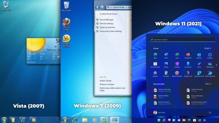
Windows Vista, launched in 2007, had a slick glass-like UI for its main menu, toolbar, and window edges. Microsoft repeated this concept in Windows 7 and 10; and with Windows 11, it has further enhanced the concept.
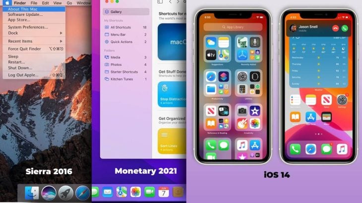
Apple’s macOS follows this UI idea in its latest releases like Catalina, Big Sur, and Monterey. iOS has also been using the same design philosophy for quite a while.
The frontend web development world has also started embracing glassmorphism, as all modern web browsers finally support the CSS properties required to implement it.
What are the properties of glassmorphism?
Let’s understand the basic concepts of glassmorphism by looking at the different properties of UI elements or objects that give them the look of frosted glass.
Translucency
In objects with a glassmorphism effect, you can see the image or colors behind them, but not completely. A blur behind the object or element keeps it from blending with the main background. This blurriness is not only essential to maintain readability and accessibility, but it also provides a slick frosted glass look.
Hierarchy
Glassmorphism includes a shadow effect that gives the element some elevation and makes it appear floating above the surface. Therefore, the user will be able to establish a sense of depth and hierarchy while interacting with the UI.
In addition, it may have some shine on its edges to support its glass-like appearance.
In the case of stacked or nested elements, the closest object should have a more opaque background with a higher blur. On the other hand, the one at the farthest point should have more fill transparency and low background blurring.
Background color
The look of a glassmorphic object goes nearly unnoticed on the surface with a plain background. It should be placed on a vibrant, colorful, or contrasting surface to maximize its frosted glass appearance.
Implementing glassmorphism in Figma
The points we discussed previously can help us develop simple guidelines to implement glassmorphism in our designs. We will use these points to create glassmorphism UIs later on with Figma.
As a general rule, there are five parameters to keep in mind to create a glassmorphism UI element:
- Vibrant base or contrasting background
- Object fill, or background transparency
- Object shadow, or elevation
- Object edges, or shine
- Object background blur, or “frosty” look
Now that we know the basics, let’s open Figma and implement the parameters we discussed above. We will use the Figma design as a blueprint for what we will create in the browser later on, using CSS and HTML.
Creating basic glassmorphic UIs in Figma
Let’s quickly create a simple card in Figma with a frosted glass look. I’m using this colorful image with gradient mesh to keep the background vibrant.
Next, add a rectangular frame over our main background to hold our card element. Let’s set white as its fill color with a 45 perfect of fill transparency. Let’s also add a radius to the corners to make it look like a modern UI element.
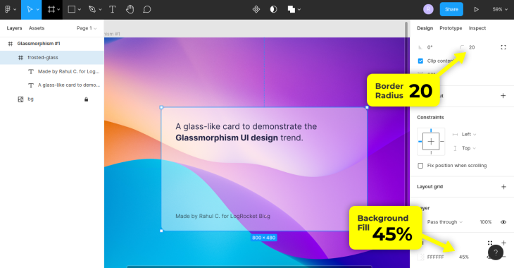
I’ve also added some text for demonstration purposes. Make sure you set the Fill and not the Layer transparency; the effect won’t work with the layer transparency.
Adding a single pixel inside border will provide shiny edges to our card. I’ll set it to 25 percent to give the card a subtle shine.
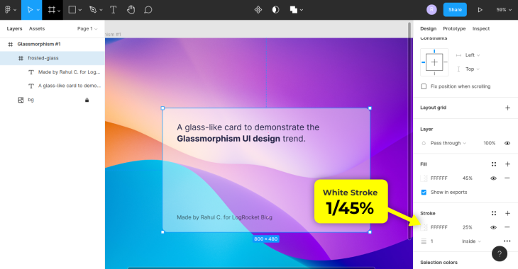
We should now add a drop shadow to make it appear stacked over the background. Let’s also add the background blur to give our card element a frosted glass finish.
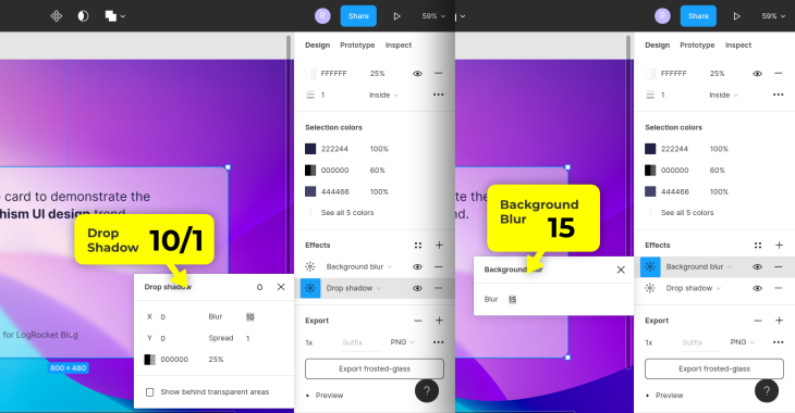
Looks perfect. Here’s a link to the finished Figma file.
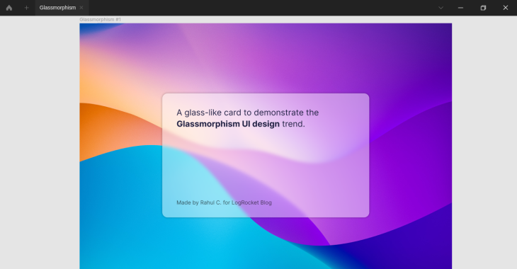
Let’s now learn how to replicate the same for the web with plain and pure CSS.
Glassmorphism in the browser with plain CSS
Although glassmorphism has been around for quite some time now, the web was not familiar with it until recently due to insufficient browser support. While PNGs were there, they were not enough to create flexible, modern design systems.
With the latest CSS additions like backdrop-filter, it is now possible to add glassmorphism effects to web pages. Let’s use CSS to implement what we created in Figma.
Structuring the element
I will use only a few HTML elements to keep things simple. Let’s start with a div with some paragraph tags inside to handle text:
<div class="card">
  <p>...</p>
</div>
At this point, we are only concerned with learning the basic technique to carry out the effect for the web. We will cover UI detailing and decoration later in this article.
Creating a glassmorphic element with CSS
Let’s begin with the styling by adding a background image to our webpage. It’s the same background we used in our Figma card project above.
I have made the root font size a bit larger for better demos. Applying the box-sizing hack would be a wise move now to avoid sizing issues in the future:
:root {
  font-size: 20px;
  box-sizing: inherit;
}
*,
*:before,
*:after {
  box-sizing: inherit;
}
body {
  font: 1em/1.618 Inter, sans-serif;
  color: #224;
  background:
    url(path/to/image.format)
    center / cover no-repeat fixed;
}
For optimal display of our card, it would be great if the body took up all the available vertical space in the viewport. To achieve this, set the minimum height for the body to 100vh:
body {
  font: 1em/1.618 Inter, sans-serif;
  color: #224;
  background:
    url(path/to/image.format)
    center / cover no-repeat fixed;
  min-height: 100vh;
}
Let’s give the card some width and height, 500 pixels by 300 pixels are ideal for a card-like layout. Feel free to use width and height of your choice:
.card {
  max-width: 500px;
  height: 300px;
  padding: 35px;
}
Without color, our card won’t be recognizable no matter what size or content it has. As discussed and implemented previously, let’s add white as its background with a 45 percent fill.
We’ll center the card in both vertical and horizontal directions using flexbox:
.card {
  max-width: 500px;
  height: 300px;
  padding: 35px;
  display: flex;
  flex-direction: column;
  justify-content: space-between;
  background-color: rgba(255, 255, 255, .45);
}
It doesn’t quite look like it’s floating on the surface yet. Referencing the values from the drop shadow effect in our Figma project, let’s set a box-shadow property to our card.
A 1-pixel-wide solid white border with 25 perfect transparency is apt to add a bit of shine to our card. Let’s also add some roundness to its corners like so:
.card {
  max-width: 500px;
  height: 300px;
  padding: 35px;
  display: flex;
  flex-direction: column;
  justify-content: space-between;
  background-color: rgba(255, 255, 255, .45);
  border-radius: 20px;
  border: 1px solid rgba(255, 255, 255, .25);
  box-shadow: 0 0 10px 1px rgba(0, 0, 0, .25);
}
Lastly, we’ll use the backdrop-filter CSS property to apply the blur effect to the area behind our card so that it appears like frosted glass:
.card {
  max-width: 500px;
  height: 300px;
  padding: 35px;
  display: flex;
  flex-direction: column;
  justify-content: space-between;
  background-color: rgba(255, 255, 255, .45);
  border-radius: 20px;
  border: 1px solid rgba(255, 255, 255, .25);
  box-shadow: 0 0 10px 1px rgba(0, 0, 0, .25);
  backdrop-filter: blur(15px);
}
And our first frosted-glass UI element is ready! See it in action below; feel free to fork the Pen and add your style modifications to it.
Glassmorphism: Simple Card UI
No Description
Enhancements
In the above demonstration, we applied a translucent background (e.g., a white color with 45 percent fill) to our card. Let’s add a background gradient to our object, which will add a bit of luster to the card:
.card {
  ...
  background: linear-gradient(
    120deg,
    rgba(255, 255, 255, .25),
    rgba(255, 255, 255, .75), 70%,
    rgba(255, 255, 255, .25)
  );
}
Glassmorphism: Simple Card UI with Gradient Shine
No Description
You can also create an angled shine effect by using CSS gradient backgrounds. Here’s an example.
We used the backdrop-filter property to apply a blur filter to the background of our card. More filters, like saturation for example, can be added alongside blur to achieve different effects:
.card {
  ...
  backdrop-filter:
    blur(15px)
    saturate(1000%);
}
Glassmorphism: Card UI with additional filters
No Description
We can further remove the border and add an inner shadow to give the card an embossed effect. An inset box shadow can help us to do that:
.card {
  ...
  box-shadow:
    inset 4px 4px 5px 0 rgba(255, 255, 255, .25),
    inset -4px -4px 5px 0 rgba(0, 0, 0, 0.125),
    0 0 10px 1px rgba(0, 0, 0, 0.25);
}
Glassmorphism: Embossed Card UI
No Description
If you noticed, I used multiple box-shadow values, each separated by a comma. It helps maintain the regular drop shadow effect along with the new inner shadow addition.
Stacking and nesting glassmorphic elements
As we discussed previously, the farthest object in glassmorphism is the most translucent and has the highest background blur. On the other hand, the nearest element has less opacity and blurring in the background.
This adjustment principle applies to both stacking and nesting of objects. Below is an example of object stacking, by showing how to make these adjustments when implementing frosted glass effects.
Glassmorphism: Stacking
No Description
For the nesting of objects, you should refer to this example and observe that the adjustments are not at all different from the stacking example.
Glassmorphism with Tailwind CSS
Tailwind CSS makes it fast and easy to design prototypes. We’ll see that in action by constructing a glassmorphism-based UI. Assuming you know how Tailwind CSS works, let’s create a new Tailwind CSS CodePen and set it up for development.
To setup Tailwind CSS development with CodePen, head over to the CodePen site and create a new pen. Under Pen Settings, click JS and, add https://cdn.TailwindCSS.com as an external script. Save the changes.
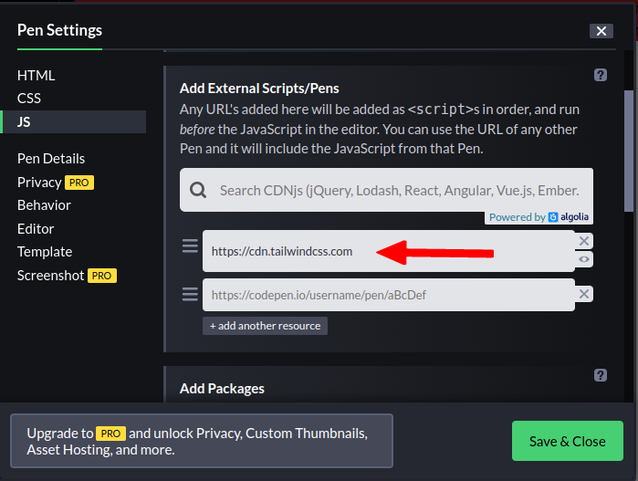
Now, we are ready to use Tailwind CSS in our CodePen.
Our goal is to create a fancy sign up page using Tailwind CSS utilities based on the knowledge we’ve gathered so far about glassmorphism.
Getting started with a component in Tailwind CSS
The first thing we need to do is add a background image to the body and set the font defaults. All base-level resetting is already taken care of by Tailwind CSS’s base component, injected by the Tailwind CSS script we added above:
body {
  background: #07c
    url(path/to/image.format)
    center / cover no-repeat fixed;
  font: 1em/1.618 sans-serif;
}
Next, add a wrapper element that will take care of absolute centering and padding on all sides of our sign up form. It should have some padding applied to keep our form element away from screen edges.
I’ve used square brackets to group similar utility classes in the code samples shared below for easier code scannability:
<div
  class="form-wrapper
         [ p-4 md:p-6 lg:p-8 ]">
  ...
</div>
It will be pretty easy to align the form element to the absolute center of the wrapper with flexbox properties.
This center alignment will make sense only when our wrapper has a larger height. To accomplish this, I have used the min-h-screen utility to make the wrapper use all the available vertical space as its minimum height:
<div
  class="form-wrapper
         min-h-screen
         [ p-4 md:p-6 lg:p-8 ]
         [ flex justify-center items-center ]">
  ...
</div>
Creating a form element
Let’s add a form element and give it some width, padding, and rounded corners for a neater look:
<div
  class="form-wrapper ...">
  <form class="signup-form
               max-w-sm
               rounded-2xl
               [ p-8 md:p-10 lg:p-10 ]">
      ...
  </form><!-- .signup-form -->
</div><!-- .form-wrapper -->
The next step is to add a tint of white as a background color to our form element. I’ve used the background gradient utilities to draw a translucent white gradient from top to bottom. Let’s also blur the form’s background by using the backdrop-blur-lg utility.
The border-solid, border-[1px], and border-opacity utilities provide a pixel-wide solid border for the shiny edges. Let’s also add a drop shadow to the form with the shadow-2xl utility. I’ve also used the shadow-black/70 opacity modifier to change the shadow shade:
  <form class="signup-form
               max-w-sm
               rounded-2xl
               text-[#1A2421]
               backdrop-blur-lg
               [ p-8 md:p-10 lg:p-10 ]
               [ bg-gradient-to-b from-white/60 to-white/30 ]
               [ border-[1px] border-solid border-white border-opacity-30 ]
               [ shadow-black/70 shadow-2xl ]">
    ...
  </form>
It’s time to add some content to the form. Here, we have a heading and a paragraph that describes the element. I have also modified the color, text size, and spacing between these fonts:
<form class="signup-form ...">
    <h3 class="mb-1 text-md text-[#1A2421]/80">...</h3>
    <h1 class="mb-6 uppercase font-bold
               [ text-xl md:text-2xl lg:text-2xl ]">...</h1>
    <p class="mb-6
              [ text-sm text-[#1A2421]/70 text-opacity-50 ]">...</p>
</form>
Next, we’ll add two input fields for accepting the email and password. Each of these fields is wrapped in a label with an SVG icon with some positioning adjustments. The input fields have slightly larger padding on the left to make room for the icons.
It’s up to you whether or not to add any icons. I have used the SVG icons from the Google font library. You can add different icons or leave them out.
Let’s also add a submit button with rounded corners, padding, and a bit of color that also changes on hover:
<form class="signup-form ...">
  ...
  <label
         for="email"
         class="form-label relative block mb-4 text-black/50 focus-within:text-[#333]">

    <svg class="label-icon
                transition pointer-events-none
                [ w-6 h-6 ]
                [ absolute top-1/2 left-3 ]
                [ transform -translate-y-1/2 ]" ...>
      ...
    </svg>
    <input
      class="form-input
             block w-full rounded-lg leading-none
             focus:outline-none placeholder-black/50
             [ transition-colors duration-200 ]
             [ py-3 pr-3 md:py-4 md:pr-4 lg:py-4 lg:pr-4 pl-12 ]
             [ bg-black/20 focus:bg-black/25 ]
             [ text-[#333] focus:text-black ]"
      type="email" name="email" id="email" placeholder="Email">
  </label><!-- form-label -->
  ...
  <button
    class="form-input w-full rounded-lg font-bold text-white focus:outline-none
           [ p-3 md:p-4 lg:p-4 ]
           [ transition-colors duration-500 ]
           [ bg-blue-800 hover:bg-blue-700 ]">Continue</button><!-- .form-input -->
</form><!-- .signup-form -->
Creating the form footer
The footer is optional and consists of a paragraph element and three SVG icons arranged in an unordered list. Again we are managing the alignment with flexbox and the gap property:
<form class="signup-form ...">
  ...
  <div class="form-footer mt-8 text-center">
    <p class="text-xs">...</p>
      <ul class="form-list mt-4 flex justify-center">
      <li class="mx-1">
        <a href="#"
           class="rounded-full bg-[#DB4437] hover:shadow-lg
                  [ transform transition hover:-translate-y-1 ]
                  [ w-10 h-10 ]
                  [ flex justify-center items-center ]">
          <svg class="[ w-3 h-3 ] fill-white" ...>...</svg>
        </a>
      </li>
      ...
    </ul><!-- .form-list -->
  </div><!-- .form-footer -->
</form><!-- .signup-form -->
The final product: Glassmorphism with Tailwind CSS
Our Tailwind CSS-powered sign up form is finished and ready to use. See the final product in action below.
TailwindCSS x Glassmorphism
No Description
Dark mode with glassmorphism
Implementing dark mode with glassmorphic elements is similar to what we have already done. The only things you need to take care of are the readability and contrast. Make sure to choose a background that isn’t too dark or dull, and choose the frosted glass colors intelligently.
TailwindCSS x Glassmorphism
No Description
Here’s another dark glassmorphism UI example with a different shade.
Challenge yourself
Additionally, if you are looking for a media-rich frosted glass implementation, I have you covered. You may consider this an assignment and extend it further to make it responsive.
TailwindCSS x Glassmorphism (Media-rich)
No Description
Accessibility notes
There are several tips you should keep in mind while designing glassmorphic elements in order to make sure they are accessible to all users.
First, because glassmorphic objects require a vivid surface to work, their main background must be bright enough. It is crucial to select the background images and colors carefully so that everything is readable and accessible.
Using the frosted glass effect in dark mode requires extra care, as it won’t be visible if the background is too dark. You might need to use a highly opaque white tint instead of a black shade in such a case.
Second, make sure the fill transparency of the object’s background does not affect the readability of the elements inside it.
Third, avoid applying the backdrop-filter CSS property to the base background layer, as it will render the backdrop-filter effects on the glassmorphic objects useless in some browsers, specifically Chrome.
Fourth, always add a solid color behind the main background image. It keeps the UI elements visible and approachable even when the main background image fails to load. This contributes to the overall UX of the UI, too.
The background CSS property allows you to do that easily. Here’s a quick example of the same:
body {
  background:
    #07c /* This color will act as a "fallback" to background-image */
    url(path/to/image.format)
    ...;
}
Lastly, always consider adding vendor prefixes in production for the backdrop-filter CSS property, as some browsers still need the prefixed properties to operate. Here’s more on backdrop-filter support.
Conclusion
Glassmorphism can enhance your designs and make them more lively and modern when used in moderation. In this article, we learned what glassmorphism is, how to create it, and how to use it to create better UIs for the web using vanilla CSS and Tailwind CSS.
We also learned how to implement a simple frosted glass effect in Figma, with which we can plan our UIs further and turn them into design systems.
Thank you for following this tutorial till the end. If you are stuck or spot a mistake, please let me know in the comments.
The post How to implement glassmorphism with CSS appeared first on LogRocket Blog.
from LogRocket Blog https://ift.tt/hcELapJ
via Read more


