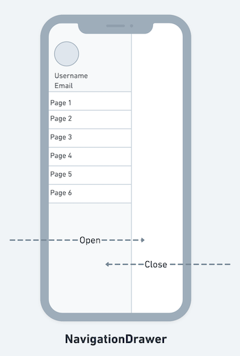
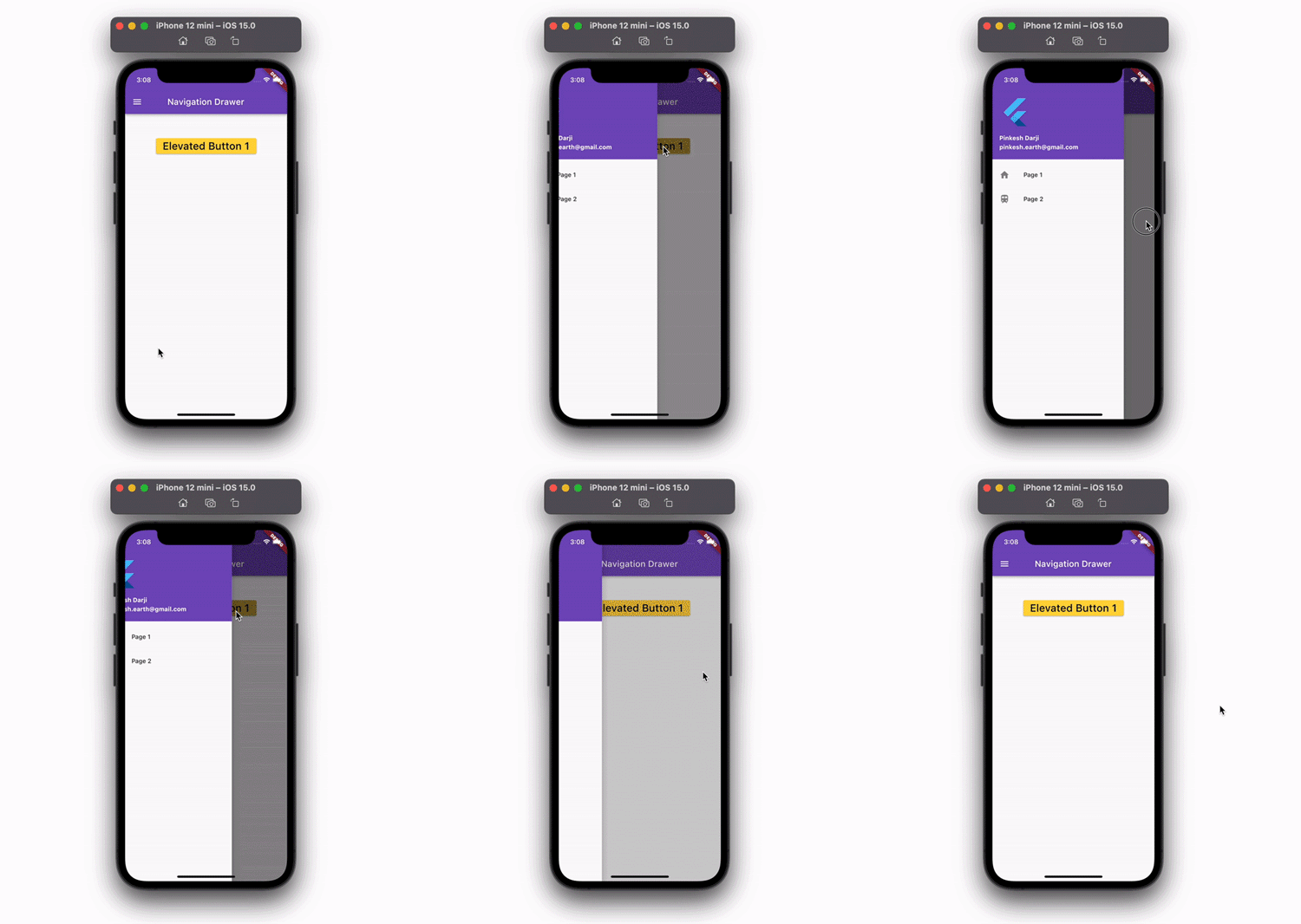
The navigation drawer in Flutter allows users to navigate to different pages of your app. The navigation drawer is added using the Drawer widget. It can be opened via swipe gesture or by clicking on the menu icon in the app bar.
Typically, the navigation drawer opens up from the left side of the screen, but you can also configure it to open from the right side (for the LTR text settings). When it opens, the drawer covers almost 60–70 percent of the screen, and to close it, you can simply swipe or click outside the drawer.
In this tutorial, we’ll learn how to add the navigation drawer in Flutter.
Here’s what we’ll cover:
- When to use a navigation drawer
- How to add a basic navigation drawer in Flutter
- Displaying user details in navigation drawer header
- Displaying AboutListTile
- Opening a navigation drawer programmatically
- Opening a navigation drawer from the right side
- Controlling navigation drawer width
If you’re a visual learner, check out this quick video tutorial:
When to use a navigation drawer
The navigation drawer can be used as an alternate option to the TabBar widget. It is recommended to use a navigation drawer when you have at least five pages to navigate. If your app has several pages, providing the navigation inside the TabBar makes for a less intuitive user experience.
How to add a basic navigation drawer in Flutter
To add a basic navigation drawer in Flutter, you must first use MaterialApp in your project. Then, the Drawer widget can be added to the Scaffold widget.
Here are the step-by-step instructions:
- Make sure you are using the
MaterialApp - Inside the
Scaffold, add theDrawerproperty and assign theDrawerwidget - Inside the
Drawerwidget, add theListViewas a child widget - Inside the
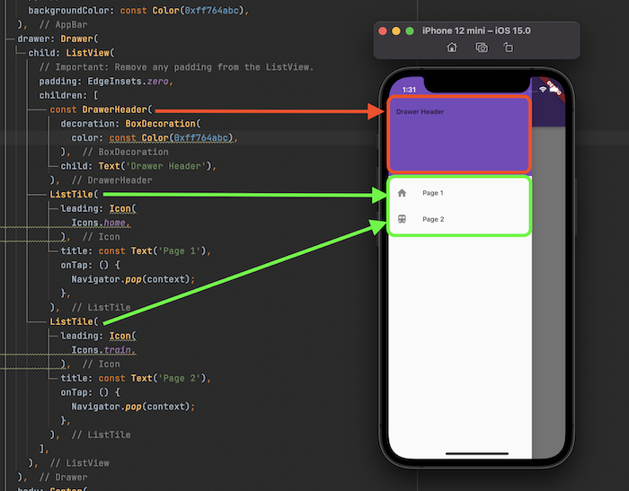
ListView, add theDrawerHeaderwidget. This will create a material design drawer header - Inside the
DrawerHeader, add aTextwidget with some text - Below the
DrawerHeader, add aListTilewidget with aniconandtitlethat represents a single page - Similarly add other
ListTilefor other pages
Code example:
@override
Widget build(BuildContext context) {
  return Scaffold(
    appBar: AppBar(
      centerTitle: true,
      title: const Text(
        'Navigation Drawer',
      ),
      backgroundColor: const Color(0xff764abc),
    ),
    drawer: Drawer(
      child: ListView(
        // Important: Remove any padding from the ListView.
        padding: EdgeInsets.zero,
        children: [
          const DrawerHeader(
            decoration: BoxDecoration(
              color: Colors.blue,
            ),
            child: Text('Drawer Header'),
          ),
          ListTile(
            leading: Icon(
              Icons.home,
            ),
            title: const Text('Page 1'),
            onTap: () {
              Navigator.pop(context);
            },
          ),
          ListTile(
            leading: Icon(
              Icons.train,
            ),
            title: const Text('Page 2'),
            onTap: () {
              Navigator.pop(context);
            },
          ),
        ],
      ),
    ),
    body: Center(
      child: Column(
        children: [
          SizedBox(
            height: 50,
          ),
        ],
      ),
    ),
  );
}
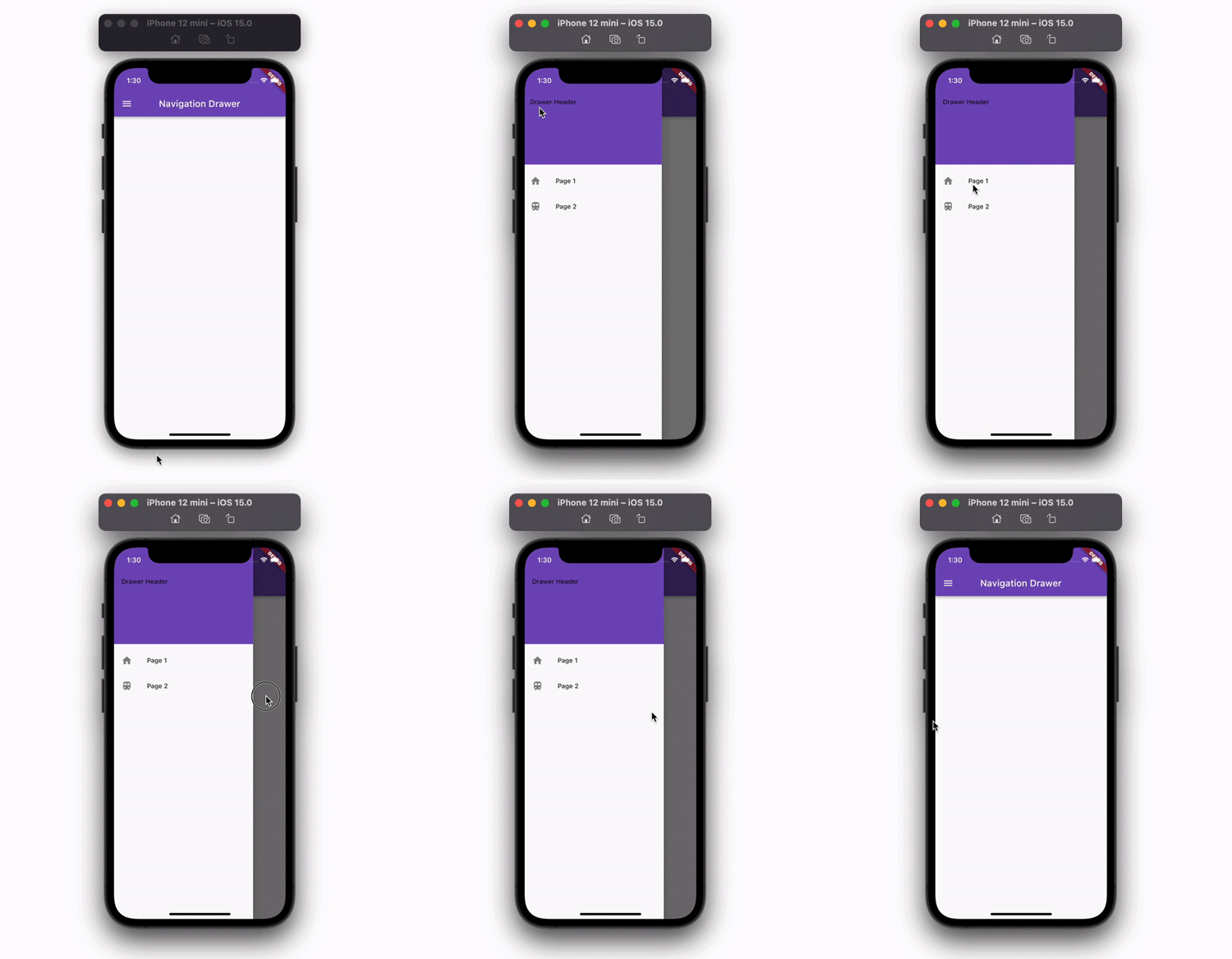
Output:
Here’s how the code is translated into design:
Displaying user details in navigation drawer header
The basic example above shows the drawer header with simple text, but in a real-world scenario, you may want to display the current user information inside the drawer header. You can do that with the help of a ready-made widget called UserAccountsDrawerHeader.
The UserAccountsDrawerHeader is used to display all user-related information, such as profile picture, username, and email. You can also open the user details page when users tap on the user information.
To display user details in the navigation drawer:
- In the example code above, just replace the
DrawerHeaderwidget with theUserAccountsDrawerHeader - Add the
accountNameparameter and set the username - Add the
accountEmailparameter and set the user email - Add the
currentAccountPictureparameter and set the logged user’s profile picture
Code example:
return Scaffold(
  appBar: AppBar(
    centerTitle: true,
    title: const Text(
      'Navigation Drawer',
    ),
    backgroundColor: const Color(0xff764abc),
  ),
  drawer: Drawer(
    child: ListView(
      // Important: Remove any padding from the ListView.
      padding: EdgeInsets.zero,
      children: [
        const UserAccountsDrawerHeader( // <-- SEE HERE
          decoration: BoxDecoration(color: const Color(0xff764abc)),
          accountName: Text(
            "Pinkesh Darji",
            style: TextStyle(
              fontWeight: FontWeight.bold,
            ),
          ),
          accountEmail: Text(
            "pinkesh.earth@gmail.com",
            style: TextStyle(
              fontWeight: FontWeight.bold,
            ),
          ),
          currentAccountPicture: FlutterLogo(),
        ),
        ListTile(
          leading: Icon(
            Icons.home,
          ),
          title: const Text('Page 1'),
          onTap: () {
            Navigator.pop(context);
          },
        ),
        ListTile(
          leading: Icon(
            Icons.train,
          ),
          title: const Text('Page 2'),
          onTap: () {
            Navigator.pop(context);
          },
        ),
      ],
    ),
  ),
  body: Center(
    child: Column(
      children: [
        SizedBox(
          height: 50,
        ),
      ],
    ),
  ),
);
Output:
Displaying AboutListTile
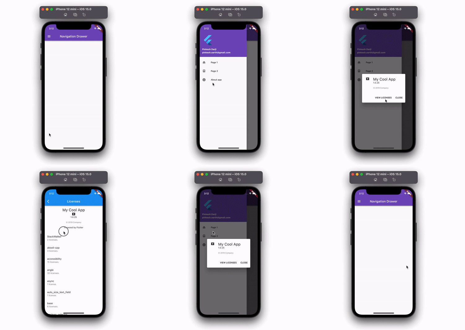
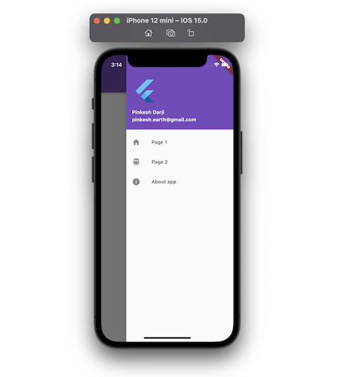
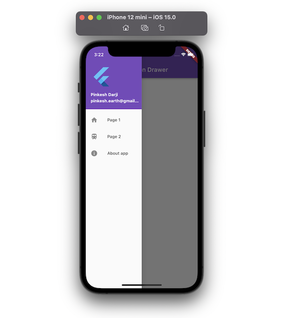
Sometimes, you may need to show additional information about the app, like its version, privacy policy, official website, etc. Flutter has a dedicated widget called AboutListTile that you can display inside the navigation drawer.
To display the AboutListTile inside the drawer:
- Add the
AboutListTilewidget at the end and inside theListView(where you haveListTileitems for the pages) - Inside the
AboutListTile, add theiconandchildparameters and add theTextwidget inside thechild - Inside the
AboutListTile, add theapplicationNameparameter and provide the app name - Inside the
AboutListTile, add theapplicationVersionparameter and provide the current app version
Code example:
Drawer(
  child: ListView(
    // Important: Remove any padding from the ListView.
    padding: EdgeInsets.zero,
    children: [
      const UserAccountsDrawerHeader(
        decoration: BoxDecoration(color: const Color(0xff764abc)),
        accountName: Text(
          "Pinkesh Darji",
          style: TextStyle(
            fontWeight: FontWeight.bold,
          ),
        ),
        accountEmail: Text(
          "pinkesh.earth@gmail.com",
          style: TextStyle(
            fontWeight: FontWeight.bold,
          ),
        ),
        currentAccountPicture: FlutterLogo(),
      ),
      ListTile(
        leading: Icon(
          Icons.home,
        ),
        title: const Text('Page 1'),
        onTap: () {
          Navigator.pop(context);
        },
      ),
      ListTile(
        leading: Icon(
          Icons.train,
        ),
        title: const Text('Page 2'),
        onTap: () {
          Navigator.pop(context);
        },
      ),
      AboutListTile( // <-- SEE HERE
        icon: Icon(
          Icons.info,
        ),
        child: Text('About app'),
        applicationIcon: Icon(
          Icons.local_play,
        ),
        applicationName: 'My Cool App',
        applicationVersion: '1.0.25',
        applicationLegalese: '© 2019 Company',
        aboutBoxChildren: [
          ///Content goes here...
        ],
      ),
    ],
  ),
)
Output:
Opening navigation drawer programmatically
Sometimes, you may also want to open or close the drawer programmatically. For example, if you are developing an onboarding feature or letting the user know how to navigate your app, you may want to open the navigation drawer when the user clicks on UI elements that are part of the onboarding feature, such as the next button, open button, etc.
To open the navigation drawer programmatically:
- First, create the global variable in your class
- Inside the
Scaffoldwidget, add thekeyparameter and assign the global key - Add the
ElevatedButtonto your page - Inside the
ElevatedButton, add theonPressed()method and call theopenDrawer()method using the Global key
Code example:
class NavigationDrawerDemo extends StatefulWidget {
  const NavigationDrawerDemo({Key? key}) : super(key: key);

  @override
  State<NavigationDrawerDemo> createState() => _NavigationDrawerDemoState();
}

class _NavigationDrawerDemoState extends State<NavigationDrawerDemo> {
  final GlobalKey<ScaffoldState> _key = GlobalKey(); // Create a key

  @override
  Widget build(BuildContext context) {
    return Scaffold(
      key: _key,
      appBar: AppBar(
        centerTitle: true,
        title: const Text(
          'Navigation Drawer',
        ),
        backgroundColor: const Color(0xff764abc),
      ),
      drawer: Drawer(
        child: ListView(
          // Important: Remove any padding from the ListView.
          padding: EdgeInsets.zero,
          children: [
            ListTile(
              leading: Icon(
                Icons.home,
              ),
              title: const Text('Page 1'),
              onTap: () {
                Navigator.pop(context);
              },
            ),
            ListTile(
              leading: Icon(
                Icons.train,
              ),
              title: const Text('Page 2'),
              onTap: () {
                Navigator.pop(context);
              },
            ),
          ],
        ),
      ),
      body: Center(
        child: Column(
          children: [
            SizedBox(
              height: 50,
            ),
            ElevatedButton(
              onPressed: () {
                _key.currentState!.openDrawer(); //<-- SEE HERE
              },
              child: const Text(
                'Elevated Button 1',
                style: TextStyle(fontSize: 24),
              ),
            ),
          ],
        ),
      ),
    );
  }
}
Output:
Opening a navigation drawer from the right side
In very rare cases, you may want to open the drawer from the right side. To do so, simply replace the drawer parameter (inside the Scaffold) with the endDrawer and you are done.
Controlling navigation drawer width
When the navigation drawer opens, by default, it will cover more than 50 percent of the screen. You can change this and allow the navigation drawer to occupy a space that you define.
To set the width of the navigation drawer:
- Wrap the existing
Drawerwidget inside theContainerwidget - Inside the
Containerwidget, add thewidthparameter and assign the percent of the screen you want the navigation drawer to cover using theMediaQuery. For example, theMediaQuery.of(context).size.width * 0.5will allow the navigation drawer to open until it reaches 50 percent of the screen’s width
Code example:
drawer: Container(
  width: MediaQuery.of(context).size.width * 0.5, //<-- SEE HERE
  child: Drawer(
    child: ListView(
      // Important: Remove any padding from the ListView.
      padding: EdgeInsets.zero,
      children: [
        ListTile(
          leading: Icon(
            Icons.home,
          ),
          title: const Text('Page 1'),
          onTap: () {
            Navigator.pop(context);
          },
        ),
      ],
    ),
  ),
),
Output:
Conclusion
In this tutorial, we learned how to add the navigation drawer in Flutter with practical examples. We first saw how to add a basic navigation drawer and then gradually moved toward customizing the drawer. Finally, we learned how to open the navigation drawer programmatically and control its width.
The post How to add a navigation drawer in Flutter appeared first on LogRocket Blog.
from LogRocket Blog https://ift.tt/aOf6jg8
via Read more


