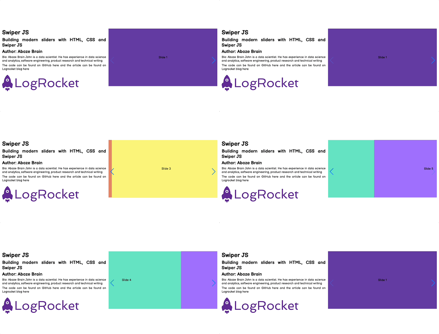
Sliders are functional user interface units that organize pieces of information in a condensed and cyclical manner within a limited space. Sliders consist of the following components:
- Containers, or the boxes that house the slider components
- Slides, or the content area that includes text, images, videos, and buttons
- Navigation icons that guide users through the slides
- Pagination visualizers that serve as additional navigation, usually bullets or numbers placed on the bottom of the container
In addition, sliders are built with transition effects to avoid abrupt changes from one block of content to another. Building these sliders from scratch, and covering their components and transition, can be intimidating. That is why in this article we will use Swiper to create modern, fast, responsive, and native (mobile-first) touch sliders with amazing transitions.
Contents
- What is Swiper?
- Getting started with Swiper
- Defining the markup
- Implementing movement and navigation
- Implementing transition effects
- Implementing sliders for image galleries
- Custom controls
What is Swiper?
Swiper is a JavaScript library that creates modern touch sliders with hardware-accelerated transitions (utilizing GPU to offload graphic-intensive transitions and create smoother visuals) and excellent native behavior. Swiper is available for vanilla JavaScript, Angular, React, Vue.js, and Svelte.
Some of the best websites that use Swiper JS can be found here.
Swiper is a completely free and open-source library with over 30.1k stars and 9.6k forks on GitHub. Some key features of Swiper include:
- Responsive design
- Rich API
- Image lazy loading
- Library agnostic
- Mobile-friendly
- Multi-row slide layout
- Flexbox layout
- Virtual slides for better performance
- Nested sliders
- Full navigation control
- Transition effects (fade, 3D Cube, 3D overflow, parallax, cards, and creative)
- Works on iOS, Android, and the latest desktop browsers
- RTL (right-to-left) layout
- Keyboard and mouse interaction and control
- Mutation observer
- Autoplay
- Loop mode
Getting started with Swiper
At the time of writing, Swiper is currently on v.8; however, check for the respective migration guide to upgrade from Swiper 6 to Swiper 7 or from Swiper 7 to Swiper 8.
There are three options for importing Swiper into your project:
- Download and use Swiper assets locally here
- Use Swiper as a content delivery network (CDN) by adding the following to your HTML file head and body, respectively:
    <link rel="stylesheet" href="https://unpkg.com/swiper@8/swiper-bundle.min.css"/>

    <script src="https://unpkg.com/swiper@8/swiper-bundle.min.js"></script>
- Install from npm using the installation command
$ npm install swiper
For this article, we will be using option two.
Defining the markup
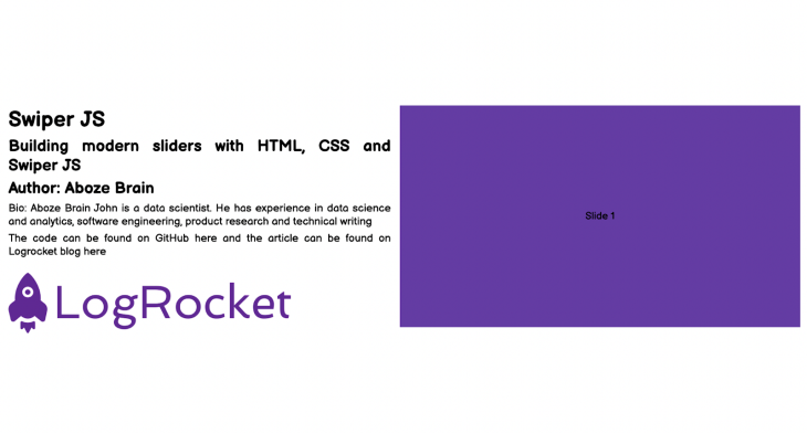
The HTML markup to structure our project web page, layout, and its contents are shown in the image above. The HTML markup is as follows:
<!DOCTYPE html>
<html lang="en">
<head>
   <meta charset="UTF-8">
   <meta http-equiv="X-UA-Compatible" content="IE=edge">
   <meta name="viewport" content="width=device-width, initial-scale=1.0">
   <title>Swiper Article</title>
   <link rel="stylesheet" href="style.css">
   <link rel="stylesheet" href="https://unpkg.com/swiper@8/swiper-bundle.min.css"/>


</head>
<body>
   <div class="container">
       <!-- Project content container -->
       <div class="project_content">
           <h1>Swiper JS</h1>
           <h2>Building modern sliders with HTML, CSS and Swiper JS</h2>
           <h2>Author: Aboze Brain</h2>
           <p>Bio: Aboze Brain John is a data scientist. He has experience in data science and analytics, software engineering, product research and technical writing</p>
           <p>The code can be found on GitHub <a href="#">here</a> and the article can be found on Logrocket blog <a href="#">here</a></p>
           <p></p>
           <img src="/logrocket.png" alt="logrocket logo">
       </div>
       <!-- Slider main container -->
       <div class="swiper mySwiper">
           <div class="swiper-wrapper">
             <div class="swiper-slide slide_1">Slide 1</div>
             <div class="swiper-slide slide_2">Slide 2</div>
             <div class="swiper-slide slide_3">Slide 3</div>
             <div class="swiper-slide slide_4">Slide 4</div>
             <div class="swiper-slide slide_5">Slide 5</div>
           </div>
         </div>
   </div>


   <script src="https://unpkg.com/swiper@8/swiper-bundle.min.js"></script>
   <script src="/script.js"></script>
</body>
</html>
In the HTML markup, you can see that our project consists of five slides. Next, let’s style the default HTML markup using CSS as shown below:
/* Import google font (Balsamiq Sans) */
@import url('https://fonts.googleapis.com/css2?family=Balsamiq+Sans:ital,wght@0,400;0,700;1,400;1,700&display=swap');


/* Box sizing rules */
*,
*::before,
*::after {
   box-sizing: border-box;
}


/* Remove default padding and margin */
* {
   padding: 0;
   margin: 0;
}


/* Default anchor tag styling */
a {
   text-decoration: none;
   color: black;
}


a:hover {
   cursor: pointer;
}


/* Default image styling */
img {
   padding: 1rem;
   max-width: 75%;
   height: auto;
}


/* Body styling */
html,
body {
 position: relative;
 height: 100%;
}


body {
   font-family: 'Balsamiq Sans', cursive, "Roboto Mono";
   font-size: 1.2rem;
   text-align:justify;
}


.container {
   display: grid;
   grid-template-columns: 1fr 1fr;
   grid-gap: 1rem;
}


.container > div {
   top: 25vh;
   height: 50vh;
}


div.project_content {
   padding-top: 25vh;
   justify-items: center;
   align-items: center;
}
.project_content h1,h2, p {
   padding: 0.2rem 1rem;
}


.project_container img {
   height: 75%;
}


/* Swiper container stylng */
.swiper {
   right: 1rem;
   width: 100%;
   height: 100%;
}


.swiper-slide {
   text-align: center;
    /* Center slide text vertically */
   display: -webkit-box;
   display: -ms-flexbox;
   display: -webkit-flex;
   display: flex;
   -webkit-box-pack: center;
   -ms-flex-pack: center;
   -webkit-justify-content: center;
   justify-content: center;
   -webkit-box-align: center;
   -ms-flex-align: center;
   -webkit-align-items: center;
   align-items: center;
}
 .swiper-slide img {
   display: block;
   width: 100%;
   height: 100%;
   object-fit: cover;
 }


.slide_1 {
   background-color:#643ca3 ;
}


.slide_2 {
   background-color:#e38364 ;
}


.slide_3 {
   background-color:#faf47a ;
}


.slide_4 {
   background-color:#64e3c1 ;
}


.slide_5 {
   background-color:#9e6ffd ;
}
Next, we initialize Swiper in this project with JavaScript. The JavaScript is as follows:
//  Initialize Swiper
let swiper = new Swiper(".mySwiper", {});
Note that the class in the Swiper container ".mySwiper" is used to create a Swiper object in the JavaScript file.
Implementing movement and navigation
For the default web page, we can see that the five slides are overlapping each other, and there’s no way to view the slides one at a time except by using the mouse to swipe over.
This is not the most intuitive or clear way to communicate information. Swipers are supposed to be tools for displaying lots of information in a small space, so let’s see how we can improve this system with Swiper.
Pagination
As we learned earlier, pagination is just a set of traditional bullets or numbers placed on the bottom of the container (in this case, the box that covers the slides). The pagination shows how many sliders are overlapping in the container.
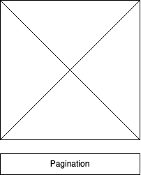
It can easily be implemented on the default files we have, by making some changes. On the HTML file, we need to add the pagination container under the sliders container as follows:
<div class="swiper mySwiper">
           <div class="swiper-wrapper">
             <div class="swiper-slide slide_1">Slide 1</div>
             <div class="swiper-slide slide_2">Slide 2</div>
             <div class="swiper-slide slide_3">Slide 3</div>
             <div class="swiper-slide slide_4">Slide 4</div>
             <div class="swiper-slide slide_5">Slide 5</div>
           </div>
           <div class="swiper-pagination"></div>
</div>
The CSS remains the same, but we need to make changes to our JavaScript file to initiate the pagination effect:
//  Initialize Swiper
let swiper = new Swiper(".mySwiper", {
   pagination: {
     el: ".swiper-pagination",
   },
 });
Now, our slider indicates how many slides we have in total, and which slide we are viewing at the moment.

Navigation
Navigation, just like pagination, serves as a tool to guide through the slides with a click rather than swiping with the mouse. It consists of a left and right arrow located on the sides of the slides container.
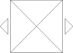
Let’s make the respective changes to our default files. On our HTML file, just like the pagination, we need to add the navigation containers under the sliders container as follows:
<div class="swiper mySwiper">
           <div class="swiper-wrapper">
             <div class="swiper-slide slide_1">Slide 1</div>
             <div class="swiper-slide slide_2">Slide 2</div>
             <div class="swiper-slide slide_3">Slide 3</div>
             <div class="swiper-slide slide_4">Slide 4</div>
             <div class="swiper-slide slide_5">Slide 5</div>
           </div>
           <div class="swiper-button-next"></div>
           <div class="swiper-button-prev"></div>
       </div>
Next, we need to add some styling to our CSS for arrow positioning (at the center of the slides container) and removing the arrow component outline as follows:
.swiper-button-next,
.swiper-button-prev {
   outline: none;
}


div.swiper-button-next, div.swiper-button-prev {
  top: 70%
}
Next, we initiate the navigation effect on our JavaScript file as follows:
//  Initialize Swiper
let swiper = new Swiper(".mySwiper", {
   navigation: {
     nextEl: ".swiper-button-next",
     prevEl: ".swiper-button-prev",
   },
 });
Scroll
Scroll aids simple horizontal scrollable sliders moving to start from left to right. It can easily be implemented by making the following changes on the default settings.

First, on the HTML markup, we will be making changes to the Swiper container as follows:
<div class="swiper mySwiper">
           <div class="swiper-wrapper">
             <div class="swiper-slide slide_1">Slide 1</div>
             <div class="swiper-slide slide_2">Slide 2</div>
             <div class="swiper-slide slide_3">Slide 3</div>
             <div class="swiper-slide slide_4">Slide 4</div>
             <div class="swiper-slide slide_5">Slide 5</div>
           </div>
           <div class="swiper-scrollbar"></div>
       </div>
Next, using the default CSS, let’s initiate the scroll effect on the JavaScript file as follows:
//  Initialize Swiper
letswiper = new Swiper(".mySwiper", {
 scrollbar: {
   el: ".swiper-scrollbar",
   hide: true,
 },
});
Now, you can see a scroll bar at the bottom of our slides.
Vertical
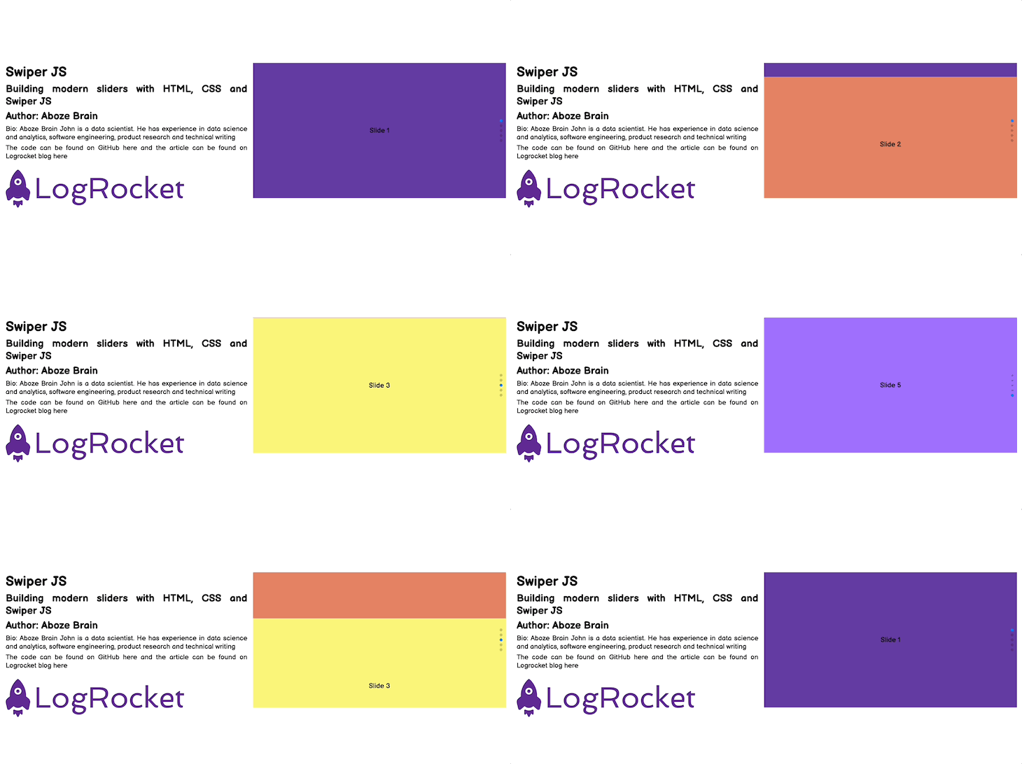
Vertical means vertical pagination; vertical pagination is just like the regular pagination we covered previously, but the bullet points are in a vertical orientation.
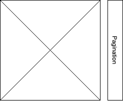
The HTML markup is the same as the horizontal pagination, we just need to specify the orientation in our JavaScript file as follows:
//  Initialize Swiper
let swiper = new Swiper(".mySwiper", {
 direction: "vertical",
 pagination: {
   el: ".swiper-pagination",
   clickable: true,
   hide: true,
 },
});
Now, we can see the slides moving up and down instead of side to side.
Nested
Nested sliders are a bit trickier. They are a combination of both the horizontal and vertical display of sliders with pagination to give you more information about the number of slides on each axis.
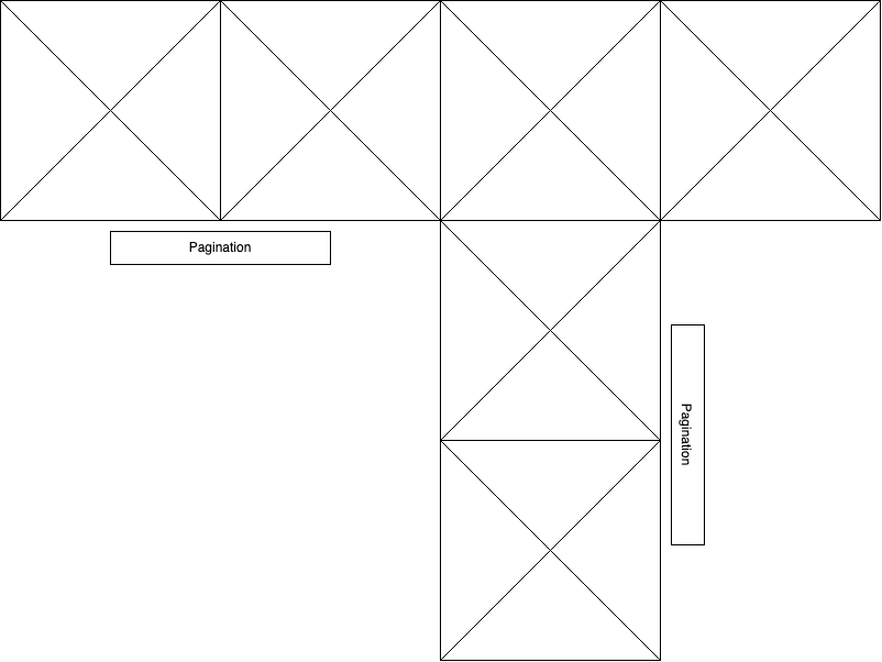
Let’s implement this using the default settings, on our HTML markup. The following changes should be made on the swiper container as follows:
<div class="swiper mySwiper swiper-h">
           <div class="swiper-wrapper">
             <div class="swiper-slide slide_1">Horizontal Slide 1</div>
             <div class="swiper-slide slide_2">Horizontal Slide 2</div>
             <div class="swiper-slide">
               <div class="swiper mySwiper2 swiper-v">
                 <div class="swiper-wrapper">
                   <div class="swiper-slide slide_3">Horizontal Slide 3 & Vertical Slide 1</div>
                   <div class="swiper-slide v_slide_2">Vertical Slide 2</div>
                   <div class="swiper-slide v_slide_3">Vertical Slide 3</div>
                 </div>
                 <div class="swiper-pagination"></div>
               </div>
             </div>
             <div class="swiper-slide slide_4">Horizontal Slide 4</div>
           </div>
           <div class="swiper-pagination"></div>
         </div>
Next, we need to specify some changes in our default CSS file to accommodate the vertical slide color as follows:
.v_slide_2 {
   background-color: #c164e3;
}


.v_slide_3 {
   background-color: #e3c164;
}
Then, we have to initiate both the vertical and horizontal sliders with pagination on our JavaScript script:
let swiper = new Swiper(".mySwiper", {
 spaceBetween: 50,
 pagination: {
   el: ".swiper-pagination",
   clickable: true,
 },
});


let swiper2 = new Swiper(".mySwiper2", {
 direction: "vertical",
 spaceBetween: 50,
 pagination: {
   el: ".swiper-pagination",
   clickable: true,
 },
});

Implementing transition effects
Sliders in web designs are incorporated with a range of transition effects to avoid overwhelming and abrupt shifts between blocks of information. For the context of this article, we will be focusing on the cube effect and the cards effect.
Cube effect
The cube effect transition makes the slides look like they are sides on a rotating cube. Changing from one slide to the next spins the cube to bring the desired slide to the front.
To implement the cube effect, on our default files we will make the following changes.
On our HTML markup we will update the swiper container as follows:
<div class="swiper mySwiper">
           <div class="swiper-wrapper">
             <div class="swiper-slide slide_1">Slide 1</div>
             <div class="swiper-slide slide_2">Slide 2</div>
             <div class="swiper-slide slide_3">Slide 3</div>
             <div class="swiper-slide slide_4">Slide 4</div>
             <div class="swiper-slide slide_5">Slide 5</div>
           </div>
       </div>
In the CSS, we have to make some changes to the swiper container selector by reducing the slide size to accommodate the effect transition like so:
.swiper {
   width: 280px;
   height: 320px;
}
Next, we have to initiate a cube effect on our JavaScript file:
//  Initialize Swiper
let swiper = new Swiper(".mySwiper", {
 effect: "cube",
 grabCursor: true,
 cubeEffect: {
   shadow: true,
   slideShadows: true,
   shadowOffset: 20,
   shadowScale: 0.94,
 },
 pagination: {
   el: ".swiper-pagination",
 },
});

Cards effect
This is a transition effect for shifting between slides just like the cube above. With the cards effect, each slide looks like a card in a deck that is being shuffled to bring the desired slide to the front.
The HTML and CSS is the same as the cube effect, just change the effect to the cards as follows:
//  Initialize Swiper
let swiper = new Swiper(".mySwiper", {
 effect: "cards",
 grabCursor: true,
});

Implementing sliders for image galleries
In this section, we will look at some sliders that are ideal for images or galleries. In my opinion, two great options for gallery sliders are thumb galleries and lazy loading, which we will learn how to implement in the following sections.
Thumb galleries
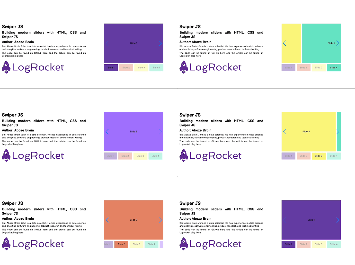
This slider consists of a compressed preview image of the original that is used as a placeholder. The thumbnail image should be smaller than the original, but the exact size is up to you. This slider creates a simple thumbnail gallery module to hold content and also functions as a means of navigation.
Using the default settings, we can implement this by making changes to our default HTML markup as follows:
<div class="swiper-container">
           <div class="swiper mySwiper2">
               <div class="swiper-wrapper">
                   <div class="swiper-slide slide_1">Slide 1</div>
                   <div class="swiper-slide slide_2">Slide 2</div>
                   <div class="swiper-slide slide_3">Slide 3</div>
                   <div class="swiper-slide slide_4">Slide 4</div>
                   <div class="swiper-slide slide_5">Slide 5</div>
               </div>
               <div class="swiper-button-next"></div>
               <div class="swiper-button-prev"></div>
           </div>


           <div thumbsSlider="" class="swiper mySwiper">
               <div class="swiper-wrapper">
                   <div class="swiper-slide slide_1">Slide 1</div>
                   <div class="swiper-slide slide_2">Slide 2</div>
                   <div class="swiper-slide slide_3">Slide 3</div>
                   <div class="swiper-slide slide_4">Slide 4</div>
                   <div class="swiper-slide slide_5">Slide 5</div>
               </div>
           </div>
 </div>
Next, we need to make changes on our CSS to the slider and thumbnails inside our swiper container as follows:
div.swiper-container {
   padding-top: 25vh;
}


.swiper-slide {
   display: flex;
   align-items: center;
   justify-content: center;
}


.swiper {
   width: 480px;
}


.mySwiper2 {
   width: 480px;
   height: 320px;
}


.mySwiper {
   height: 30%;
   box-sizing: border-box;
   margin: 10px;
}


.mySwiper .swiper-slide {
   opacity: 0.4;
}


.swiper-slide {
   background-position: center;
}


.mySwiper .swiper-slide-thumb-active {
   opacity: 1;
}
Then, we initiate the thumb gallery sliders on our default JavaScript file:
//  Initialize Swiper
let swiper = new Swiper(".mySwiper", {
 spaceBetween: 10,
 slidesPerView: 4,
 freeMode: true,
 watchSlidesProgress: true,
});


let swiper2 = new Swiper(".mySwiper2", {
 spaceBetween: 10,
 navigation: {
   nextEl: ".swiper-button-next",
   prevEl: ".swiper-button-prev",
 },
 thumbs: {
   swiper: swiper,
 },
});
Lazy loading
Lazy loading is a strategy that delays loading or initialization of resources until they are actually needed in order to reduce page load time and save system resources. Just imagine a user downloading the entire gallery in the previous use case, but the user leaves after viewing only the first slide; it results in memory and bandwidth wastage.
Lazy loading occurs on some users’ interactions such as navigation and scrolling. In order to see the lazy loading effect, we will be using images from Pexels.
To begin, on the default HTML file make the following changes on the slider container as follows:
div class="swiper mySwiper">
           <div class="swiper-wrapper">
              <div class="swiper-slide">
               <img data-src="https://images.pexels.com/photos/1824273/pexels-photo-1824273.jpeg?cs=srgb&dl=pexels-victor-miyata-1824273.jpg&fm=jpg"
               class="swiper-lazy"/>
              </div>
              <div class="swiper-slide">
               <img data-src="https://images.pexels.com/photos/3219549/pexels-photo-3219549.jpeg?cs=srgb&dl=pexels-engin-akyurt-3219549.jpg&fm=jpg"
               class="swiper-lazy"/>
              </div>
              <div class="swiper-slide">
               <img data-src="https://images.pexels.com/photos/1579240/pexels-photo-1579240.jpeg?cs=srgb&dl=pexels-stas-knop-1579240.jpg&fm=jpg"
               class="swiper-lazy"/>
              </div>
              <div class="swiper-slide">
               <img data-src="https://images.pexels.com/photos/51415/pexels-photo-51415.jpeg?cs=srgb&dl=pexels-max-deroin-51415.jpg&fm=jpg"
               class="swiper-lazy"/>
              </div>
           </div>


           <div class="swiper-button-next"></div>
           <div class="swiper-button-prev"></div>
           <div class="swiper-pagination"></div>
       </div>
On the default CSS file, remove all stylings related to swiper class and add the following styling:
.swiper {
   width: 70%;
   --swiper-navigation-color: #000000;
   --swiper-pagination-color: #000000;
}


.swiper-slide img {
   width: auto;
   height: auto;
   max-width: 85%;
   max-height: 100%;
   -ms-transform: translate(-50%, -50%);
   -webkit-transform: translate(-50%, -50%);
   -moz-transform: translate(-50%, -50%);
   transform: translate(-50%, -50%);
   position: absolute;
   left: 50%;
   top: 50%;
 }
Next we need to initiate the lazy loading effect on our JavaScript file like so:
let swiper = new Swiper(".mySwiper", {
 lazy: true,
 pagination: {
   el: ".swiper-pagination",
   clickable: true,
 },
 navigation: {
   nextEl: ".swiper-button-next",
   prevEl: ".swiper-button-prev",
 },
});

Custom controls
These controls are just a few ways to navigate through the slides. They are relatively simple to implement, we just need to specify them in the JavaScript file to take effect. Let’s look at three of the most popular.
First is keyboard control. This control utilizes the navigation keys on the keyboard (arrows keys or WASD) to control the shifting of slides. It can be initiated by adding the following to the swiper object as follows:
    keyboard: {
       enabled: true,
     },
Second is mousewheel control: This control aids navigation of slides via the scrolling of the mouse. This is ideal for vertical sliders, as the mousewheel can quickly scroll through the content. It can be initiated by adding the following to the swiper object in the JavaScript:
mousewheel: true,
Third and finally is grab cursor. This is an intuitive control that allows the mouse cursor to grab content and move it in different directions to navigate through the slides. It can be initialized on the JavaScript as follows:
grabCursor: true,
Conclusion
Sliders are important web design units that deserve special attention. Despite their pros on managing contents in a space, they have some cons such as inhibiting SEO strategies and creating UX blunders. Sliders are a matter of personal preference, and when implemented efficiently, can produce a favorable impression. Swiper makes it easy for you to make them, should you decide to include them in your next project.
The post Building modern sliders with HTML, CSS, and Swiper appeared first on LogRocket Blog.
from LogRocket Blog https://ift.tt/yfpdMDo
via Read more


