Using the ThemeProvider, a wrapper component available in styled-components, we can quickly set up multiple custom themes in React and switch between them with ease.
To demonstrate this, we’ll build a React app featuring quotes from popular characters from Game of Thrones. This tutorial will show how to create styled components and multiple themes for the app, change the theme with a click of a button, and save the theme in local storage.
Jump ahead:
- Why use styled-components for theme switching?
- Prerequisites
- Setting up the React app
- Creating the styled components
- Creating multiple themes
- Adding themes with
ThemeProvider - Switching themes
- Saving the theme in local storage
Why use styled-components for theme switching
Before we jump into the tutorial, let’s take a look at some reasons to use styled-components for theme switching:
- Full theming support: the
ThemeProviderwrapper component allows us to pass the theme to all React components underneath it in the render tree - Efficiency: styled-components uses the React Context API which offers a Theme Context that we can pass a theme into as a prop, allowing it to be dynamically accessed within every component – even those that are deeply nested
- Flexibility: any theme created in styled-components can be accessed in other React components using the
withThemehigher order component
Check out the styled-components advanced documentation page for more information.
Prerequisites
- Working knowledge of JavaScript and CSS
- Familiarity creating and using components and Hooks in React
- Code editor of your choice
Let’s get started!
Setting up the React app
Before building our app, we’ll first need to set up an environment that will enable us to develop our React application quickly.
Start by running the following command:
npx create-react-app theme-switching
In the above snippet, theme-switching is the name of both the application and the folder.
Next, cd into the app:
cd theme-switching
Now, open the folder in your code editor.
Next, install the styled-components dependency via npm or Yarn to allow styled-components to be used in the app.
# with npm
npm install --save styled-components

# with yarn
yarn add styled-components
At this point, we can clean up the app by deleting any unwanted files.
Alternatively, we can replace the code in the App.js file, like so:
import React from 'react';

function App() {
  return (
    <div className="App">
      <h1>Theme Switching</h1>
   </div>
  );
}

export default App;
After replacing the code, run one of the following commands to view the app in the browser:
# with npm
npm start

# with yarn
yarn start
This may take a little time to run; once it’s finished, launch your browser and navigate to http://localhost:3000.
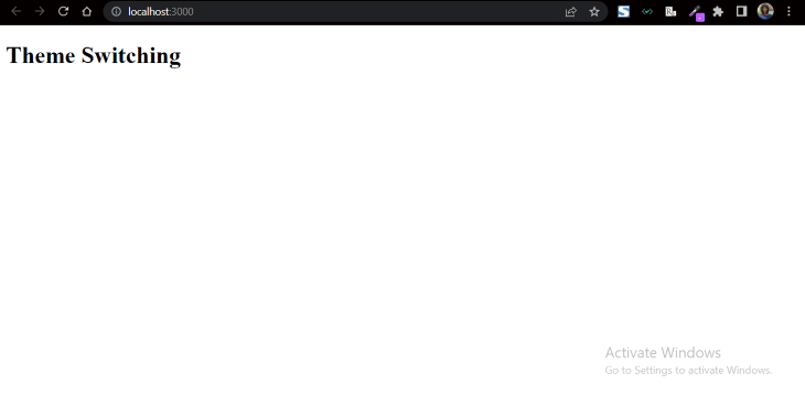
The app should look like this:
Now, let’s create the styled components.
Creating the styled components
For this tutorial, we’ll build a simple one-page web app containing the following components:
- Header
- Footer
- Body with cards containing quotes from popular Game of Thrones characters
- Themes bar with buttons for selecting a theme preference
To start, in the src folder, we’ll create a components folder. Inside the components folder, we’ll create a styles folder to house our styled components.
Next, we’ll add GlobalStyles to the app using the styled-components keyword, createGlobalStyle.
In the styles folder, create a Global.js file and add the following:
Global.js
import { createGlobalStyle } from "styled-components";

export const GlobalStyles = createGlobalStyle`
*,
*::before,
*::after {
  margin: 0;
  padding: 0;
  box-sizing: border-box;
}

body {
  background-color: hsl(0, 0%, 100%);
  color: hsl(0, 1%, 16%);
  font-family: monospace;
  overflow-x: hidden;
}
`
This code gives a simple reset to all the elements in the app and adds some styling to the body element.
Creating the header component
Next, we’ll create a styled-component file for the header: Header.styled.js. By including .styled in the naming convention of the component files, we’ll be able to easily identify the styled components from the regular React components.
Now, we’ll import styled from styled-components and add the following;
Header.styled.js
import styled from "styled-components";

export const Header = styled.header`
  background-color: hsl(0, 0%, 93%);
  padding: 20px;
  text-align: center;
  font-weight: bold;
`;
Creating the footer component
Now, we’ll create a styled-component file for the footer with the same steps used to create the header.
Footer.styled.js
import styled from "styled-components";

export const Footer = styled.footer`
  background-color: hsl(0, 1%, 38%);
  padding: 40px 20px;
  text-align: center;
  color: hsl(0, 0%, 100%);

  a {
    color: hsl(0, 0%, 100%);
  }
`;
Now, let’s go back to the App.js file and import the GlobalStyles, Header, and Footer styled components:
App.js
import React from 'react';
import { GlobalStyles } from "./components/styles/Global";
import { Header } from "./components/styles/Header.styled";
import { Footer } from "./components/styles/Footer.styled";

function App() {
  return (
    <div className="App">
      <GlobalStyles />
      <Header>Game of Thrones Quotes</Header>

      <Footer>
          <p>
            Made with love by <a href="http://bio.link/timonwa">Timonwa</a>
          </p>
        </Footer>
    </div>
  );
}

export default App;
Of course, you can change the content of the footer to your name or something else.
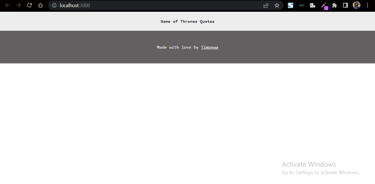
After saving the code and refreshing the browser, the app should look like this:
Creating the cards component
Next, we’ll create a styled-component file in the styles folder for the cards: Cards.styled.js. Let’s add the following code:
Cards.styled.js
import styled from "styled-components";

export const CardsContainer = styled.section`
  margin: 50px;
`;

export const Card = styled.div`
  background-color: hsl(60, 40%, 100%);
  border: 1px solid hsl(0, 0%, 87%);
  margin-left: auto;
  margin-right: auto;
  margin-bottom: 20px;
  border-radius: 3px;
  max-width: 450px;
`;

export const CardTitle = styled.div`
  color: hsl(0, 1%, 38%);
  border-bottom: 1px solid hsl(0, 0%, 87%);
  text-align: center;
  padding: 10px;
  font-weight: bold;
`;

export const CardBody = styled.div`
  color: hsl(0, 1%, 38%);
  padding: 10px;
`;
In the above code, we’ve created a CardContainer styled component that will house the individual cards. We’ve also created a Card styled component, along with CardTitle and CardBody styled components that will be displayed in the cards.
Creating the quotes component
Now, let’s create a Quotes React component inside the components folder. We’ll import the Card components into the Quotes.js file and create cards for the Quotes.
Quotes.js
import React from "react";
import {
  CardsContainer,
  Card,
  CardTitle,
  CardBody,
} from "./styles/Cards.styled";

const Quotes = () => {
  return (
    <CardsContainer>
      <Card>
        <CardTitle>Bran Stark</CardTitle>
        <CardBody>
          <p>
            I was never going to be as good a lady as you. So I had to be
            something else. I never could have survived what you survived.
          </p>
        </CardBody>
      </Card>

      <Card>
        <CardTitle>Tyrion Lannister</CardTitle>
        <CardBody>
          <p>
            It's not easy being drunk all the time. If it were easy, everyone
            would do it.
          </p>
        </CardBody>
      </Card>

      <Card>
        <CardTitle>Jon Snow</CardTitle>
        <CardBody>
          <p>
            Sometimes there is no happy choice Sam, only one less grievous than
            the others.
          </p>
        </CardBody>
      </Card>
    </CardsContainer>
  )
};

export default Quotes;
Now, we’ll import the Quotes React component into the App.js file so that we can view it in the browser:
App.js
import React from 'react';
import { GlobalStyles } from "./components/styles/Global";
import { Header } from "./components/styles/Header.styled";
import { Footer } from "./components/styles/Footer.styled";
import Quotes from "./components/Quotes";

function App() {
  return (
    <div className="App">
      <GlobalStyles />
      <Header>Game of Thrones Quotes</Header>

      <Quotes />

      <Footer>
          <p>
            Made with love by <a href="http://bio.link/timonwa">Timonwa</a>
          </p>
        </Footer>
     </div>
  );
}

export default App;
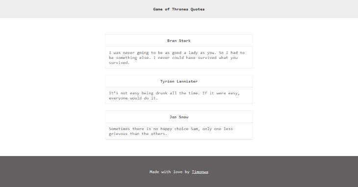
The app now should now look like this:
Creating the buttons
So far, we’ve created the components for the app and added content. Now, let’s create buttons for the themes and a container to house the buttons.
In the styles folder, we’ll create a ThemeSwitching.styled.js file and include the following:
ThemeSwitching.styled.js
import styled from "styled-components";

export const ThemeContainer = styled.div`
  background-color: hsl(0, 0%, 100%);
  display: flex;
  flex-wrap: wrap;
  justify-content: center;
  align-items: center;
  padding: 10px;
  border-bottom: 1px solid hsl(0, 0%, 87%);
`;

export const ThemeButton = styled.button`
  margin: 0 5px;
  padding: 10px;
  font-size: 0.5rem;
  border: 1px solid hsl(0, 0%, 87%);
  border-radius: 5px;
  width: 20px;
  height: 20px;
  cursor: pointer;
  &:hover {
    box-shadow: 2px 2px 2px hsl(0, 0%, 87%);
`;
In the above code, we’ve created a ThemeContainer styled component which will house all the theme buttons and a ThemeButton styled component for the individual theme buttons.
We’ve also added a hover state to the button. When a user hovers over a button, it will display a box-shadow effect.
Now, let’s import these styling changes by adding the following to the top of the App.js file along with our other imports:
App.js
import {
  ThemeContainer,
  ThemeButton,
} from "./components/styles/ThemeSwitching.styled";
In the same file, we’ll also add the below code snippet between the Header styled-component and Quotes React component:
App.js
<ThemeContainer>
  <span>Themes: </span>
  <ThemeButton className="light active"></ThemeButton>
  <ThemeButton className="dark"></ThemeButton>
  <ThemeButton className="blue"></ThemeButton>
  <ThemeButton className="green"></ThemeButton>
  <ThemeButton className="brown"></ThemeButton>
  <ThemeButton className="pink"></ThemeButton>
</ThemeContainer>
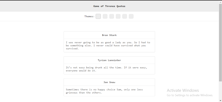
At this point, all the theme buttons have an identical appearance:
Let’s add different background colors to the theme buttons to represent the different themes.
We’ll add the following code to the Global.js file:
Global.js
// theme buttons color
.light {
  background-color: hsl(0, 0%, 93%);
}
.dark {
  background-color: hsl(0, 0%, 20%);
}
.blue {
  background-color: hsl(195, 53%, 79%);
}
.green {
  background-color: hsl(150, 80%, 15%);
}
.brown {
  background-color: hsl(39, 70%, 50%);
}
.pink {
  background-color: hsl(350, 100%, 88%);
}

// active theme
.active{
    border: 3px solid hsl(0, 0%, 87%);
    }
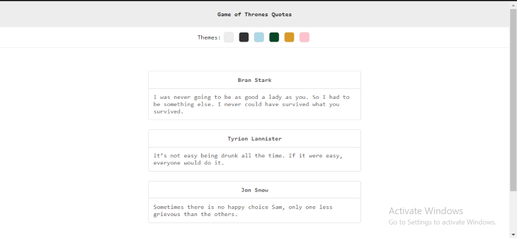
Now, as shown below, each of the buttons has a different color that corresponds to its theme. The light theme (the current theme) has a light gray background and a different border than the other buttons. This is because we used the active className to specify a solid border for the current theme. Later in this tutorial, we’ll apply function clicks to the buttons in order to add the active className to the button of the selected theme when the button is toggled.
Now let’s create the themes.
Creating multiple themes
So far, we’ve created buttons for six themes. Each button’s background color corresponds to a theme. The light theme button is white, the dark theme button is black, and the other theme button colors match the corresponding theme name: blue, green, brown, and pink.
Now, it’s time to actually create the themes.
In the styles folder, let’s create a Theme.styled.js file and add the following:
Theme.styled.js
export const light = {
  name: "light-theme",
  colors: {
    header: "hsl(0, 0%, 93%)",
    background: "hsl(0, 0%, 100%)",
    footer: "hsl(0, 1%, 38%)",
    text: "hsl(0, 1%, 16%)",
    quoteBgc: "hsl(60, 40%, 100%)",
    quoteTitle: "hsl(0, 1%, 38%)",
    quoteBody: "hsl(0, 1%, 38%);",
    quoteBorder: "hsl(0, 0%, 87%)",
    border: "hsl(0, 0%, 87%)",
  },
};

export const dark = {
  name: "dark-theme",
  colors: {
    header: "hsl(0, 0%, 20%)",
    background: "hsl(0, 1%, 16%)",
    footer: "hsl(0, 0%, 93%)",
    text: "hsl(0, 0%, 100%)",
    quoteBgc: "hsl(0, 0%, 35%)",
    quoteTitle: "hsl(0, 0%, 100%)",
    quoteBody: "hsl(0, 0%, 100%)",
    quoteBorder: "hsl(0, 0%, 59%)",
    border: "hsl(0, 0%, 78%)",
  },
};

export const blue = {
  name: "blue-theme",
  colors: {
    header: "hsl(195, 53%, 79%)",
    background: "hsl(194, 100%, 97%)",
    footer: "hsl(195, 52%, 28%)",
    text: "hsl(0, 1%, 16%)",
    quoteBgc: "hsl(0, 0%, 100%)",
    quoteTitle: "hsl(195, 52%, 28%)",
    quoteBody: "hsl(0, 0%, 38%)",
    quoteBorder: "hsl(0, 0%, 87%)",
    border: "hsl(0, 0%, 87%)",
  },
};

export const green = {
  name: "green-theme",
  colors: {
    header: "hsl(150, 80%, 15%)",
    background: "hsl(150, 80%, 20%)",
    footer: "hsl(150, 80%, 80%)",
    text: "hsl(150, 80%, 80%);",
    quoteBgc: "hsl(150, 60%, 60%)",
    quoteTitle: "hsl(130, 90%, 10%)",
    quoteBody: "hsl(130, 70%, 10%)",
    quoteBorder: "hsl(130, 80%, 20%)",
    border: "hsl(170, 100%, 60%)",
  },
};

export const brown = {
  name: "brown-theme",
  colors: {
    header: "hsl(39, 70%, 50%)",
    background: "hsl(37, 83%, 54%)",
    footer: "hsl(39, 50%, 20%)",
    text: "hsl(100, 0%, 20%)",
    quoteBgc: "hsl(50, 100%, 70%)",
    quoteTitle: "hsl(37, 23%, 24%)",
    quoteBody: "hsl(30, 23%, 24%)",
    quoteBorder: "hsl(50, 50%, 50%)",
    border: "rgb(224, 189, 33)",
  },
};

export const pink = {
  name: "pink-theme",
  colors: {
    header: "hsl(350, 100%, 88%)",
    background: "hsl(300, 80%, 88%)",
    footer: "hsl(300, 10%, 28%)",
    text: "hsl(300, 100%, 28%)",
    quoteBgc: "hsl(350, 50%, 78%)",
    quoteTitle: "hsl(300, 50%, 28%)",
    quoteBody: "hsl(320, 20%, 28%)",
    quoteBorder: "hsl(300, 50%, 28%)",
    border: "hsl(300, 50%, 58%)",
  },
};
In the above code, we’ve created six different theme objects and have named each object according to the theme’s color. We’ve exported the objects the same way we exported the other styled components.
Now that we’ve created the themes, let’s use ThemeProvider to add them to the app.
Adding themes with ThemeProvider
ThemeProvider provides our theme to every component within its wrapper via the React Context API. We’ll use ThemeProvider to enable theme switching.
First let’s import ThemeProvider and then import our Themes from the Theme.styled.js file into the App.js file.
App.js
import { ThemeProvider } from "styled-components";
import {
  light,
  dark,
  blue,
  green,
  brown,
  pink,
} from "./components/styles/Theme.styled";
Now that we’ve imported the themes, let’s wrap the app’s components with the ThemeProvider component. We’ll also be passing a theme prop into the ThemeProvider component.
This theme prop passes any theme object assigned to it down to every component and element in the app that is wrapped by ThemeProvider, allowing them to have access to every property present in the theme object.
For now, we’re passing down the light theme object as a prop.
App.js
function App() {
  return (
    <ThemeProvider theme={light}>
      <div className="App">
    <GlobalStyles />
      <Header>Game of Thrones Quotes</Header>

      <ThemeContainer>
        <span>Themes: </span>
        <ThemeButton className="light active"></ThemeButton>
        <ThemeButton className="dark"></ThemeButton>
        <ThemeButton className="blue"></ThemeButton>
        <ThemeButton className="green"></ThemeButton>
        <ThemeButton className="brown"></ThemeButton>
        <ThemeButton className="pink"></ThemeButton>
       </ThemeContainer>


      <Quotes />

      <Footer>
          <p>
            Made with love by <a href="http://bio.link/timonwa">Timonwa</a>
          </p>
        </Footer>
     </div>
     </ThemeProvider>
  );
}
Now, we’ll go into each of the styled-components and refactor the codes to access the color properties from the theme, which is currently set to light theme.
We’ll import the Theme.styled component first; I’ll explain why a little later in this tutorial.
Global.js
import * as theme from "./Theme.styled";
Global.styled.js
body {
  background-color: ${({ theme }) => theme.colors.background};
  color: ${({ theme }) => theme.colors.text};
  font-family: monospace;
  overflow-x: hidden;
}

// theme buttons color
.light {
  background-color: ${theme.light.colors.header};
}
.dark {
  background-color: ${theme.dark.colors.header};
}
.blue {
  background-color: ${theme.blue.colors.header};
}
.green {
  background-color: ${theme.green.colors.header};
}
.brown {
  background-color: ${theme.brown.colors.header};
}
.pink {
  background-color: ${theme.pink.colors.header};
}

// active theme
.active{
    border: 3px solid ${({ theme }) => theme.colors.border};
}
In the body style, we access the colors properties of the theme we passed in using a nameless function which also takes in the theme as an argument. Now, if we set the theme prop to dark, we’ll get the background and text color from the dark theme color properties. The same goes for light, blue, green, brown, and pink.
The button background color, however, is not accessed from the theme prop but directly from the theme that we imported. If we set the button background color according to the theme prop passed, all six buttons would have the same background color — that of the active (current) theme. This is why we imported the Theme.styled component first
Let’s test this:
Global.styled.js
// theme buttons color
.light {
  background-color: ${({ theme }) => theme.colors.header};
}
.dark {
  background-color: ${({ theme }) => theme.colors.header};
}
.blue {
  background-color: ${({ theme }) => theme.colors.header};
}
.green {
  background-color: ${({ theme }) => theme.colors.header};
}
.brown {
  background-color: ${({ theme }) => theme.colors.header};
}
.pink {
  background-color: ${({ theme }) => theme.colors.header};
}
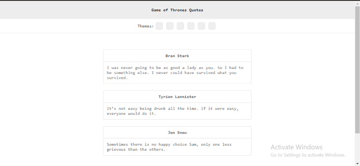
As you can see, all the theme buttons currently have a light gray background color, as specified in the default theme prop: light.
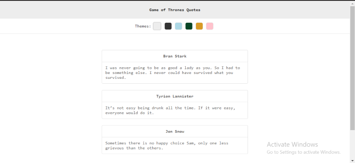
Let’s revert the buttons back to the correct code:
Continuing with our refactoring, let’s make changes to the other styled components, such as the Header, Footer, Card and ThemeSwitching so they can have access to our theme prop.
Replace the relevant code in existing style properties with the following:
Header.styled.js
export const Header = styled.header`
  background-color: ${({ theme }) => theme.colors.header};
`;
Footer.styled.js
export const Footer = styled.footer`
  background-color: ${({ theme }) => theme.colors.footer};
  color: ${({ theme }) => theme.colors.background};

  a {
    color: ${({ theme }) => theme.colors.background};
  }
`;
Card.styled.js
export const Card = styled.div`
  background-color: ${({ theme }) => theme.colors.quoteBgc};
  border: 1px solid ${({ theme }) => theme.colors.quoteBorder};
`;

export const CardTitle = styled.div`
  color: ${({ theme }) => theme.colors.quoteTitle};
  border-bottom: 1px solid ${({ theme }) => theme.colors.quoteBorder};
`;

export const CardBody = styled.div`
  color: ${({ theme }) => theme.colors.quoteBody};
`;
ThemeSwitching.styled.js
export const ThemeContainer = styled.div`
  background-color: ${({ theme }) => theme.colors.background};
  border-bottom: 1px solid ${({ theme }) => theme.colors.border};
`;

export const ThemeButton = styled.button`
  border: 1px solid ${({ theme }) => theme.colors.border};

  &:hover {
    box-shadow: 2px 2px 2px ${({ theme }) => theme.colors.border};
`;
As shown below, the app still looks the same in the browser. We can also change the theme prop to other themes to confirm each theme has the desired appearance with the styled elements.

Now, it’s time to make the theme buttons work.
Switching themes
There’s no point in giving the user a theme preference if the user cannot change it in the UI, is there? So let’s write the code that will enable theme switching with just a click of a button.
We’ll create a selectedTheme state with the useState React Hook. This state will initially be set to the light theme object.
First, we’ll import the useState Hook into the App.js file:
App.js
import React, { useState } from "react";
Then, we’ll create the state, like so, just before the return key:
App.js
function App() {
  // theme state
  const [selectedTheme, setSelectedTheme] = useState(light);
  return (
Next, we’ll pass in selectedTheme as a theme prop in the ThemeProvider. When the selectedTheme state changes, the theme prop will change, causing the page to update to the new theme.
App.js
return (
    <ThemeProvider theme={selectedTheme}>
      <div className="App">
Now, we’ll write a HandleThemeChange function which will run anytime a theme button is clicked. This will be added to the App.js file, just below the useState function:
App.js
// function to handle user theme selection on click and save it to local storage
  const HandleThemeChange = (theme) => {
    setSelectedTheme(theme);
  };
When a user clicks on a button, an argument is passed into the HandleThemeChange function as a parameter (i.e., the theme object associated with that button). The HandleThemeChange function then changes the selectedTheme state to the parameter that was passed.
For example, if the user clicks on the dark theme button, the dark theme object would be passed on as an argument and used as a parameter in the HandleThemeChange function. The function would set the selectedTheme to dark. This, in turn, would get passed as a prop into the ThemeProvider, updating the appearance of the page in the browser with the color properties associated with the selected theme..
Now, we then need to attach this function to the buttons. We’ll add the following to the App.js file:
App.js
       <ThemeContainer>
          <span>Themes: </span>
          <ThemeButton
            className={`light ${selectedTheme === light ? "active" : ""}`}
            onClick={() => HandleThemeChange(light)}></ThemeButton>
          <ThemeButton
            className={`dark ${selectedTheme === dark ? "active" : ""}`}
            onClick={() => HandleThemeChange(dark)}></ThemeButton>
          <ThemeButton
            className={`blue ${selectedTheme === blue ? "active" : ""}`}
            onClick={() => HandleThemeChange(blue)}></ThemeButton>
          <ThemeButton
            className={`green ${selectedTheme === green ? "active" : ""}`}
            onClick={() => HandleThemeChange(green)}></ThemeButton>
          <ThemeButton
            className={`brown ${selectedTheme === brown ? "active" : ""}`}
            onClick={() => HandleThemeChange(brown)}></ThemeButton>
          <ThemeButton
            className={`pink ${selectedTheme === pink ? "active" : ""}`}
            onClick={() => HandleThemeChange(pink)}></ThemeButton>
        </ThemeContainer>
In the above code, we added a conditional ternary operator to the className of each button.
This operator checks if the selectedTheme is equal to the theme associated with the button. If it is, it adds an active class to that button.
For example, our selectedTheme is equal to light due to the code that ran in the HandleThemeChange function. So, if we click on the light button, an active class will be added to the light button since our selectedTheme is also equal to light.
You’ll recall from earlier in this tutorial, that the active class adds box shadow styling to any theme button that has the active class attached to it.
Let’s take a look at the app in the browser and select a new theme. You’ll notice that the colors of the page change according to the selected theme. Also, the selected theme button has a box shadow.
The app is almost complete! We still have one crucial issue to fix in order for the theme switching to perform perfectly.
Currently, if we select a theme other than the preselected light (default) theme, the page colors revert back to those associated with the light theme when we reload the page:
The color reverts back to the default theme because the theme preference is not being stored or saved somewhere (i.e., in local storage or caching).
This is a critical issue that must be addressed. For apps with more than one page, the theme would revert back to the default theme every time the user navigated to a new page.
Saving the theme in local storage
Saving the selectedTheme in local storage is relatively easy and only involves a few lines of code. We’ll use the useEffect React Hook along with localStorage.
Let’s update the HandleThemeChange function, like so:
App.js
const HandleThemeChange = (theme) => {
    setSelectedTheme(theme);
    localStorage.setItem("current-theme", JSON.stringify(theme));
  };
Now, when a user clicks on a theme button, the selectedTheme state will change and the preferred theme will be saved to localStorage as current-theme.
You’ll notice that we do need to stringify the theme first before saving it in localStorage.
Now, let’s create the useEffect Hook. This function should be placed in the code immediately after useState:
App.js
  // theme state
  const [selectedTheme, setSelectedTheme] = useState(light);

  // react hook to get the theme selected by the user that is saved in local storage
  useEffect(() => {
    const currentTheme = JSON.parse(localStorage.getItem("current-theme"));
    if (currentTheme) {
      setSelectedTheme(currentTheme);
    }
  }, []);
We also need to import this Hook from React in order to use it:
import React, { useState, useEffect } from "react";
When the app initially loads, useEffect checks localStorage to see if there is a current theme stored. If a current theme is stored, useEffect returns this theme as a string and we parse the data to change it back to JavaScript. useEffect also sets the selectedTheme to the stored theme.
If useEffect does not find a theme stored in localStorage, then it sets the selectedTheme to the default theme (in this case, the light theme).
If we choose any theme besides the light theme and refresh the page, our theme preference will remain, as shown:
Conclusion
styled-components makes it very easy to create and maintain multiple themes for React web apps.
In this tutorial, we demonstrated how to build a custom theme switcher for a Game of Thrones-themed React app using styled-components. We also showed how to use local storage to save a user’s theme preference, so that when they reload the page, navigate to another page, or even close the page or browser and then revisit the page a few days later, their theme preference remains the same.
You can view the complete code used in the tutorial on GitHub and the deployed app here.
The post Build a React theme switcher app with styled-components appeared first on LogRocket Blog.
from LogRocket Blog https://ift.tt/dM6DFRZ
via Read more


