Progressive web apps (PWA’s) have been around for quite some time now, and they’re widely regarded as an easy way to create web apps that feel more native.
As time has gone on, this has only improved, with PWA’s being able to do more and more, while also allowing installation onto computers or phones. The gap between a native app and a web app has shrunk with the advancement of PWA’s.
However, no matter how convincing or believable a PWA may appear, they always retain the telltale toolbar that makes it abundantly clear that you are not running a native app, and you are using a website in a shell. For example, YouTube Music, when run as a PWA, looks like this:
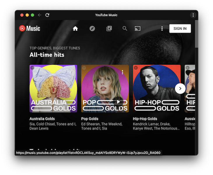
At the top of the window, you receive the title of the website, the three-dot menu to the right, along with a refresh and navigation buttons to the right. This clearly isn’t a native app, after all, native apps don’t have a refresh button because they don’t typically need one.
At a glance, we know that this is a PWA installed on a computer. And that’s a good thing.
Why, though? For starters, the delineation between web apps and native apps is quite important from a security perspective. If we saw a warning within a PWA that our computer was infected, we would perhaps not be concerned about it because we’d know it’s probably just a spammy ad on a website.
But, if we saw a warning from an app on our computer that looked like a native app, we would perhaps take that more seriously. Possibly, we would interact with it because we might think we already had that app on our computer, and we’re checking to see what the problem is.
It’s also important because it sets expectations. A native app will often respond instantly to clicks or other types of interaction, whereas a web app might not be so instant.
However, with an upcoming change in Chromium (the core browser that powers both Chrome and Edge), developers can take advantage of Window Controls Overlay to have more control over the title bar area of a web app.
This means that developers can overlay the window controls area of their web browser with custom content, instead of having this content prescribed to them by the browser or operating system.
Better still, it’s part of Chrome 99, which was released into the stable channel on 1 March 2022. This means that developers can start using this functionality today to make their PWA’s more immersive.
Websites and PWA’s only operate in this mode when the user allows them to, which reduces the risk of a malicious website trying to pass itself off as real.
So, in this tutorial, we’ll cover the following:
- How are PWAs changing?
- Creating an example PWA
- Creating our manifest
- Setting up the title bar
- Setting up the playlist
- Wiring the audio player
- Final polishing and styling
How are PWAs changing?
Traditionally, PWA apps have a title area that looks like this:

If we use the Window Control Overlay functionality, we can draw to anywhere within this region:

This means that we have endless control over what to actually place within this region. So, let’s dig into this new functionality by creating a simple music player that shows what track is currently playing and gives the user the opportunity to change the track.
Creating an example PWA
Today, we’ll create the following app in HTML and JavaScript. It’s hard to believe, but it’s actually a PWA and not a native app.
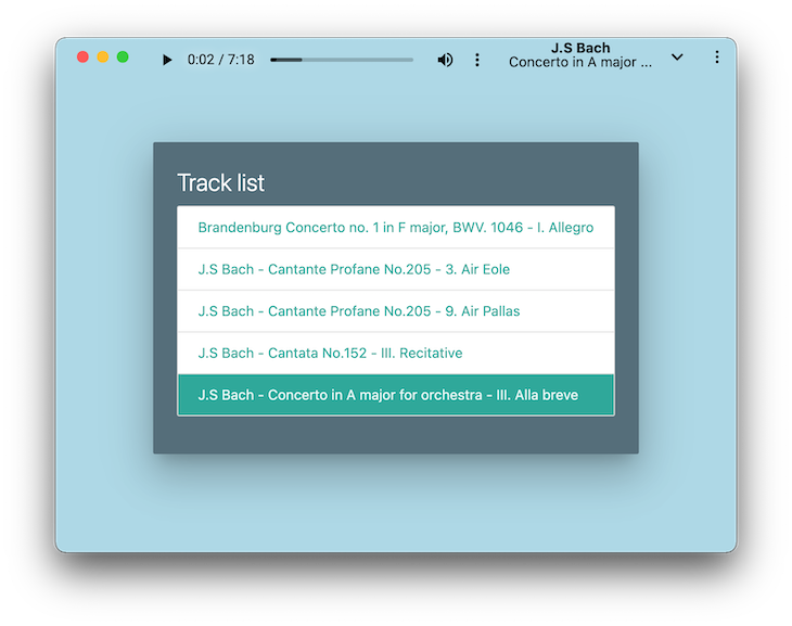
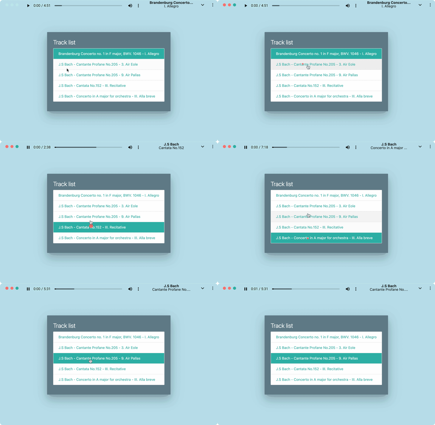
We used the space available to us in the title area to show an audio player, the track artist, and track title. We also kept the background color the same between the background of the app and the title bar, so the app appears to be the same colour.
All of this makes for a fairly convincing visual experience.
You can demo the app here and clone the source from here. The PWA is installable via the address bar, but to see the demo work correctly, take a quick visit to chrome://flags and enable the Desktop PWA Window Controls Overlay option.

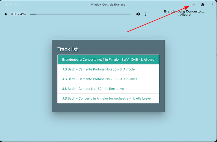
If you visit the link to the demo app after enabling the Desktop PWA Window Controls Overlay, you should be able to click on the arrow in the title bar, at which point the app will run with the Window Controls Overlay functionality enabled.
Creating our manifest
The first thing we need to do is create our index.html in a directory. Next, we must create a PWA manifest, so the browser recognizes our website as a PWA.
That’s as simple as creating a manifest.json in our directory, and using the following details:
{
    "theme_color": "#ADD8E6",
    "background_color": "#ADD8E6",
    "display": "standalone",
    "display_override": ["window-controls-overlay"],
    "scope": "/",
    "start_url": "/",
    "name": "Window Controls Example",
    "short_name": "Window Controls Example",
    "icons": [
        {
            "src": "/icon-192x192.png",
            "sizes": "192x192",
            "type": "image/png"
        },
        {
            "src": "/icon-256x256.png",
            "sizes": "256x256",
            "type": "image/png"
        },
        {
            "src": "/icon-384x384.png",
            "sizes": "384x384",
            "type": "image/png"
        },
        {
            "src": "/icon-512x512.png",
            "sizes": "512x512",
            "type": "image/png"
        }
    ]
}
Here we set the theme_color and background_color to the same light blue, but more importantly, we set the display_override to ["window-controls-overlay"]. This is how we indicate that our PWA supports the Window Controls Overlay functionality.
Within our index.html, we can now add the following head element:
<head>
  <!-- We use Materialize CSS for styling -->
  <link rel="stylesheet" href="https://cdnjs.cloudflare.com/ajax/libs/materialize/1.0.0/css/materialize.min.css">
  <script src="https://cdnjs.cloudflare.com/ajax/libs/materialize/1.0.0/js/materialize.min.js"></script>
  <!-- PWA Manifest -->
  <link rel="manifest" href="manifest.json">
</head>
<body>
</body>
We must also configure our service worker, which gives us some basic caching. To do this, reate a serviceworker.js and paste the following details in:
var staticCacheName = "pwa";

// Register the install event
self.addEventListener("install", function (e) {
  e.waitUntil(
    caches.open(staticCacheName).then(function (cache) {
      return cache.addAll(["/"]);
    })
  );
});

// Register the fetch event
self.addEventListener("fetch", function (event) {
  console.log(event.request.url);

  event.respondWith(
    caches.match(event.request).then(function (response) {
      return response || fetch(event.request);
    })
  );
});
Finally, within our index.html, we’ll need to register our service worker. That’s as easy as registering our service worker after the page loads, which we can do within a <script> block in our index.html:
    window.addEventListener('load', () => {
      registerSW();
    });
    // Register the Service Worker
    async function registerSW() {
      if ('serviceWorker' in navigator) {
        try {
          await navigator
            .serviceWorker
            .register('serviceworker.js');
        }
        catch (e) {
          console.log('SW registration failed');
        }
      }
    }
Now, if we serve this file over HTTP and open it in a preview version of Chrome, we will be asked to install the app.

After clicking on this button, our app will pop out into a separate window, which will look like this:
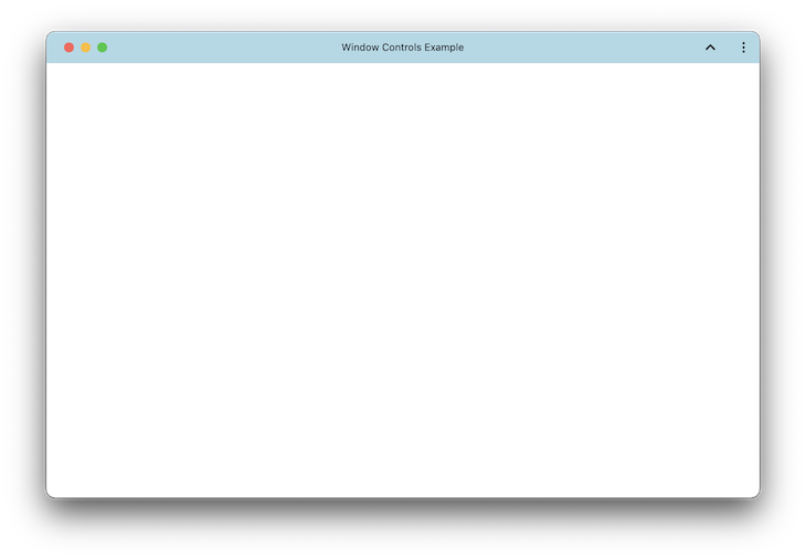
If we click on the ^ button next to the three dots, we get our first taste of the Window Controls Overlay  .
.
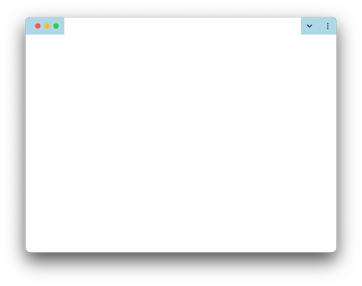
It’s pretty uninspiring, but it shows us the new title area that we have access to. So, let’s start using it.
Setting up the title bar
Our title bar will contain the playhead for the track that is currently playing and the name of the current track. The first thing we need to do is ensure that our title bar doesn’t move when we scroll the page and position it appropriately within the allowed space.
To achieve our layout, let’s use two divs side by side in a row layout. The left div will contain the audio player, and the right div will contain the track artist and title, like so:
  <div class="audiobar">
    <audio controls id="player" style="width: 70%">
      <source src="music/Brandenburg Concerto no. 1 in F major, BWV. 1046 - I. Allegro.mp3" type="audio/mpeg"
        id="audiosource">
    </audio>
    <div style="display: flex; flex-direction: column; width: 30%; margin-top: 3px">
      <div style="text-align: center; line-height: 1; font-weight: bold;" id='artist'>Track Artist</div>
      <div style="text-align: center; line-height: 1;" id='trackname'>Track Title</div>
    </div>
  </div>
The styling for our audiobar class looks like this:
  .audiobar {
      /* Always position it at the top */
      position: fixed;
      /* Position the left of this box to the titlebar-area-x variable, otherwise fallback to 0. */
      left: env(titlebar-area-x, 0);
      /* Position the right of this box to the titlebar-area-x variable, otherwise fallback to 0. */
      top: env(titlebar-area-y, 0);
      /* Set the width of the titlebar, to the variable of titlebar-area-width. Otherwise, fallback to 100% width. */
      width: env(titlebar-area-width, 100%);
      /* Make the height of the title bar the titlebar-area-height variable, otherwise fallback to 33px high. */
      height: env(titlebar-area-height, 33px);
      /* Layout the child items from left to right */
      flex-direction: row;
      /* Use flexbox to control the layout of this div */
      display: flex;
      /* Make the background colour the same as the PWA colour*/
      background-color: #ADD8E6;
    }
If we save our HTML now, we can see that we’ve set up our audio tracking bar within the title area.
![]()
Technically, that’s the Window Controls Overlay functionality covered, but let’s put a bit more work into this so it looks like an actual app.
Setting up the playlist
Our playlist will use the Materialize CSS library to present a card to the user with several tracks in it. In this case, we’re creating a container for the playlist so we can populate it with JavaScript later on:
<!-- Colour the entire background the same light blue as the PWA colour -->
  <div style="background-color: #ADD8E6; width: 100%; height: 100%; z-index: -100; position: fixed;"></div>

  <!-- The main playlist container -->
  <div class="content">
    <div class="row">
      <div class="col s12 m12">
        <div class="card blue-grey darken-1 z-depth-5">
          <div class="card-content white-text">
            <span class="card-title">Track list</span>
            <div class="collection" id='tracklist'>
            </div>
          </div>
        </div>
      </div>
    </div>
  </div>
Wiring the audio player
Within our script tag, let’s set up a basic array that contains the filenames of our tracks:
    var trackNames = [
      'Brandenburg Concerto no. 1 in F major, BWV. 1046 - I. Allegro.mp3',
      'J.S Bach - Cantante Profane No.205 - 3. Air Eole.mp3',
      'J.S Bach - Cantante Profane No.205 - 9. Air Pallas.mp3',
      'J.S Bach - Cantata No.152 - III. Recitative.mp3',
      'J.S Bach - Concerto in A major for orchestra - III. Alla breve.mp3'
    ];
These tracks are within our music directory for the sample, which you can clone and use. You can also use different tracks if you wish to.
Next, let’s retrieve references to our various elements within the DOM:
    var musicContainer = document.getElementById('tracklist');
    var player = document.getElementById('player');
    var audioSource = document.getElementById('audiosource');
It’s now time to add the tracks to our playlist container. To achieve this, for every track in our trackNames array, we must create an anchor tag, set the appropriate class within the list of tracks, and use the active class if it’s the first track in the list.
We must also call the play function with the track to play, which we’ll define a little later.
When we set our text for the track, we’ll also remove the last four characters (the .mp3 suffix), so we are just left with our track artist and title:
   trackNames.forEach((track, index) => {
      let tag = document.createElement('a');
      tag.classList = 'collection-item ' + (index == 0 ? 'active' : '');
      tag.setAttribute('href', '#');
      tag.setAttribute('onclick', 'play(\'' + track + '\')');
      let text = document.createTextNode(track.substring(0, track.length - 4));
      tag.appendChild(text);
      musicContainer.appendChild(tag);
    });
We’ll also declare our play function that sets the selected track as the track to play. This function accepts the name of the track we are playing and uses it to work out the index of the selected track.
It then unsets the .active class from any elements in the DOM that have it and sets it to the track that has been clicked on:
    function play(track) {
      let trackIndex = trackNames.findIndex(x => x == track);
      document.querySelector('.active').classList.remove('active');
      musicContainer.children[trackIndex].classList.add('active');
      setTrackMetadata(track);
      player.pause();
      audioSource.setAttribute('src', 'music/' + track);
      player.load();
      player.play();
    }
We also need to define our setTrackMetadata function, which will update our currently playing track. This removes the .mp3 from the track name, splits up the track name into artist and title, and assigns the result to an artist and trackName variable, respectively.
We can also cut down the length of these items if we need to, so they fit neatly into the allotted space:
    function setTrackMetadata(track) {
      let metadata = track.substring(0, track.length - 4).split(' - ');
      let artist = metadata[0];
      let trackName = metadata[1];
      if (artist.length > 20) {
        artist = artist.substring(0, 20) + '...';
      }
      if (trackName.length > 20) {
        trackName = trackName.substring(0, 20) + '...';
      }
      document.getElementById('artist').innerText = artist;
      document.getElementById('trackname').innerText = trackName;
    }
Final polishing and styling
We need to update our styles for our app, so we can:
- Vertically offset the content of our app so it doesn’t overlap with the title bar
- Change the background color of the
audioplayer to transparent, so it looks like it’s part of the title bar - Offset the
audioelement so it’s more centered within the title area - Vertically and horizontally align the
contentclass so the playlist is in the middle of the screen
Fortunately, we can accomplish all of the above with the following styles:
    .content {
      padding-top: env(titlelbar-area-height, 33px);
      display: flex;
      align-items: center;
      justify-content: center;
      height: 100%;
      width: 100%;
    }
    audio::-webkit-media-controls-enclosure {
      background-color: rgba(0, 0, 0, 0);
      color: white;
    }
    audio {
      color: white;
      margin-top: -5px;
    }
With our app having the final level of visual polish, we’ve created a fairly compelling PWA that makes great use of the title bar area.
Conclusion
PWAs are an easy way for software developers to bring their websites to computers and devices and to make them feel more native. With the Window Controls Overlay functionality landing soon, that trend is only set to continue.
Whatever you decide to place in the title area is up to you, and before long, I’m sure we’ll see many websites using this functionality. But, never mind them, what will you make? Be sure to let us know how you’ll make use of this in the comments below.
Happy developing!
The post Nativizing PWAs with Window Controls Overlay appeared first on LogRocket Blog.
from LogRocket Blog https://ift.tt/3AQ1Rpb
via Read more


