Reading progress bars are quite common in blogs and online social reading platforms, for example, Wattpad. A progress bar gives the reader an idea of how much they have read, adding to the overall user experience and keeping readers hooked.
The good news is that this is a very simple feature to add to your site or blog. In this article, we’ll create a reading progress bar in React. You can see a live demo of the final application. Let’s get started!
Table of contents
- Creating a new React app
- Creating a dummy blog post
- Creating the reading progress bar
- styled-components
- Calculating the scroll percentage
- Using states
- Why we need the
useEffectHook - Wrapping up
Creating a new React app
To get started, we’ll first need to create a new React app for our project. Use the following commands to create a React app from scratch:
npx create-react-app my-app
cd my-app
npm start
Next, delete all the content from the App.js file so that it is blank. We’ll add all our components in App.js.
Creating a dummy blog post
Since our main objective is to create a reading progress bar and not a blog, we’ll create a dummy blog post using existing templates. I’m using a free blog template called Philosophy that I found online, however, you can use any template or dummy content.
With the steps below, we’ll create a dummy content component that we’ll import into our App.js file:
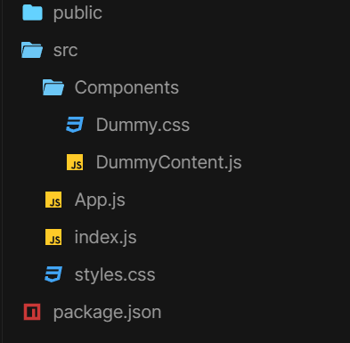
- Create a
Componentsfolder in yourSrcfolder - Create a new file in this folder called
DummyContent.js - Next, add the HTML for the blog post in
DummyContent.js - In
DummyContent.js, create a new CSS file calledDummy.css, which will contain the styling for the blog post
Your directory should look something like the image below:

Now, import and render the DummyContent.js file in your App.js file. Now, you have a simple blog layout to work with, and your App.js file will look like the following code:
import React from "react";
import DummyContent from "./Components/DummyContent";
function App() {
  return (
    <div className="main">
      <DummyContent />
    </div>
  );
}
export default App;
Creating the reading progress bar
For our main objective, we first need to create the reading bar component. In the same Components folder, create a new file called ReadingBar.js. Add the basic markup in VS Code by typing rfce.
styled-components
To create the styling for our reading progress bar, we’ll use styled-components to easily add CSS in our JavaScript. We’ll create a styled.div called Bar, which will contain the styling for our reading bar.
Make sure to create Bar outside of our main ReadingBar function. By declaring a styled-component inside the render method of a React component, a new component will be created on each render, leading to performance issues and unpredictable behavior:
import { React } from "react";
import styled from "styled-components";
// Bar Styled Component
const Bar = styled.div`
  position: fixed;
  height: 6px;
  border-radius: 0px 2px 0px 0px;
  background: linear-gradient(
    90deg,
    rgba(109, 227, 219, 1) 0%,
    rgba(132, 115, 177, 1) 100%,
    rgba(3, 9, 112, 1) 100%
  );
`;
function ReadingBar() {
  return <Bar style=></Bar>;
}
export default ReadingBar;
As you can see above, the styling is quite straight forward. The bar is fixed on the top, and we’re also adding a gradient to the background color. Inside the return function, the width is based as a style. It is currently set to 0%, but we’ll replace it with a state later on.
Calculating the scroll percentage
Calculating precise scroll percentages can be tricky sometimes. This is the part where most developers get stuck.
In most cases, a precise percentage is not that important, like with sticky headers and scroll to top buttons. However, in our case, we need to use the precise scroll percentage for our bar. Even a slight inaccuracy will cause the progress bar to either complete too early or not be complete at the end.
Luckily, we have a simple method to fix this issue:
var el = document.documentElement,
  ScrollTop = el.scrollTop || document.body.scrollTop,
  ScrollHeight = el.scrollHeight || document.body.scrollHeight;
var percent = (ScrollTop / (ScrollHeight - el.clientHeight)) * 100;
document.documentElement returns the element that is the root element of the document. We use this element here because we want to see how much of the page is left to scroll.
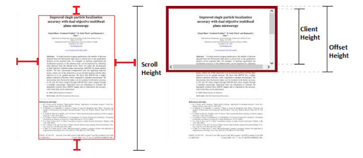
Scroll top is the number of pixels that have been vertically scrolled through an element’s content. Scroll Height is the complete measurement of the height of an element’s content, which also includes content that is not visible on the screen due to overflow. Lastly, the Client Height is the inner height of an element, which is the page in our case.
To calculate the percentage, we divide the Scroll top by the amount there is left to scroll. To calculate how much is left to scroll, subtract the complete Scroll Height by the Height , which is visible:

As you can see, the Scroll Height is the complete height of the element, even the part that is not visible due to overflow. The Client Height is the inner height. Thus, we can get the area that is not yet scrolled by subtracting the complete Scroll Height by the Height.
Using states
Now, we need to store this percentage value. We will use a simple state to store it, then we’ll use the state in the inline style of the Bar component as follows:
import { React, useState } from "react";
import styled from "styled-components";
// Bar Styled Component
const Bar = styled.div`
  position: fixed;
  height: 6px;
  border-radius: 0px 2px 0px 0px;
  background: linear-gradient(
    90deg,
    rgba(109, 227, 219, 1) 0%,
    rgba(132, 115, 177, 1) 100%,
    rgba(3, 9, 112, 1) 100%);
`;
function ReadingBar() {
  //Width State
  const [width, setWidth] = useState(0);
  // scroll function
  const scrollHeight = () => {
    var el = document.documentElement,
      ScrollTop = el.scrollTop || document.body.scrollTop,
      ScrollHeight = el.scrollHeight || document.body.scrollHeight;
    var percent = (ScrollTop / (ScrollHeight - el.clientHeight)) * 100;
    // store percentage in state
    setWidth(percent);
  };
  return <Bar style=></Bar>;
}
export default ReadingBar;
Note: The percentage sign also needs to be appended to the value when it is used.
Why we need the useEffect Hook
The logic for our progress bar is complete, however, an important functionality is missing, the component life cycle. You can think of the useEffect Hook as componentDidMount, componentDidUpdate, and componentWillUnmount combined.
We’ll use the useEffect Hook as follows:
//useEffect to control the component lifecycle
useEffect(() => {
  window.addEventListener("scroll", scrollHeight);
  return () => window.removeEventListener("scroll", scrollHeight);
});
The useEffect Hook is used for side effects, which is for DOM manipulation in our example. The useEffect Hook basically tells React that your component needs to do something after rendering, in our case, running the scrollHeight function on scroll.
In our case, the useEffect Hook does the following:
- It checks whether the component is mounted
- If the component is mounted, it runs the callback function
- If any change is made to the state or scroll position, it updates
The return function in our useEffect Hook removes the event listener when the component is unmounted.
Wrapping up
Lastly, import the Bar component in your App.js file and run it:
import React from "react";
import DummyContent from "./Components/DummyContent";
import ReadingBar from "./Components/ReadingBar";
function App() {
  return (
    <div className="main">
      <ReadingBar />
      <DummyContent />
    </div>
  );
}
export default App;
Now, your reading progress bar should be fully functional. I hope you enjoyed this tutorial. Be sure to leave a comment if you have any questions or concerns. Happy coding!
The post Creating a reading progress bar with React appeared first on LogRocket Blog.
from LogRocket Blog https://ift.tt/tY39m7G
via Read more


