Grids, grids, grids. So many things we can do with them. But, so many properties we have to remember. 
If you are like me and you always have to resort to Google when using grids, the tricks we’ll cover in this guide will make your life as a developer much easier.
What are CSS grid generators?
A grid generator is a website you can use to generate a grid in a few clicks. But why should you care about them? In my case, I use them quite often when I want to design the layout of my websites or a complex responsive structure inside an interface. Grids are great because they help you achieve a lot with just a few CSS lines, which saves a lot of time.
In this article, we will compare the following CSS grid generators and list their pros and cons so that you can bookmark your favorite one:
Also, to save you time, I made a cheat sheet with the essential CSS grid properties you should remember.  This cheat sheet is available at the bottom of this article.
1. CSS Grid Generator
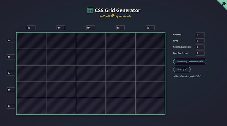
I put CSS Grid Generator first on my list because I use it the most. It is an open source project designed by Sarah Drasner (the code of the project is available here if you want to contribute).
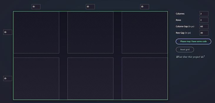
To give you an example, I recently needed to generate a simple grid with two rows and three columns. I didn’t remember how to set a specific size for the row gap and the column gap. With CSS Grid Generator, I was able to easily create the structure I desired and move on to more complex tasks.
.parent {
  display: grid;
  grid-template-columns: repeat(3, 1fr);
  grid-template-rows: repeat(2, 1fr);
  grid-column-gap: 60px;
  grid-row-gap: 30px;
}
The final grid looked like this:
Pros:
- The interface is user-friendly and the colors are well-chosen, making CSS Grid Generator an excellent tool for beginners who want to become more familiar with CSS grids
- CSS Grid Generator can help you get the result you want for most use cases because you can specify the number of columns, rows, and gaps across your grids
- Just hit one button to preview the code and copy it to your clipboard
Cons:
- There is no template you can choose to save you time
- You will not be able to generate complicated layouts
2. CSS Layout Generator
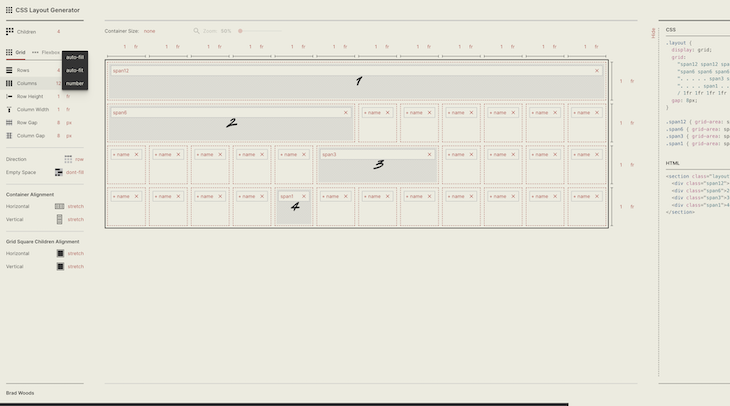
I could have put CSS Layout Generator first on the list. If you are looking to generate complicated grids all the time, this is probably the one you should bookmark. Developed by Braid Design System, CSS Layout Generator offers a wide range of options that will solve most headaches.
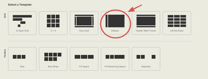
In my daily work, I use CSS Layout Generator templates a lot because they conveniently allow you to choose between a structure with a sidebar/container or a header/main/footer.
<section class="layout">
  <!-- The left sidebar where you can put your navigation items etc. -->
  <div class="sidebar">1</div>

  <!-- The main content of your website -->
  <div class="body">2</div>
</section>

<style>
.layout {
  width: 1366px;
  height: 768px;
  display: grid;
  /* This is the most important part where we define the size of our sidebar and body  */
  grid:
    "sidebar body" 1fr
    / auto 1fr;
  gap: 8px;
}

.sidebar {
  grid-area: sidebar;
}

.body {
  grid-area: body;
}
</style>
The Sidebar option looks like this:
Pros:
- CSS Layout Generator allows you to choose between six standard templates to get started faster
- There are many options to solve nearly all use cases
- You can switch between grids and Flexbox, which is helpful to compare both options
- The interface is excellent and user-friendly
Cons:
- Because it offers so many options, CSS Layout Generator can be confusing for a beginner
3. Grid LayoutIt
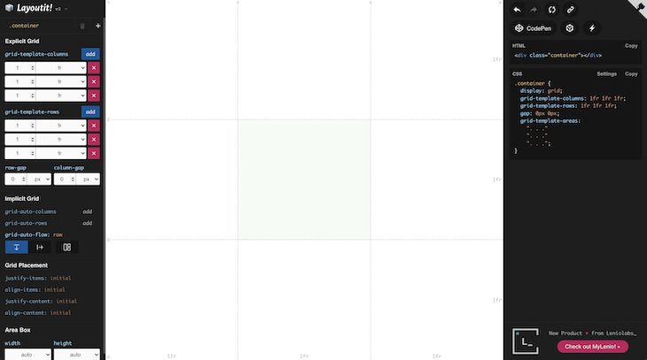
Grid LayoutIt was developed by Leniolabs and is another grid generator that comes with many options. The code is available publicly on GitHub if you are interested in contributing.
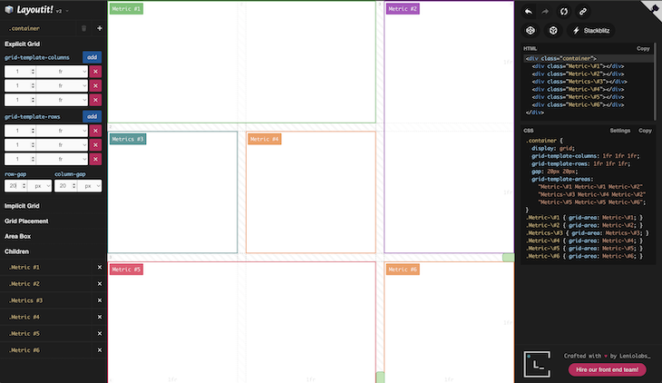
Last week, a customer asked me to design an interface to display important metrics about his product (somewhat similar to Geckoboard). The layout he wanted was very precise but, thanks to LayoutIt, I generated the code in a few seconds.
<div class="container">
  <div class="metric-1"></div>
  <div class="metric-2"></div>
  <div class="metrics-3"></div>
  <div class="metric-4"></div>
  <div class="metric-5"></div>
  <div class="metric-6"></div>
</div>

<style>
.container {
  display: grid;
  grid-template-columns: 1fr 1fr 1fr;
  grid-template-rows: 1fr 1fr 1fr;
  gap: 20px 20px;
  grid-auto-flow: row;
  grid-template-areas:
    "metric-1 metric-1 metric-2"
    "metrics-3 metric-4 metric-2"
    "metric-5 metric-5 metric-6";
}
.metric-1 {
  grid-area: metric-1;
}
.metric-2 {
  grid-area: metric-2;
}
.metrics-3 {
  grid-area: metrics-3;
}
.metric-4 {
  grid-area: metric-4;
}
.metric-5 {
  grid-area: metric-5;
}
.metric-6 {
  grid-area: metric-6;
}
</style>
The resulting layout looked like this:
Pros:
- Grid LayoutIt is intuitive to use and it provides many options
- You can set your columns and your rows using pixels (px), fractionals (fr), and percentages (%)
- Your layouts can be exported to CodePen, CodeSandbox, or StackBlitz in one click
- The interface is well-designed, with a proper contrast between the options and the grid preview
- Grid LayoutIt supports grid placement options
Cons:
- This generator does not provide templates to save you time, which is the main reason why I put it third on the list
4. Griddy
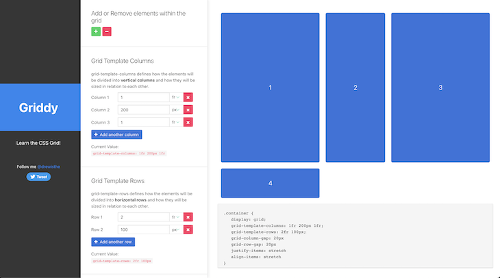
In my past experience, I spent a lot of time using Griddy. It is a little less easy to use than the CSS grid made by Sarah Drasner, but it offers more options.
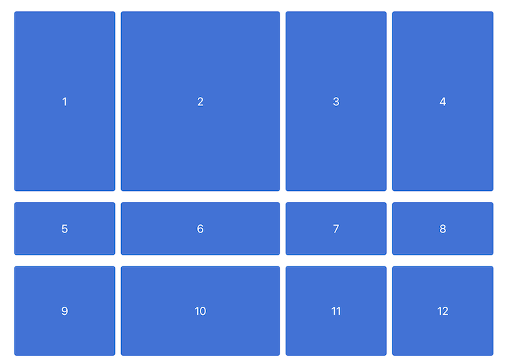
For example, it allows you to easily generate a four column grid with three rows:
.container {
  display: grid;
  grid-template-columns: 1fr 300px 1fr 1fr;
  grid-template-rows: 2fr 100px 1fr;
  grid-column-gap: 10px
  grid-row-gap: 20px
  justify-items: stretch
  align-items: stretch
}
The resulting layout looks like this:
Pros:
- You can set your columns and your rows using pixels (px), fractionals (fr), and percentages (%)
- The provided options are enough to solve most use cases and test different alignments. In a nutshell, it gets the job done
Cons:
- It may be a question of taste, but the sidebar with the options is not the best interface for me. You have to scroll for a while to get what you are looking for
- There are no templates to choose from
- There is no
minmax()function
5. Cssgr.id
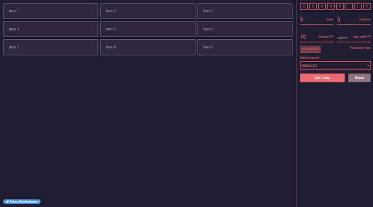
Cssgr.id is another great choice if you are looking for a grid generator that does not have too many options but enough to solve most use cases.
I used Cssgr.id last year to create a gallery because I remembered that it had a gallery template. In a few clicks, I was able to get something quite close to what I needed.
<div class="grid">
  <!-- This item will take 3 columns and 2 rows -->
  <div class="span-col-3 span-row-2">Item 1</div>

  <!-- This item will take 1 column and 1 row -->
  <div>Item 2</div>
  <div class="span-row-2">Item 3</div>
  <div class="span-row-3">Item 4</div>

  <!-- This item will take 1 column and 1 row -->
  <div>Item 5</div>

  <!-- This item will take 1 column and 1 row -->
  <div>Item 6</div>

  <!-- This item will take 1 column and 1 row -->
  <div>Item 7</div>

  <!-- This item will take 3 columns and 2 rows -->
  <div class="span-col-3 span-row-2">Item 8</div>

  <!-- This item will take 2 columns and 3 rows -->
  <div class="span-col-2 span-row-2">Item 9</div>

  <!-- This item will take 1 column and 1 row -->
  <div>Item 10</div>

  <!-- This item will take 1 column and 1 row -->
  <div>Item 11</div>

  <!-- This item will take 1 column and 1 row -->
  <div>Item 12</div>

  <!-- This item will take 1 column and 1 row -->
  <div>Item 13</div>

  <!-- This item will take 1 column and 1 row -->
  <div>Item 14</div>
</div>

<style>
.grid {
  display: grid;
  grid-template-columns: repeat(6, 1fr);
  grid-gap: 10px;
}

/* Items with this class will take 3 columns */
.span-col-3 {
  grid-column: span 3 / auto;
}

/* Items with this class will take 2 columns */
.span-col-2 {
  grid-column: span 2 / auto;
}

/* Items with this class will take 2 rows */
.span-row-2 {
  grid-row: span 2 / auto;
}

/* Items with this class will take 3 rows */
.span-row-3 {
  grid-row: span 3 / auto;
}
</style>
The gallery looked like this:

Pros:
- Cssgr.id comes with five practical starter layouts to choose from (3×3, football formation, header/footer, gallery, and generic website)
- You can add placeholder text to see how it renders with some written content
- It has a well-designed interface that can be easily configured
Cons:
- It is not the grid generator with the most options
6. Angry Tools CSS Grid
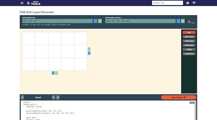
Angry Tools CSS Grid is the last CSS grid generator on our list. It can be handy, though probably less user-friendly than the other tools highlighted in this guide.
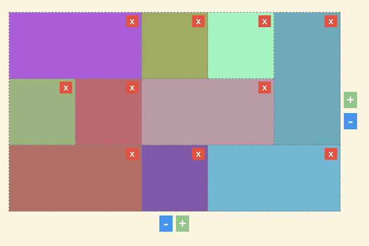
Angry Tools CSS Grid is also useful when generating galleries. By clicking on the squares, you can define their sizes and their directions (horizontally or vertically).
<div class="angry-grid">
  <div id="item-0">Item 0</div>
  <div id="item-1">Item 1</div>
  <div id="item-2">Item 2</div>
  <div id="item-3">Item 3</div>
  <div id="item-4">Item 4</div>
  <div id="item-5">Item 5</div>
  <div id="item-6">Item 6</div>
  <div id="item-7">Item 7</div>
  <div id="item-8">Item 8</div>
  <div id="item-9">Item 9</div>
</div>

<style>
.angry-grid {
  display: grid;
  /* Our grid will be displayed using 3 rows */
  grid-template-rows: 1fr 1fr 1fr;
  /* Our grid will be displayed using 4 columns */
  grid-template-columns: 1fr 1fr 1fr 1fr 1fr;
  /* You can define a gap between your columns and your rows if you need to */
  gap: 0px;
  height: 100%;
}

/* This grid item will start at row 1 and column 4 and end at row 2 and column 5 */
#item-0 {
  background-color: #8bf7ba;
  grid-row-start: 1;
  grid-column-start: 4;
  grid-row-end: 2;
  grid-column-end: 5;
}

/* This grid item will start at row 2 and column 3 and end at row 3 and column 5 */
#item-1 {
  background-color: #bf9aa7;
  grid-row-start: 2;
  grid-column-start: 3;
  grid-row-end: 3;
  grid-column-end: 5;
}

/* This grid item will start at row 2 and column 2 and end at row 3 and column 3 */
#item-2 {
  background-color: #c7656e;
  grid-row-start: 2;
  grid-column-start: 2;
  grid-row-end: 3;
  grid-column-end: 3;
}

/* This grid item will start at row 1 and column 1 and end at row 2 and column 3 */
#item-3 {
  background-color: #b659df;
  grid-row-start: 1;
  grid-column-start: 1;
  grid-row-end: 2;
  grid-column-end: 3;
}

/* This grid item will start at row 3 and column 1 and end at row 4 and column 3 */
#item-4 {
  background-color: #be6b5e;
  grid-row-start: 3;
  grid-column-start: 1;
  grid-row-end: 4;
  grid-column-end: 3;
}

/* This grid item will start at row 3 and column 4 and end at row 4 and column 6 */
#item-5 {
  background-color: #5bb9d7;
  grid-row-start: 3;
  grid-column-start: 4;
  grid-row-end: 4;
  grid-column-end: 6;
}

/* This grid item will start at row 1 and column 5 and end at row 3 and column 6 */
#item-6 {
  background-color: #56adba;
  grid-row-start: 1;
  grid-column-start: 5;
  grid-row-end: 3;
  grid-column-end: 6;
}

/* This grid item will start at row 1 and column 3 and end at row 2 and column 4 */
#item-7 {
  background-color: #9cab58;
  grid-row-start: 1;
  grid-column-start: 3;
  grid-row-end: 2;
  grid-column-end: 4;
}

/* This grid item will start at row 3 and column 3 and end at row 4 and column 4 */
#item-8 {
  background-color: #8558ad;
  grid-row-start: 3;
  grid-column-start: 3;
  grid-row-end: 4;
  grid-column-end: 4;
}

/* This grid item will start at row 2 and column 1 and end at row 3 and column 2 */
#item-9 {
  background-color: #96b576;
  grid-row-start: 2;
  grid-column-start: 1;
  grid-row-end: 3;
  grid-column-end: 2;
}
</style>
The resulting gallery looks like this:
Pros:
- Angry Tools CSS Grid comes with some templates you can choose from
Cons:
- It does not have the best design overall. To be honest, it is quite ugly and can be hard to use
- I would not recommend this tool for beginners. Advanced developers should also probably choose either CSS Layout Generator or Grid LayoutIt instead
- You have to scroll to get the CSS outputs
BONUS: CSS grid cheat sheet
CSS grid generators are great when you are not familiar with CSS properties. But, as you become a more advanced developer, you may find that a quick cheat sheet is probably handier.
 If it can help you, here is the one I have made for myself:
gap |
Sets the gap size between the rows and columns. It is a shorthand for the following properties: row-gap and column-gap |
row-gap |
Specifies the gap between the grid rows |
column-gap |
Specifies the gap between the columns |
grid |
A shorthand property for: grid-template-rows, grid-template-columns, grid-template-areas, grid-auto-rows, grid-auto-columns, grid-auto-flow |
grid-area |
Specifies a grid item’s size and location in a grid layout and is a shorthand property for the following properties: grid-row-start, grid-column-start, grid-row-end, grid-column-end |
grid-auto-columns |
Sets the size for the columns in a grid container |
grid-auto-flow |
Controls how auto-placed items get inserted in the grid |
grid-auto-rows |
Sets the size for the rows in a grid container |
grid-column |
Specifies a grid item’s size and location in a grid layout and is a shorthand property for the following properties: grid-column-start, grid-column-end |
grid-column-end |
Defines how many columns an item will span or on which column-line the item will end |
grid-column-gap |
Defines the size of the gap between the columns in a grid layout |
grid-column-start |
Defines on which column-line the item will start |
grid-gap |
Defines the size of the gap between the rows and columns in a grid layout and is a shorthand property for the following properties: grid-row-gap, grid-column-gap |
grid-row |
Specifies a grid item’s size and location in a grid layout and is a shorthand property for the following properties: grid-row-start, grid-row-end |
grid-row-end |
Defines how many rows an item will span or on which row-line the item will end |
grid-row-gap |
Defines the size of the gap between the rows in a grid layout |
grid-row-start |
Defines on which row-line the item will start |
grid-template |
A shorthand property for the following properties: grid-template-rows, grid-template-columns, grid-template-areas |
grid-template-areas |
Specifies areas within the grid layout |
grid-template-columns |
Specifies the number (and the widths) of columns in a grid layout |
grid-template-rows |
Specifies the number (and the heights) of the rows in a grid layout |
I hope this quick comparison of the best CSS grid generators helped you bookmark your favorite one.
Also, if I can give you a critical piece of advice when dealing with CSS grids: take your time. These generators are a great option because they can help you get the layouts you need step by step and avoid relying on a complicated solution.
I am also happy to read your comments and Twitter messages.  And in case you are curious about my work or my other articles, you can find that.
Thank you for reading!
The post Comparing the best CSS grid generators appeared first on LogRocket Blog.
from LogRocket Blog https://ift.tt/QS6ixZB
via Read more


