When designing a commercial product with an extensive catalog, it is beneficial to add filters to the search functionality to deliver an improved user experience. Effective filters help users winnow down their options and hasten the decision-making process by tuning search results to their taste. It also saves your users precious time.
On average, 30 percent of online shoppers use search filters and are twice more likely to convert than those who do not.
However, search filters can be implemented incorrectly, often hurting the user experience and increasing the bounce rate — 12 percent of users will bounce to a competitor’s site after an unsatisfactory search. So what should we avoid when building search filters in our products? And what principles can we apply to deliver a better UX?
In this post, we’ll examine various examples of poorly implemented search filters and highlight some tips you can use to produce a satisfying filtering experience. Let’s begin!
- Strategically locate the filter panel
- Applied filters should be visible and easy to remove
- Provide clear and descriptive labels for search filters
- Create an organized tagging system for your product’s catalog
- Use sorting to enhance the search experience
- Allow users to save and reuse filter configurations
- Provide adequate feedback
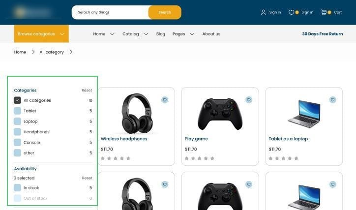
Strategically locate the filter panel
As mentioned earlier, a search filter is one of the first components a user looks for when they land on your ecommerce product. It is, therefore, necessary to position this element strategically, ensuring your user has no friction trying to reach it.
You will find various positioning methods across the web with the most common approach being a vertical layout on either side of the screen.


In the design above, however, this clothing company makes a mistake by concealing the filter panel behind a fairly unnoticeable Filters button. Enforcing the user to make an extra click to view the panel is unnecessary — especially when there is enough real estate to display it in desktop view. The panel also visually cuts off some results when expanded.
A better approach to this would be to keep the panel visible at all times, and reserve the button for a mobile view:
Another example of a satisfactory filter layout is this sticky, horizontal filter panel that stays in view as a user navigates the product listing:
In general, the position of a filter system helps the user complete their tasks faster.
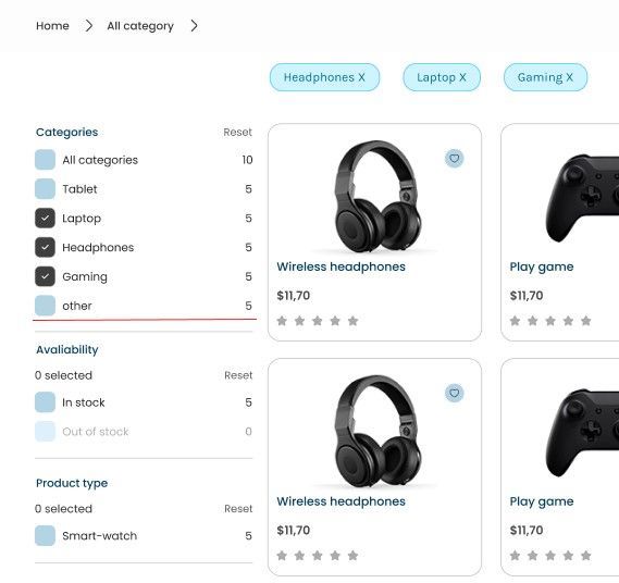
Applied filters should be visible and easy to remove
Making all applied filters visible to the user will help them better understand how these filters affect their search results. This feedback mechanism will go a long way in ensuring your users aren’t frustrated when they don’t find what they want since they can easily tweak the filter parameters.
It is also necessary to make it easy for the user to remove the applied filters. This allows them to easily modify their search experience when they are not getting the results they want, or if they want to see more (or fewer) results.
Here’s an example of this in action:
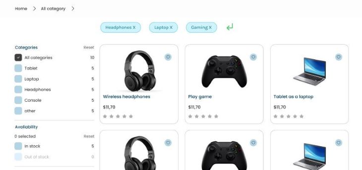
Overall, the goal of making applied filters visible and easy to remove is to give the user more control and flexibility in their search or browsing experience and to make it easier for them to find what they are looking for.
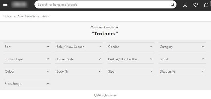
Provide clear and descriptive labels for search filters
Providing clear and descriptive labels for your product’s filtering system can help users find what they are looking for more easily. When labels are not clear or descriptive enough, users may have difficulty understanding what the filter does or what content will be included when they apply it.
Take the design below for instance:
The filter option Other is ambiguous, and a user would not know what results to expect from applying it. I encourage you to use descriptive labels because it can improve the user experience and make it more likely that they will use the filtering system effectively.
Create an organized tagging system for your product’s catalog
An organized catalog with each item tagged correctly in a tagging system will provide a pleasant filtering experience to end users. If an item is appropriately tagged to its correct category, a filter can easily make its computations based on these tags and return relevant results to the user.
Ecommerce and media giants that keep their catalogs organized are already benefitting from this practice, allowing them to retain their user’s attention.
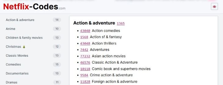
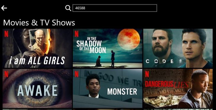
Take Netflix for example. It’s widely known that finding a program to watch on the streaming service can be an arduous task. As a solution, Netflix provides a collection of unique codes that a viewer can use to filter programs by categories like Sci-Fi, Anime, Classics, Horror, etc.
In general, having organized tags will be helpful for both your filter system and users.
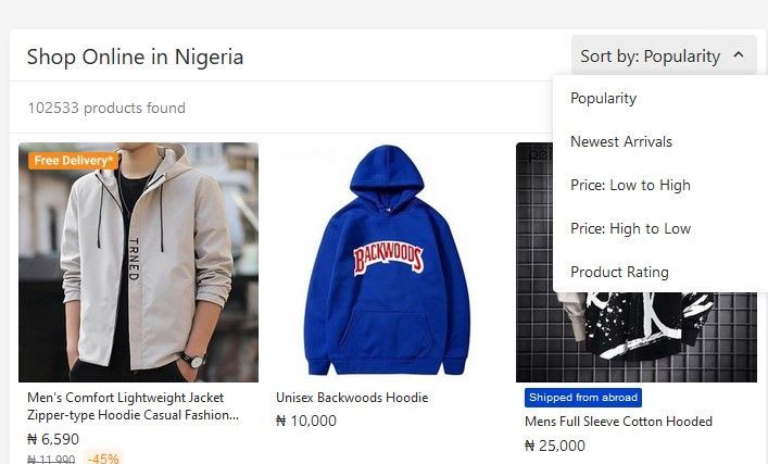
Use sorting to enhance the search experience
While filters give a user significant control over the organization of their search results, adding a sorting tool in the mix will greatly enhance the search experience. Sorting helps arrange data into meaningful order so that your users can analyze it more effectively.
Sorting can make it easier for a user to find the information they are looking for by organizing the data in a way that resonates with them. For example, suppose a user is on a budget and is searching for an affordable item on a website. In that case, they may be able to find it more quickly if they have the option to sort the search results by price rather than the items being presented in random order.
Some popular sorting parameters in online stores include New arrivals; Popularity; Price: Low to High; and so on.
Allow users to save and reuse filter configurations
Storing a user’s filter configurations for future reuse is a huge bonus for any product’s user experience. In doing so, the user can easily pick up where they left off or build on top of previous filter parameters to create a new query. This can lead to better user satisfaction and increased usage of your filter system.
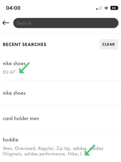
This technique can be beneficial if the filters are complex or if the users want to apply the same filters to multiple sets of data.
Provide adequate feedback
Feedback is a vital component of any successful design used to engage, explain, and improve user satisfaction. There are a few ways that filtering systems can provide good feedback to end users:
- Number of results: for every new filter applied, a product’s UI should display the number of results/items/products now available due to the filter
- Blurring unavailable filter options: quite frequently, a combination of certain filters will make other filter options unavailable — for instance, on a sneaker site, filtering for a certain shoe size might exclude some brand options which don’t have that size in stock. It’s therefore important to reflect this in the UI and progressively blur unavailable filter options out rather than let the user apply them and end up with no results
- Interactive filtering over batch filtering: interactive filtering is a more responsive approach where search results are instantly updated as new filters are applied. In this way, a user can immediately see the effects of their applied filters as opposed to batch filtering where the results are updated only after the user’s filter selections have been made
- Relevant results: The filtering system should return relevant results based on the applied filters. If the results are not relevant, the user may become frustrated and lose confidence in the system
Overall, good feedback from a filtering system should help the user understand how the filters affect their results and give them the tools they need to find what they are looking for.
Conclusion
Many techniques can be applied to search filters to make them more usable and pleasant for your user. Paying attention to this part of your UX design will greatly enhance your site’s performance, and increase chances of conversion. You can always count on users to keep returning to your product when your filter system helps them complete their tasks effectively.
Header image source: IconScout
The post Search filter principles for better UX appeared first on LogRocket Blog.
from LogRocket Blog https://ift.tt/PckFV6o
Gain $200 in a week
via Read more