There is no doubt that carousels are essential components in a website’s design. When you are limited in space. When you are limited in space but still want to display a lot of information, carousels come in very handy as they are perfect for displaying groups of related or unrelated content.
Whether it’s for rendering a slideshow, a testimonials section, or showcasing multiple messages in a slider, carousels are indispensable. In this tutorial, we will take a look at how we can build a carousel with just HTML, CSS, and plain old vanilla JavaScript.
Potential problems with prebuilt carousel components
Often when there is a need to implement a carousel within a website based on design requirements or just for aesthetic reasons, we immediately consider using an existing library, plugin, or something already prebuilt to save time.
While this is reasonable and perfectly fine, using external libraries and such often adds unnecessary dependencies and code bloatware to our application. This might lead to extra load time because these dependencies have to be downloaded. It can also lead to code conflicts between the library or plugin and our existing application codebase, which can take time to get fixed.
Building your own carousel with just HTML, CSS, and vanilla JavaScript can be the most effective solution because it would take less time to implement with no added dependency, nor will it give rise to conflicts/errors.
With that said, let’s get started!
Creating the HTML markup for the carousel
We’ll start by creating the HTML markup structure of the carousel. To keep things simple, we will need just a few HTML elements:
- A main slider container div
- A wrapper div for each slide
- Four actual slides containing four random images from Unsplash, respectively
- Two buttons for navigating between the slides
So let’s do just that:
 <body>
   <!-- slider container -->
    <div class="slider">

      <!-- slide 1 -->
      <div class="slide">
        <img
          src="https://source.unsplash.com/random?landscape,mountain"
          alt=""
        />
      </div>

       <!-- slide 2 -->
      <div class="slide">
        <img src="https://source.unsplash.com/random?landscape,cars" alt="" />
      </div>

       <!-- slide 3 -->
      <div class="slide">
        <img src="https://source.unsplash.com/random?landscape,night" alt="" />
      </div>

       <!-- slide 4 -->
      <div class="slide">
        <img src="https://source.unsplash.com/random?landscape,city" alt="" />
      </div>

       <!-- Control buttons -->
      <button class="btn btn-next">></button>
      <button class="btn btn-prev"><
    </div>
  </body>
We have chosen to go with images from Unsplash for our carousel so as not to overcomplicate our code with actual content markup. The resulting output is shown below:

Now that we’ve cleared that up, we’re ready to move on to the CSS part and start styling our carousel.
Note: Because we are using an Unsplash random image endpoint, whenever we reload the browser we are provided with a set of new random images from Unsplash.
Creating the CSS style for the carousel
Now let’s move on to styling our carousel by creating the CSS stylesheet for it. Before getting to the code, let’s take a look at what we will do:
- We’ll start by centering the slider container in the body element using grid. We’ll also give the slider container and the slides a corresponding fixed width and height that is responsive
- Next, we will set the slider container to have a relative position; it then becomes a parent container to the slides, as we would set the position of these slides to absolute position respectively. This makes them all stack on top of each other within the slider container
- Lastly, we will style both previous and next buttons to stay above the slides using absolute, transform, and z-index properties
body {
  height: 100vh;
  display: grid;
  place-items: center;
}

.slider {
  width: 100%;
  max-width: 800px;
  height: 350px;
  position: relative;
  /* overflow: hidden; */
}

.slide {
  width: 100%;
  max-width: 800px;
  height: 350px;
  position: absolute;
  transition: all 0.5s;
}

.slide img {
  width: 100%;
  height: 100%;
  object-fit: cover;
}

.btn {
  position: absolute;
  width: 40px;
  height: 40px;
  padding: 10px;
  border: none;
  border-radius: 50%;
  z-index: 10px;
  cursor: pointer;
  background-color: #fff;
  font-size: 18px;
}

.btn:active {
  transform: scale(1.1);
}

.btn-prev {
  top: 45%;
  left: 2%;
}

.btn-next {
  top: 45%;
  right: 2%;
}
Notice we commented out an overflow property in the slider style rule above. We’ll need this later on to hide any overflowing image. But for now we need to be able to see what is going on with our slider.
The resulting output would be:

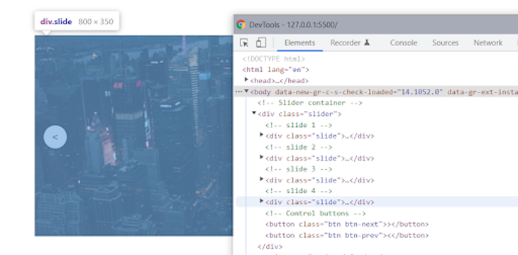
If this wasn’t obvious already, the four slides are stacked on top of each other in the order they appear in the HTML markup because we set the position of the slides to an absolute position. Inspecting the slider would show that all the slides are right there, with the last slide appearing on top, as shown below.

Making it work with vanilla JavaScript
Our carousel isn’t working right now because we have yet to add some interactivity using JavaScript, which is exactly what we are going to do next. We will have to add some event listeners to the next and previous control buttons so they move the slides left or right whenever they are clicked on.
To achieve this, we will tackle the JavaScript code needed to get our carousel working section by section so that it’s easy to understand and follow along.
The first step is to grab an array (NodeList) of all our slides and set their respective translateX property to 100 percent multiplied by each slide’s index in the array. Because arrays are ordered in zero-based indexing, the first slide begins with an index of 0, 1, 2, 3 – which translates to 0 percent, 100 percent, 200 percent, 300 percent.
// Select all slides
const slides = document.querySelectorAll(".slide");

// loop through slides and set each slides translateX property to index * 100%
slides.forEach((slide, indx) => {
  slide.style.transform = `translateX(${indx * 100}%)`;
});
As a result, each slide’s translateX property will be 0 percent, 100 percent, 200 percent, and 300 percent — making the last three slides overflow horizontally to the right of the carousel slider container, as shown below.

Note: We are able to see all slides above because the browser’s window has been zoomed out to 50 percent to accommodate the slides so we can fully see how they are rendered.
Inspecting the webpage using the dev tools would provide better clarity to what the JavaScript code above did exactly as shown below.

As you can see, each slide is translated horizontally using its index number multiplied by 100 percent.
Next, we will create an initial current slide counter that keeps track of the current slide, then proceed to add an event listener to the next button and a function that increases the current slide by +1 when the button is clicked.
We will then subtract the value of the current slide from each index before multiplying it by 100 percent. This would ensure that the individual slide index drops by -1 each time the button is clicked — thereby moving the slide index to -1 (i.e., -1, 0, 1, 2 and when clicked again -2, -1, 0, 1, and so on).
// current slide counter
let curSlide = 0;

// select next slide button
const nextSlide = document.querySelector(".btn-next");

// add event listener and next slide functionality
nextSlide.addEventListener("click", function () {
     curSlide++;

  slides.forEach((slide, indx) => {
    slide.style.transform = `translateX(${100 * (indx - curSlide)}%)`;
  });
});
As stated earlier, when the button is clicked, the index order goes from 0, 1, 2, 3 to -1, 0, 1, 2 (i.e., -100 percent, 0 percent, 100 percent, 200 percent). When clicked again, it goes from -1, 0, 1, 2 to -2, -1, 0, 1 (i.e -200 percent, -100 percent, 0 percent, 100 percent), and so on. The result would be each slide translated (moving) horizontally to the left by -100 percent.

But now we have a problem on our hands: the slide keeps moving on each click, even after it gets to the end of the slide instead of coming back to the first slide. This is because we haven’t written any condition that checks for that.
We will now create a maximum slide counter that holds the total number of slides in the array, which is 4, and then subtract 1 from it so it matches the zero-based index order of the slides.
Next, we will refactor this next slide event function to check if the current slide is equal to the maximum slide value (i.e., it’s at the last slide), and when this condition is true, reset the value of the current slide back to 0 — bringing the slides back to the first one.
// select next slide button
const nextSlide = document.querySelector(".btn-next");

// current slide counter
let curSlide = 0;
// maximum number of slides
let maxSlide = slides.length - 1;

// add event listener and navigation functionality
nextSlide.addEventListener("click", function () {
  // check if current slide is the last and reset current slide
  if (curSlide === maxSlide) {
    curSlide = 0;
  } else {
    curSlide++;
  }

//   move slide by -100%
  slides.forEach((slide, indx) => {
    slide.style.transform = `translateX(${100 * (indx - curSlide)}%)`;
  });
});
With that, our slide should go back to the first when it hits the last slide, as shown below.

Now that we have the next button working, let’s move on to the previous button.
- For the previous button, we will simply duplicate the event function for the next button and change just one thing. Rather than adding +1 to the current slide, we will subtract -1 from it so the slide moves the opposite direction.
- Lastly, we will add a condition that checks if the slide is currently the first (i.e., 0), and if it is, move the slide to the last one (maximum slide value).
// select prev slide button
const prevSlide = document.querySelector(".btn-prev");

// add event listener and navigation functionality
prevSlide.addEventListener("click", function () {
  // check if current slide is the first and reset current slide to last
  if (curSlide === 0) {
    curSlide = maxSlide;
  } else {
    curSlide-;
  }

  //   move slide by 100%
  slides.forEach((slide, indx) => {
    slide.style.transform = `translateX(${100 * (indx - curSlide)}%)`;
  });
});
Just as expected, the slide should move the opposite direction (backwards) of the next slide when clicked, as shown below.

With that out of the way, our slide is also done — only one step left. Recall that we commented out the overflow property that was set to hidden in the CSS style rule for our slider? We did this so we could see all the images as they got translated (moved). Now we will un-comment that property so that the overflowing images are hidden and only the current slide is visible at all times.
.slider {
  width: 100%;
  max-width: 800px;
  height: 350px;
  position: relative;
  overflow: hidden;  /* <===  */
  border-radius: 15px;
}
After hiding the overflow, adding a bit of border radius, and resetting the browser’s window back to normal, we should now have a perfectly working carousel slider, as shown below.

To play around with the demo, check out an interactive example on CodePen. You can find the full source code associated with this tutorial on GitHub.
Conclusion
Congrats! You just learned how to build a functional carousel with just HTML, CSS, and plain old vanilla JavaScript. You can extend the functionality to make it more accessible using arrow keys to navigate or include dots to highlight the current slide and number of slides, etc.
You can also put whatever desired content in this carousel, be it an image, actual markup content, testimonials, services, etc. Either way, now you no longer have to use bulky libraries to create simple carousels.
I hope you enjoyed this tutorial and found it helpful.
The post Build an image carousel from scratch with vanilla JavaScript appeared first on LogRocket Blog.
from LogRocket Blog https://ift.tt/sgkc84S
via Read more


